WATERCOLOUR DEMO. Harmony of colour and water
Dialog of the epochs: PIERRE-JOSEPH REDOUTÉKJfgsfg gfgdadafgfffgs

Dialog of the epochs: RÖSEL VON ROSENHOF KJfgsfggfdgfgfgghhfggHK

Dialog of the epochs: Karl BryullovKJghgfhfhttryryrtyyreyHKKJLhgdjghjgjgdjjgjg jjtyjtjteeuyu
Colors of Armenia. International Watercolour Festival
Urban plein airs with YUri Akopyants fdadfh hfdahadh
NEW COLOURS 2024.Tests with Elena Bazanova dGGgadqer
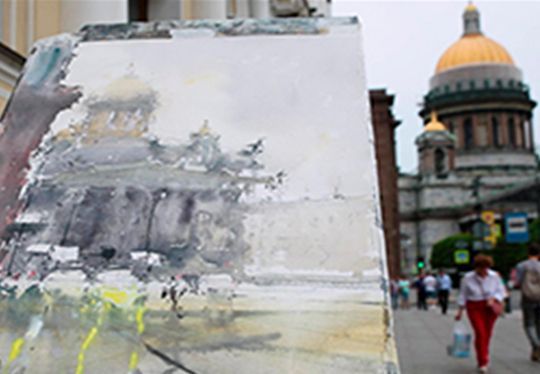
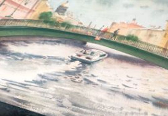
YURI AKOPYANTS. CITYSCAPE ST. ISAAC’S CATHEDRAL dgagdfdfaa
LANDSCAPE WITH A POND. PLEIN AIR WITH ELENA BAZANOVA
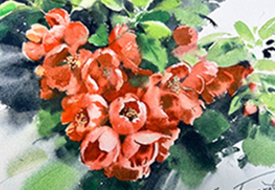
BLOSSOMING QUINCE. PLEIN AIR WITH ELENA BAZANOVA
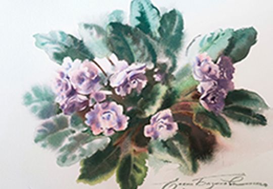
SUMMER SKETCHES. TWO VIOLET SKETCHES WITH ELENA BAZANOVA
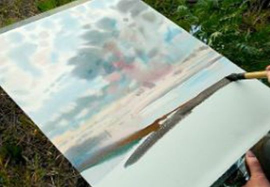
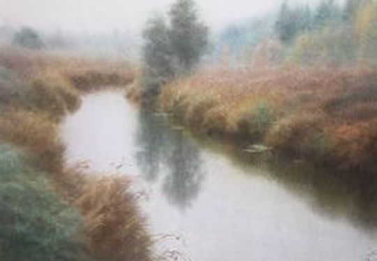
AUTUMN. PLEIN AIR WITH ELENA BAZANOVAgfjfjgsfhdfdfaadfdgsg
CITY LANDSCAPE. PLEIN AIR WITH ELENA BAZANOVA. FDGADFHDF
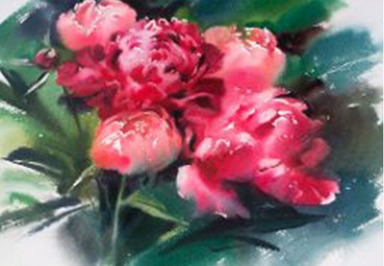
Peonies. PLEIN AIR WITH ELENA BAZANOVA DGAFADHFHAFDHAHFADF
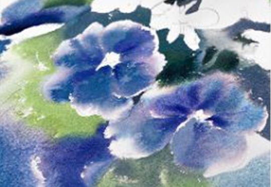
PANSIES. PLEIN AIR WITH ELENA BAZANOVA sSFDSKJLJLKJKGJKL
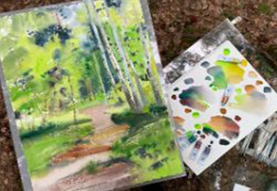
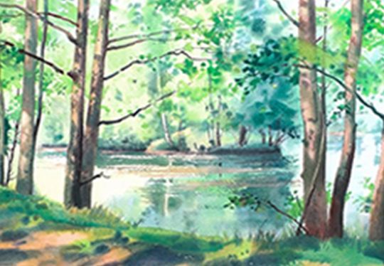
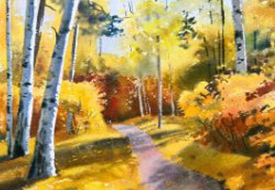
FOREST. PLEIN AIR WITH ELENA BAZANOVA
SOFTNESS OF WATERCOLOUR PAINTING BY EUGENE DUBITSKY
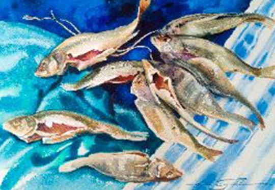
BLUE PALETTE: STILL LIFE WITH DRIED FISH ;';lk;k;'k
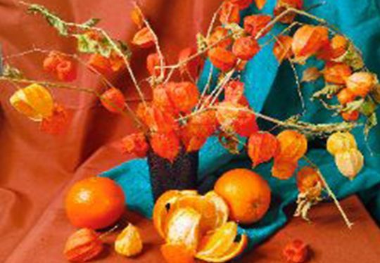
CONTRAST OF HEAT-COLDNESS: STILL LIFE WITH PHYSALIS
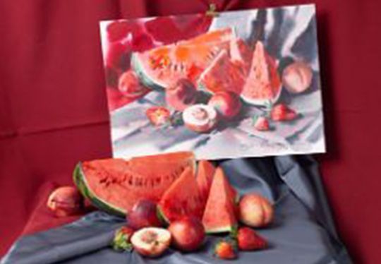
CONTRAST OF BRIGHTNESS: STILL LIFE WITH WATERMELON

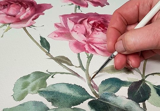
BOUQUET WITH ROSES BYELENA BAZANOVA
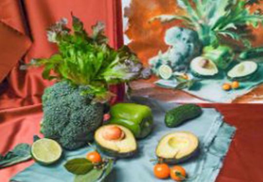
STILL LIFE IN GREEN & RED - BROWN BY ELENA BAZANOVA
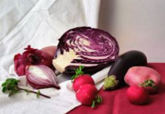
PINK-PURPLE STILL LIFE BY ELENA BAZANOVA
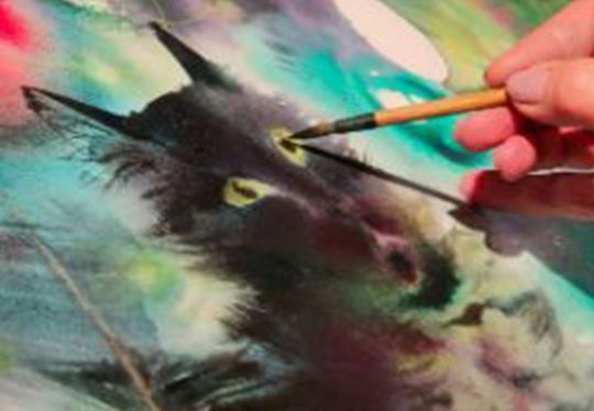
NEW YEAR'S CAT 2023. GRACE AND MYSTERY
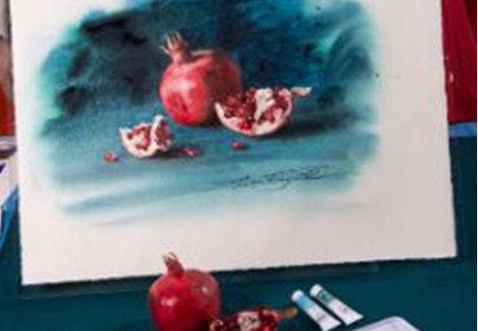
POMEGRANATE. UNDERSTANDABLE SHAPE AND COMPLEX COLOUR
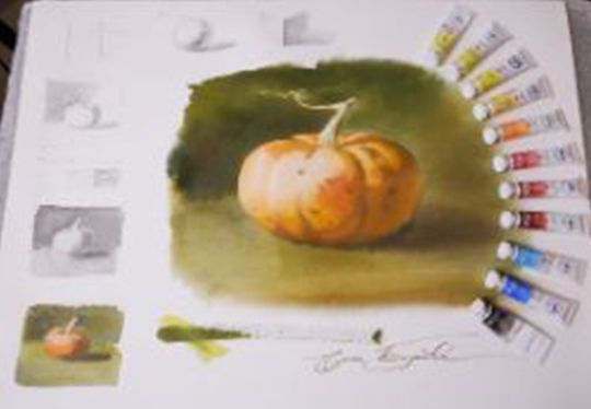
PUMPKIN. THE ILLUSION OF VOLUME IN WATERCOLOUR PAINTING