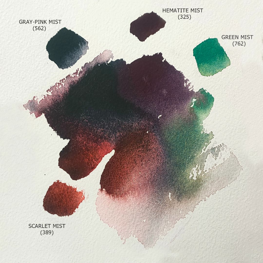
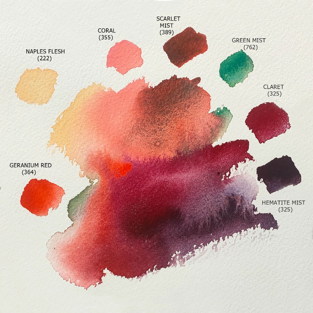
1. 222. Naples flesh (P.O.62, P.W.6 *** ■△), 2. 355. Coral (P.R.242 P.W.6 *** ■◮), 3. 364. Geranium Red (P.R.242 *** ◨▲), 4. 323. Ruby (P.R.170 *** □▲), 5. 313. Madder Lake Red Light (P.R.187 *** □◮), 6. 325. Claret (P.R.179 P.V.55 *** □▲), 7. 389. Scarlet mist (P.G.19, P.R.188 *** □◮G), 8. 632. Hematite Mist (P.B.29, P.R.101 *** ◨△ G), 9. 562. Grey-pink Mist (P.B.29, P.G.7, P.R.187 *** ◨◮ G), 10. 762. Green Mist (P.B.28, P.Y.3 *** ◨▲G).

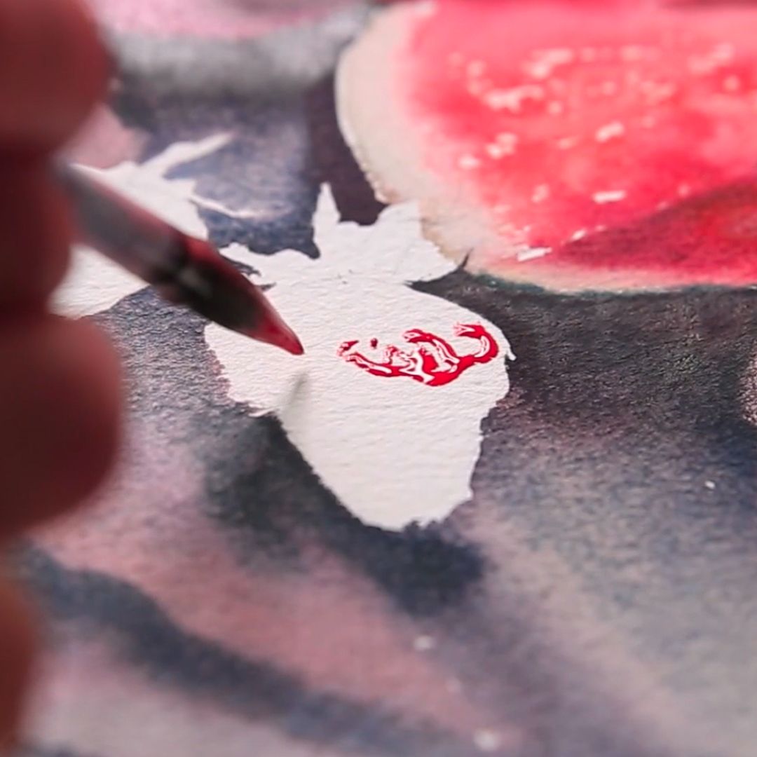
I take a sheet of watercolour paper, cotton, large grain, 300 gr/m2, I draw with light lines. I moisturize the sheet well on the back, turn it over, place the sheet on the pad and moisturize it well at the edges, so that the paper completely aligns and sticks to the pad. It is important that the surface of the sheet becomes even and fully contacts the surface of the pad. In a slightly smaller amount, I moisturize the background along the boundaries of objects. The sheet is well-watered, allowing the pigments to move freely across the sheet, revealing colour and properties. Thus, the background will turn out to be rich and interesting in texture, while the paint will stop at the border of the object, without fraying on the object itself. Background and objects will differ in technique (background - on wet paper, objects - on dry), which will allow you to "tear" objects from the background, make them more detailed. Also, it will diversify painting with various textures, make it more saturated and interesting.
Background


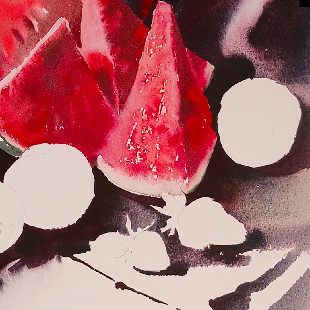
We start with a dark red background, take a lot of Claret on my brush and do bold strokes. I need to set a deep and rich burgundy colour, so I don't feel sorry for the paint. I also want the paint to spread freely across the wet sheet, forming an arbitrary fill, and for this there should be a lot of it. Claret has a rich wine colour with a slightly noticeable cold purple undertone, it is good for displaying the penumbra of our background, and with the addition of Madder Lake Red Light, the colour becomes warmer. For shadows, I use Hematite Mist - a paint from the granulation series, which has a deep complex colour with a noticeable effect of granulation of blue pigment Ultramarine Blue (P.B.29) and pink tint Synthetic Iron Oxide Red (P.R.101). They both granulate, but still have different speeds in water, so the effect is pigment delamination is very dynamic and beautiful.
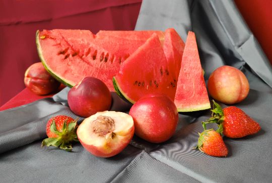
Watermelon

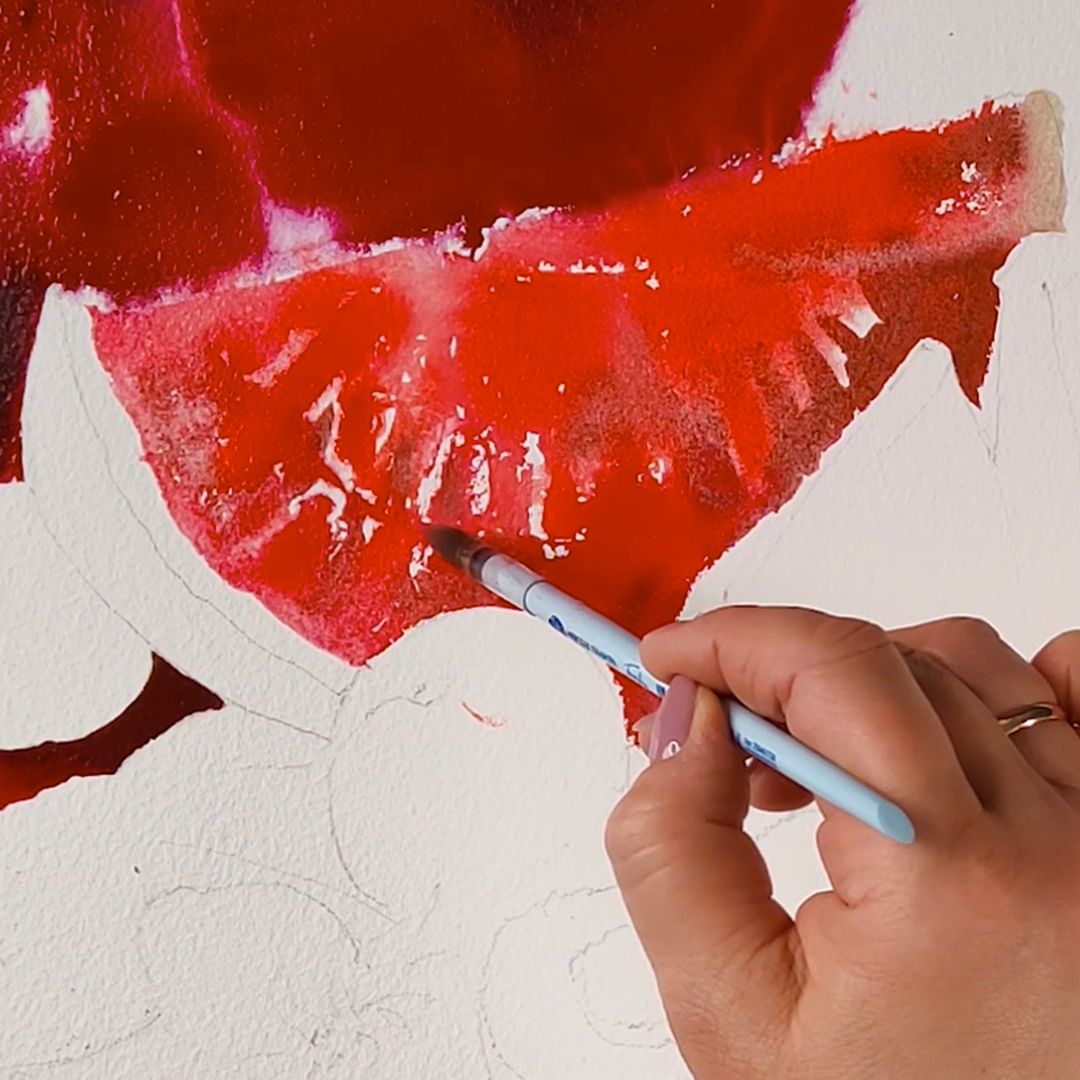
Large watermelon wedge. The pulp of watermelon has a delicate but also very rich red colour with light and dark, cold and warm shades. The main colour of the flesh is Geranium Red. I chose it for its soft and clean warm colour, red and orange with a cold pinkish undertone. Working on a watermelon, I often apply paint sideways with a dry brush, thereby forming the texture of a juicy pulp. The brush slips in some places, leaving white pieces of paper. This creates a velvet grainy surface of watermelon pulp. To convey freshness, as well as emphasizing the play of light on a juicy slice, I add Ruby to Geranium Red. This paint has a bright ringing cold ruby red colour. Adding it, the colour becomes a little darker, colder and even more saturated. Ruby consists of Naphthol Red AS pigment, has good light resistance and colour purity.
In the upper thin part of the watermelon wedge, to get a characteristic pink hue on the slice, I add to the mixture of reds on the Naples flesh palette, which consists of two pigments: Benzimidazolone Orange (P.O.62) and Titanium White (P.W.6). The paint has a pastel, soft and warm yellow-orange hue. Due to the content of whitewash in the composition, when applied to wet paper, it displaces neighboring colours well, which I will use: the pink tint will actively intervene directly at work in the previously applied colours, creating the feeling of light veins in the pulp of the watermelon. For shadow fragments, I take Scarlet mist - a new colour from a collection of granulating paints that consists of two pigments: Cobalt Green Pale (P.G.19) and Naphthol Scarlet Lake (P.R.188). Scarlet mist reveals its colour on the wet surface of the leaf: cold, almost colour-neutral, greenish granulating cobalt particles surrounded by warm scarlet overflows. Using Scarlet mist, I get light and transparent shadows, and cobalt particles further accentuate the grain texture of ripe watermelon. At the bottom, where the flesh ends in a light green, almost white stripe, I take a light blend of Naples flesh + Green Mist paints and apply light touches to the sheet.
Small watermelon wedges. Small watermelon wedges are in the shade, except for one of their edges, which is turned to the light. The main paint mix is Madder Lake Red Light + Ruby + Scarlet mist. I use this mixture, periodically changing the amount of paint in it, since the colour and tone of the pulp of the watermelon is heterogeneous. In dark places I add more Madder Lake Red Light and Scarlet mist, and in light places I reduce their component in the mixture by adding Ruby. For a lighted surface, I use Geranium Red, applying side-brush paint in sliding motions to create a flesh texture. A little later, when the paint dries a little, I will finalize the wedges with a clean wet brush, carefully distributing the paint already available. At this stage, this cannot be done, since the paint will immediately begin to spread, and I will not be able to control it.
3. Grey drapery.
When we solved on the shades and tones, the main volume of red, I go to graphite-grey drapery. It plays the role of a moderately contrasting colour accent in the red colour palette. The combination of red and grey is based on the contrast of brightness. Red is rich and bright, shimmering with juiciness in the spotlight. Grey is strict and calm, fading into the background, and thereby even more revealing and enhancing the effect of the red palette. Our task is to create a similar visual sensation in our still life.
I take Grey-pink Mist and I make shadows first, adding in the darkest parts of Hematite Mist, which will delicately enhance the reddish hue and make the shade warmer. After working the shadow, I distribute the paint with the help of a brush and water and set the direction for the movement of the paint, allowing it to flow and form halftones on its own. In the foreground, I add a little Green Mist to Grey-pink Mist in order to further enhance the contrast of the red palette with a greenish shade of grey, and to tie the whole colour scheme together, I use a light mix of Grey-pink Mist + Ruby, getting light pink-grey reflexes.
Nectarines
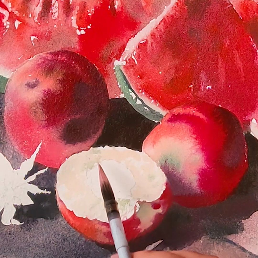
Nectarines have a matte skin devoid of glare. Unlike peaches, there are no villi on them, the surface is smooth. The colour is from rich dark wine and burgundy to gently pink and green. There are 4 whole nectarines and one half in our still life. Two of them are in the background, so I will not focus on them and solve them figuratively, without much contrast, in the way that they should not distract attention from the foreground, but should be perceived as part of the background.
I make the left nectarin in the background a little lighter than the background, thereby preventing it from merging with it and using a wet brush I wash out a few highlights. For this nectarine, I use a mixture of Claret + Geranium Red colours, for shadow - Hematite Mist.
The right nectarine in the background is turned towards us with a yellowish pink side, and for him I will take a mixture of Naples flesh + Coral, and for shadows I use Scarlet mist. At the end I will put a green speck adding Green Mist.
Central composition. A composition in the foreground, consisting of two whole nectarines and one half, I will work more contrastically because it is the foreground of a still life. I use all the same paints I took for the first two nectarines: Naples flesh + Coral, Claret + Geranium Red, for shade - Hematite Mist and green specks - Green Mist, but in greater numbers, making bold strokes, allowing the colours to flow into each other, forming the texture of the skin nectarines and creating volume. For a light slice of nectarine, I use Naples flesh with the addition of a Green Mist bone near it. Bone - Scarlet mist with small points of Hematite Mist in the shadow part.
Strawberry
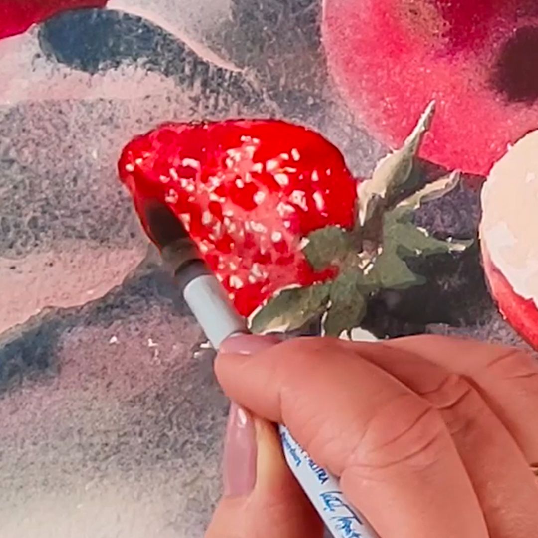
For strawberries, I take the main colour - Ruby, periodically adding Geranium Red to it, playing warm-cold in shades of red. Applying paint to a sheet, I set the texture of berries with a brush: with light movements, forming a glossy surface (leaving white paper) with small grains recessed into it. For shade, I add Madder Lake Red Light, and at the top, near the green ponytail, I add Naples flesh. The right berries are colder in colour, so the Ruby proportion is greater in them. Strawberries lying to the left of nectarine are warmer in colour, so I take more Geranium Red. I make green ponytails with a mixture of Naples flesh + Green Mist, adding some Madder Lake Red Light to the shadows.