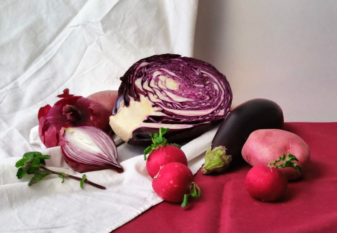
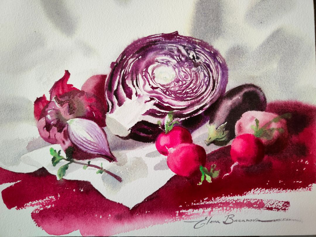
PINK-PURPLE STILL LIFE WITH ELENA BAZANOVA
Before starting work, I generously wet the paper on both sides, place it on a pad. I remove excess moisture from the front side with a paper napkin. I will start with the background and if you let the water stay on the surface of the paper in place of the painted objects, then the paint from the background will flow behind their contours, which, in this case, we do not need.
Background and white drapery
Cabbage
A cabbage head cut in two is an intricate pattern: cabbage leaves, which have a dark, rich purple colour on the outside and a light yellowish-grey colour on the inside, form an interesting dynamics of curved lines on the slice. These lines vary in thickness, shades of the main purple colour and shape. I will start with the light fragments of the slice, using for this a mixture of colours that I have already taken for the background: Ultramarine Violet + Yellowish green mist.
For the dark parts of the leaves, I will take a mixture consisting of Violet Shadows, Quinacridone violet, Ultramarine Violet, depending on the desired shade, slightly changing the proportions of the colours in the mixture.
Violet Shadows is a paint developed for a new granulating collection of colours, consisting of two pigments P.V.23, P.Bk.11 and having a powerful colour force due to the presence of Dioxazine Violet (P.V.23) and a tone enhanced by Mars black (P.Bk.11), so it needs quite a bit. The Mars black pigment included in this paint will give the necessary depth for the shadow fragments of leaves located closer to the centre of the head, as well as for small accents on the edges of the cabbage. To write the bulk of the dark pattern of cabbage leaves, I use Quinacridone violet, and add Ultramarine Violet to the light, which is colder than Quinacridone violet and gives the purple colour a purple hue.
Forming the volume of the cabbage head under the cut, to get a warm shade of my own, I will add a little Venice purple. Venice purple is one of my favorite colours, I use it in almost every work. Made on the pigment Perylene Maroon (P.R.179), Venice purple has a dark red colour with a cold undertone. The colour has a wonderful noble shade, rich and deep. This translucent paint is almost completely washed off with water, leaving a light trace on the paper. It works perfectly in mixtures with almost all colours.
At the ends, the leaves turn a reddish hue, and I add Grey-violet granite to the mixture. This is a new monopigment colour of granulating paints, which contains natural earth with the name of the pigment Brown Iron Oxide (P.Br7). Transparent, delicate, muted, cold gray-purple colour with a red-brown tint, has a pronounced granulation effect. Due to the unique properties of the colour, it looks harmoniously in any colour palette, because its colour can be called neutral.
To convey the depth of the bundle, as well as the shadow fragments of the leaves, I use Green mist. This is a new colour of the granulating series, developed on the basis of Cobalt Blue (P.B.28) and Hansa Yellow (P.Y.3) pigments. It is darker in tone and colder in colour than Yellowish green mist. The granulation effect is provided by the presence of Cobalt Blue. The amount of Hansa Yellow in the paint is less than that of Yellowish green mist, so the cold yellow undertone is only slightly noticeable. I will transfer the darkest accents in the salad when the paper dries a little with a mixture of Green Shadows + Chomim-cobalt mist colours, and the lightest ones with a light May green solution.
Eggplant
Colours: 627. Perylene Violet (P.V.29 *** □ ◮), 832. Grey-Pink Mist (P.B.29, P.G.17, P.R.187 *** ◨ ◮G), 763. Yellowish green mist (P.B.35, P.Y.3 *** ◨ ◮G).
Picking up the colours for the eggplant colour, I settled on a mixture of Perylene Violet + Grey is Pink Mist, and the resulting colour itself can be called eggplant. Perylene Violet is transparent, made on the basis of the pigment Perylene Violet (P.V.29), has a great power of colour and tone, moves easily and actively in water. In mixtures, it gives pure complex colours, and the addition of Grey-Pink Mist gives a noble cold muted shade. For the remaining green tail, I use Yellowish green mist, adding eggplant colour in the shadows.
Grey-Pink Mist is part of the collection of granulating colours, developed on the basis of pigments Ultramarine Blue (P.B.29), Chrome Oxide Green (P.G.17) and Permanent Pink FL (P.R.187). It has a soft cold saturated grey colour with a light pink undertone and a strong granulation effect, due to the particles of the pigment Ultramarine Blue.
Onion
I chose red onions for the still life, different in shape and size, one of which is cut in half and the cut, as well as the cut of cabbage, has a characteristic pattern. Another onion is interesting for its exfoliated peel, through which light passes. Let's start with it.
For the peel, I took Quinacridone violet rose, which is characterized by a cool, pure red-pink colour and is perfect for glowing onion peels in the light.
Quinacridone violet rose is developed on the basis of Quinacridone Violet pigment (P.V.19), has a strong saturated cold berry colour and gives good stretch tones, resistant to flushing.
At the edges of the peel, I add Grey-Pink Mist paint to Quinacridone violet rose, as a result we get a cold purple shade.
For the onion itself, I take Quinacridone lilac and mix it with Grey-Pink Mist, getting an even more purple and cool colour. I use the same colour for the side of the second onion.
Quinacridone lilac is also developed on the basis of Quinacridone Violet pigment (P.V.19), but the pigment has a different shade: a rich beetroot colour with a cold undertone. Just like all quinacridones, Quinacridone lilac has great colour power and tone depth, is transparent and resistant to flushing. Around the tail of the onion, I add Yellowish green mist paint to the main colour of the onion, getting a soft gray-green color.
Radish
A mixture of Quinacridone Red + Neon Pink fully corresponds to the main colour of radish. In the light, I add more water to this colour, getting a weaker solution, and for shadows I use a mixture of Quinacridone violet + Venice purple colours.
Neon Pink (368) was created using two pigments: P. R. 122 (Quinacridone Magenta) and a fluorescent pigment that provides a special glow to the saturated colour of magenta. Neon pink gives pure shades in mixtures with almost all colours of the palette. It is often used in illustrations to obtain bright shades of pink, so that when scanning and reproducing in printing, the pink colour turns out.
Quinacridone Red is also developed on the basis of Quinacridone Violet pigment (P.V.19), but has a different shade: soft, juicy, bright and crimson colour. In mixtures with other paints, it gives beautiful noble shades, which, with purity and brightness of tone, have some pastel softness.
In the light, I add more water to this colour, getting a weaker solution, and for shadows I use a mixture of Quinacridone violet + Venice purple colours.
Potato
Potatoes are placed in the background between radish and eggplant, so it is not necessary to detail it too much. I will designate the colour and volume using a mixture of colours Venice purple + Ultramarine Violet. In the shadow part and recesses of the potato shape, I add more Venice purple to the mixture and work with less water, and in the light, I work with a clean wet brush with light movements distributing the light tone of the mixture.
A sprig of mint and green tails of radishes
For the green colour of the radish tails and mint sprigs, I take Yellowish green mist, adding a little Violet Mist in the shadow part. I set the reflex from the red drapery by adding Venice purple.
Violet Mist has a pronounced granulation effect, is part of the collection of granulating colours. Like the Grey-Pink Mist (832) paint, it consists of a mixture of Ultramarine Blue (P.B.29), Chrome Oxide Green (P.G.17) and Permanent Pink FL (P.R.187) pigments, but in a different proportion, therefore, unlike the cold grey shade of Grey-Pink Mist, it has a soft and a complex dark purple colour with a light pink undertone. The granulation effect is also manifested by the particles of the pigment Ultramarine Blue.
The cut of the second onion
Colours: 621. Quinacridone violet (P.V.55 *** □▲), Ultramarine Violet (P.V.15 *** ◨ △G), 763. Yellowish green mist (P.B.35, P.Y.3 *** ◨ ◮G).
Starting to work on the cut of the second onion, I take a mixture of Quinacridone violet + Ultramarine Violet flowers. I have already used this mixture for dark fragments of leaves on a cabbage cut, but on an onion cut I add more water to it, achieving a lighter and softer shade. Closer to the tail of the onion, I enhance the colour by reducing the amount of water. For the core of the onion, I use a light Yellowish green mist solution.
Red and pink drapery
For the red-pink drapery in the main colour, I will take a mixture of Quinacridone Red + Grey-Pink Mist paints. In the shadow part, I will add Perylene Violet to the mixture. To enhance the foreground, in the light, I use a bright colour of Quinacridone Rose paint, developed on Quinacridone Magenta pigment (P.R.122). This colour has a rich pink cold shade. This is the most sonorous and coldest red. The colour is close to spectral red, gives pure mixtures with almost all colours of the palette.