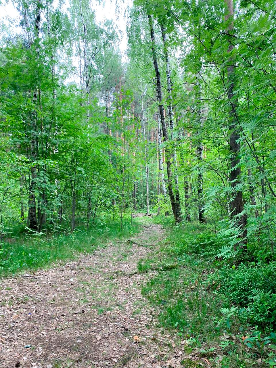
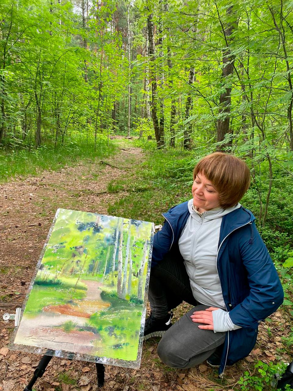
Forest landscape. Plein air with Elena Bazanova
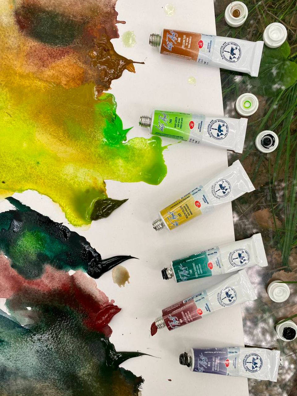
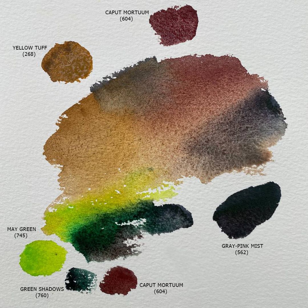
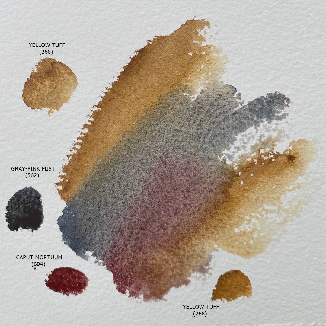
I picked 6 colours in the set, 3 of which are able to reflect all the varieties of green shades of crowns of various trees, both coniferous and deciduous, as well as grass and other low plants, these are May Green, Irgazin Yellow (or you can use Olive green, which also fits this set wonderfully, but today I will use Irgazin Yellow) and Green Shadows. I will use May Green for bright greens as it has a sonorous bright green colour of young foliage, and the addition to it, Irgazin Yellow, gives a golden hue to the leaves, through which bright warm sunlight flows. I take to the Green Shadows palette for dark green accents of green in the shade and crown of conifers, because its rich cold green colour is well suited for dark paws of spruce or crown of pines or shadows in dense grass, and the Mars black pigment included in the paint creates a picturesque granulation effect, giving depth and simplifying work with details.
I take two brown colours to the palette for tree trunks and land - Yellow Tuff, Caput Mortuum. Yellow Tuff has a rich ocher colour and granulation effect due to transparent dark particles of natural carbon, which is part of the rock of the same name brought from Armenia, from which pigment for this colour is extracted. In the second brown colour, I take Caput Mortuum, which has a deep chocolate colour with a cold reddish tone, and after drying, the colour acquires pastel softness of tone. Mixed with cold Gray-pink Mist, I get a deep dark brown, and mixed with Yellow Tuff, I'll get many different brown shades. Also, the beautiful deep brown colour of the Caput Mortuum works well in mixtures with green colours giving pure complex shades.
path and greenery under the trees
path
The last I will take to the palette is a cold gray-blue colour with a slightly noticeable pinkish undertone Gray-pink Mist to depict the sky in the foliage gaps, give tonal depth to an array of greens and work with shadows. The slightly noticeable pinkish undertone of Gray-pink Mist is consonant with the shade of Caput Mortuum and this consonance unites the palette of the entire landscape, creating a single colour harmony.

Greenery in the depths

Birch trunks

Greenery of trees
I do not take a single pure blue colour into the palette, because I will paint a forest, not a view of it from afar, but being inside it, there will be no open sky in my field of view, but only very small pieces, quite a little visible at the very top of my view through the foliage.
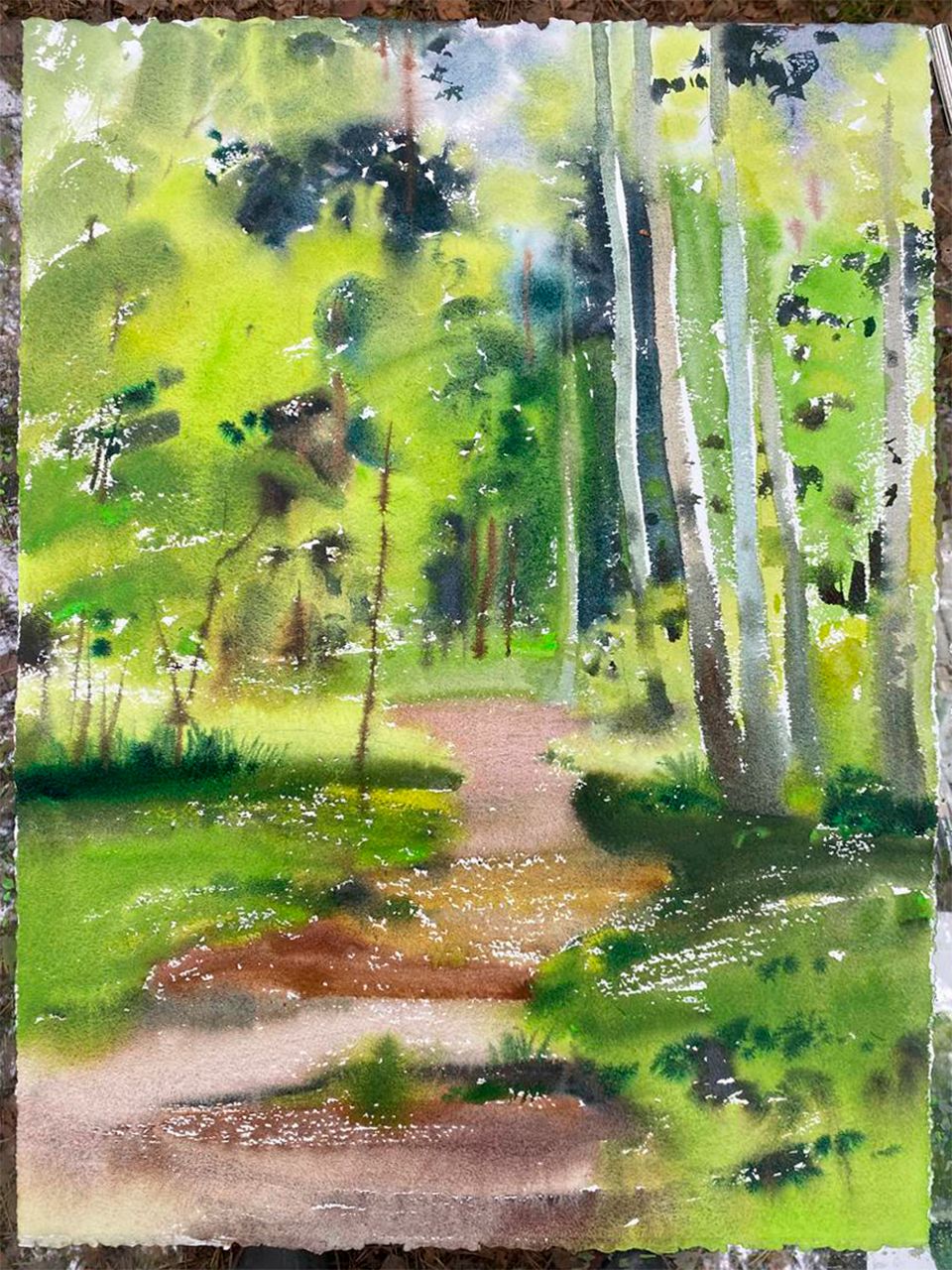
Placed on a forest path, I make a light pencil drawing of 300 grams of cotton on paper. Finished with the drawing, I moisturise the sheet well on the back, and place it on a plastic pad, carefully removing the air and water remaining between the pad and paper, the sheet should fit tightly to the pad. The front surface of the sheet remains dry. During work, I will moisten small pieces of paper locally with a brush, where it will be necessary, but I will not do it first over the entire surface. The dry surface of the sheet makes it possible to maintain contrasting touches: the paint does not move as dynamically and spreads on the dry surface of the sheet as it does on the wet, maintaining the strength of colour and tone at the point of touching the brush with the paper.
I start with the background, with a dark thicket visible in the distance, for this I take Gray-pink Mist. By applying paint to a sheet, I try to repeat the pattern of dark fragments in an array of greenery, I work somewhere with the very tip and light touches, and somewhere with the entire surface of the brush with strong pressure. In some places, I add more water, wanting to get the effects of spreading colour: Gray-pink Mist is a paint of a granulating series, and has a strong granulation effect due to Ultramarine Blue, which is part of it, and the granulation effect is best manifested when using a large amount of water. Next, I add some May Green and Green Shadows to Gray-pink Mist and get the colour of tree crowns in penumbers. Finished with shadows and penumbers in the background, I move on to a mass of lighted greenery. For bright leaf spots and grass in the light, I use May Green sometimes adding Irgazin Yellow to produce a golden leaf sheen. In penumbra, I add Yellow Tuff, Gray-pink Mist or a little bit of Green Shadows to convey the gliding shadows of leaf movement in the wind. Falling shadows under tree trunks, I take darker and denser in tone, adding more Gray-pink Mist and Green Shadows.


For the forest path, I use Yellow Tuff, Caput Mortuum and Gray-pink Mist. I also start with shadows and penumbers. I take Yellow Tuff and apply quite a lot of paint to the sheet with a confident swab, I need a wide rich swab. Next, just below, I do the same with the Caput Mortuum + Yellow Tuff mix. Even lower, I apply the pure colour of Caput Mortuum and the last smear - Gray-pink Mist. Next, I combine these strokes with a very light paint solution, in some places just clean water, allowing the colour to spread a little.
After the path, I move to the trunks of birches in the foreground. I hadn't done it before because the surface of the paper wasn't dry enough and the paint could have melted. White trunks reflect the main shades of the surrounding forest while remaining very light, also have characteristic horizontal dark stripes. So, for them, I take May Green, Yellow Tuff and Gray-pink Mist with lots of water. A mixture of these colours gives a wide range of different pure muted shades.
Last of all, when the surface of the paper is dry enough, I go to the details. With Caput Mortuum + Gray-pink Mist, I paint trunks and branches of the rest of the trees, and strips on birches, and Green Shadows make individual bumps of grass in the foreground.