Bouquet with roses WITH ELENA BAZANOVA


Central rosebuds


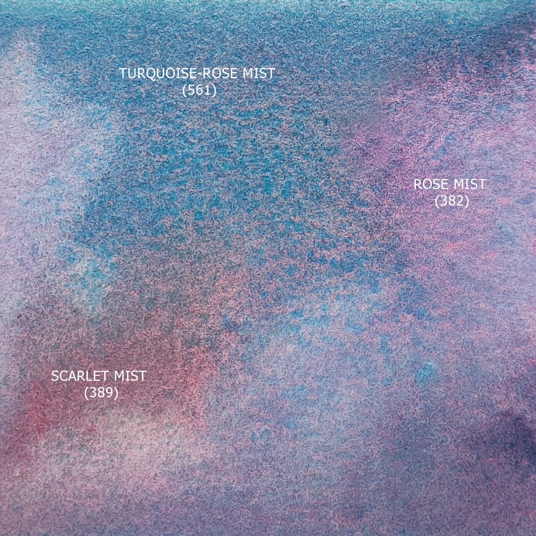
In Rose mist, I add Scarlet mist, getting a reddish pink with a subtle cool green undertone, which comes from the Cobalt Green Pale contained in the paint. At this stage, I create the composition with spots, denoting the "main characters" of my work. When working with paints of the granulating series, it seems that the watercolour paints itself. This is true, but it is important to give it the opportunity to express itself, allowing the paint to open up, moving freely in a layer of water on paper.
The series is presented in many shades. There are colours based on black pigments, ultramarines, cobalts, chromium oxide and earths. As I work, I mix them freely and they don't get dirt. What's the secret? It's all about composition. The pigment composition of this series is arranged in such a way that the final colour of the mixture is not uniform, as it usually happens, but breaks up into the main shade and sub-hue, and the size of this scattering of colours is controlled by the amount of water: the more water, the greater the effect. By mixing several paints of the granulating series that are related in colour, I get a harmonious gradation of shades, with the help of which volume and space, light and air perspective, nuances of warm and cold shades of colour are conveyed.
Paints based on medium tone granulating pigments such as cobalts, ultramarines, earths or chromium oxide mix well with each other, giving complex shades with soft granulation. Mixtures of paints based on black pigments also work harmoniously with each other: Lamp black or Mars Black. The effect of granulation in them is tougher and more contrasting. In practice, I noticed that the most harmonious palettes are obtained by combining several colours with soft granulation and one colour (less often 2, for contrasting productions or plots) with black pigment. Or, if the setting or plot is initially dark, then vice versa - several colours with black pigment and 1-2 paints with the effect of soft granulation.
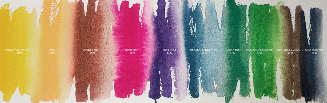
In the composition of the palette of this sketch, I included 7 paints of the granulating series (6 of them give the effect of soft granulation and only the 7th contains carbon black, which I will use for dark shadow fragments, giving depth to the bouquet).


After drawing the main buds, I move on to the background, namely the greenery. Now you need to let the paint on the buds dry, and you also need to open the sheet and set the colour scheme for the whole work.
Background of leaves
For green leaves I’ll take 763. Yellowish green mist (P.B.35, P.Y.3 *** ◨ ◮G), 762. Green mist (P.B.28, P.Y.3 *** ◨ △G), 634. Grey-violet granite (P.Br.7 ***□△G), 562. Grey-Blue Mist (P.B.29, P.B.29, P.Bk.7 *** ◨◮G).
Yellowish green mist is a fantastic paint, consisting of Cerulean Blue (P.B.35) and Hansa Yellow 10G (P.Y.3), it moves amazingly, gives pure colour and mixes well with other paints. Its soft yellow-green colour is ideal for the light parts of the leaves. For the midtones, I'll use Green mist, which is darker and cooler in colour. It contains Cobalt Blue and the same yellow pigment, but in a smaller amount, so the colour of the paint is colder. A mixture of Green mist + Grey-violet granite will give a more neutral grey-pink shade, gently shaping the shadow transition. At the junction of the borders of the outline of the buds and greenery, as well as in the depth of the bouquet in the Green mist, I will add a Gray-Blue Mist to show the deep shadow fragments.
Several branches of gypsophila with small blue inflorescences I paint with general picturesque spots using Turquoise-rose mist paint. As well as Rose mist, it consists of 2 pigments: Cobalt Blue (P.B.28) and Quinacridone Magenta (P.R.122), but the proportion of Cobalt Blue in its composition is greater, so the paint has a soft but rich blue-turquoise colour with a slight pink undertone. Denoting spots of blue inflorescences, I work a lot with water, letting the paint flow freely over the paper, and somewhere I leave untouched fragments of clean paper.


Coral-hued rosebuds
Base mix of Naples yellow light + Neon Pink. By adding Rose mist to it, I get a cold shade, and by adding Scarlet mist, I get a warm one. Particles of Cobalt Green Pale (P.G.19) pigment in Scarlet mist harmoniously combine the colour of rosebuds and the green of the background, giving smooth colour transitions and a soft granulation effect. The same merging effect occurs when using Rose mist: Cobalt Blue in the background of gypsophila twigs and roses.
I apply a pattern of small buds of light roses in the centre of the composition with a light solution of Grey-Blue Mist, adding colours from the palette: Rose mist, Peach, Neon Pink, Scarlet mist. The roses are very light, so I add quite a bit of mixtures from the ones I already have on the palette. And also, I work a lot with a clean, damp brush, directing the colour to the right place.


At the very end of the work, when the paper is dry, I quickly finalize the details: finalize the shape of the leaves and the pattern of rose petals, add depth to the shadows, emphasizing the foreground of the composition.