SOFTNESS OF WATERCOLOUR PAINTING BY EUGENE DUBITSKY


SUNSET ON THE LAKE, WATERCOLOR LANDSCAPE WITH EUGENE DUBITSKY
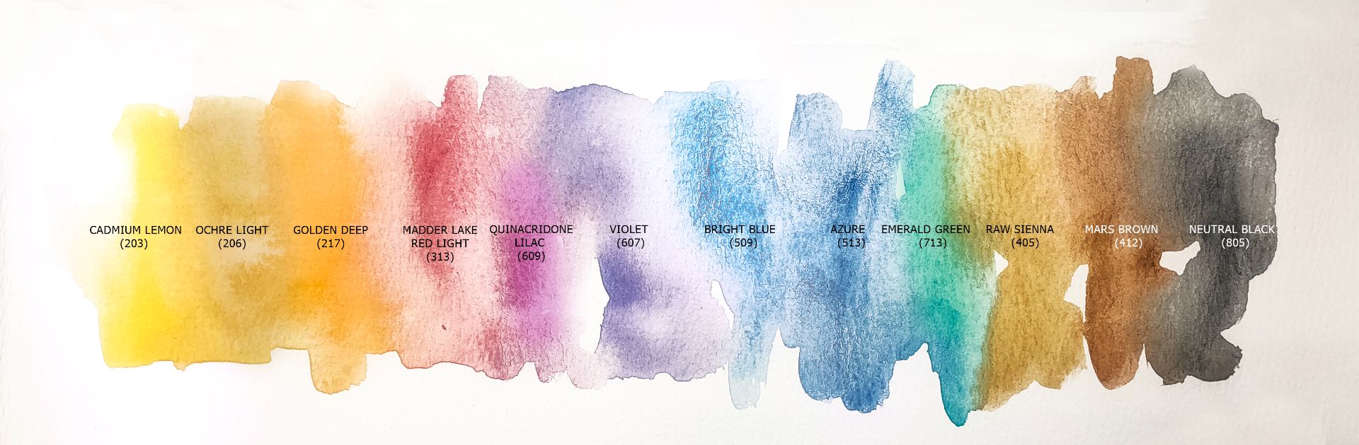
1. 203. Cadmium Lemon (P.Y.35 *** ◨◮), 2. 206. Ochre Light (P.Y.43 *** ◨∆ G), 3. 405. Raw Sienna (P.Br.7 *** ◨∆ G), 4. 217. Golden Deep P.O.62 *** □◮, 5. 313. Madder Lake Red Light (P.R.187 *** □◮), 6. 609. Quinacridone lilac (P.V.19 *** □▲), 7. 607. Violet (P.V.3 * □▲), 8. 509. Bright Blue (P.B.15:3 *** □▲), 9. 513. Azure (P.B.15 *** □▲), 10. 713. Emerald Green (P.G.7 *** □▲), 11. 412. Mars brown (P.Br.6tr. *** □∆ G), 12. 805. Neutral black (P.R.187 P.B.15:1 P.Bk.7 *** ◨▲).
Now I use paper - a mix of pulp and cotton 50% with a medium texture. For quick sketches, it fits well. For longer work, I use 100% cotton. On the eve of our master class, I prepared a pad with watercolour paper stretched on it: placing the paper on a wooden pad, I thoroughly wet it and glued a still wet sheet to the pad around the perimeter, carefully spreading it. When the paper dried, the surface of the sheet became completely flat. Now many people use plastic pads, and they are wonderful, but I prefer to use wooden ones, as we were taught at the academy, I am used to this and I find it comfortable.
After all the manipulations with the pad, I also prepared a preliminary drawing with a pencil on dried on the pad paper. And now, together with you, I am starting painting.
At first, I will make the pencil drawing lighter with a soft rubber. Then I will make a light colour filling on wet paper, having previously moistened the surface of the sheet. To fill the sky, I use colours: Cadmium Lemon, Violet, Neutral black, Ochre Leigh. This landscape is painted during sunset, when the sun has almost set, and its rays gently reflect and scatter in space, painting the sky in light yellow. Therefore, the main colour of the sky is Cadmium Lemon, diluted with water, with the addition of other colours to it in different proportions to indicate clouds. Clouds are below scattered sunlight, so the tone is darker than the sky. I also fill the far shore of the lake with the light colour Ochre Leigh, because the rays of the setting sun illuminate it, tinting it yellowish.


To depict the water of a small lake, I take Bright Blue, Azure and Violet colours and do the filling. The main colour is Azure, I add a little other colours to it during the work. I pour the near shore of the lake with the same colours, because the rays of the sun almost do not reach it, and it is already immersed in dusk. The whole sheet is now covered with a light colourful layer, and while the paper is still wet, I will add colours to it and go through all the work again, adjusting and specifying a little. I make the disc of the setting sun richer with Cadmium Lemon paint and I add Madder Lake Red Light and Quinacridone lilac strokes around the perimeter. Also, on the surface of the water near the far bank, I indicate yellow and red highlights from the sun using the same colours and Golden Deep. For the greenery growing on the shores of the lake, I pick up a mixture of Cadmium Lemon + Emerald Green and fill both shores. I add a little Ochre Light or Bright Blue for light and shadows. With a mixture of Neutral black + Violet + Bright Blue colours in different proportions, I strengthen the sky in colour and tone. With the same mixture of colours, I denote the dark reflections of plants on the surface of water. Next, I need to dry the sheet to get to the final stage.


After the surface of the paper has dried and the paint has stopped spreading, I turn to the details. The pencil drawing makes it easier for me to detail, because the main part of the details, such as twigs and leaves of trees, blades of grass and stones, I have already drawn with a pencil and are clearly visible under a light layer of paint.
With a mixture of Violet + Mars brown paints, I amplify the far dark strip of the forest, in some places adding Raw Sienna pure colour, as the rays of the sun still touch the tops of the trees. With the same mixture, I refine the greenery along the shores of the lake, giving depth and specifying shadows.