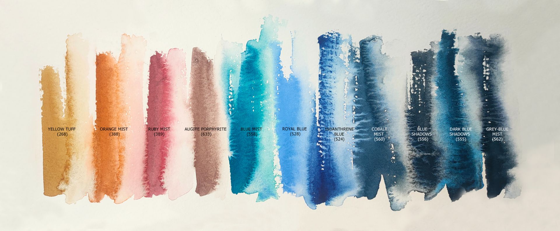
1. 268. Yellow Tuff (P.Bk.8, P.Y.43 ***□△ G), 2. 388. Orange Mist (P.Bk.8, P.O.64 *** □◮), 3. 389. Ruby mist (P.G.19, P.R.170 *** □▲G), 5. 633. Augite porphyrite (P.R.102 ***□△ G), 4. 558. Blue mist (P.B.29, P.G.7 *** ◨▲G), 5. 528. Royal blue (P.B.29, P.W.6 *** ■◮), 6. 524. Indanthrene blue (P.B.60 *** □◮), 7. 560. Cobalt mist (P.B.28, P.Bk.7 *** ◨△G), 8. 556. Blue shadows (P.B.29, P.Bk.11 *** ◨△G), 9. 555. Dark blue shadows (P.B.15:6, P.Bk.11 *** ◨△G), 10. 562. Grey-Blue Mist (P.B.29, P.Bk.7 *** ◨◮G).
I have long wanted to talk about the colours of the blue spectrum. To maximise the sound of blue, I will complement the cold palette of blue with muted warm yellow-orange-reddish shades that will contrast with the blue shades.
Blue drapery
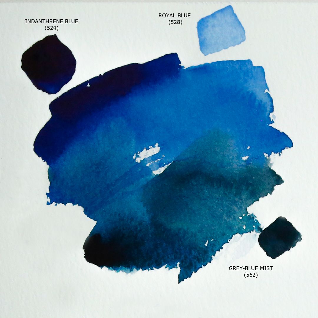
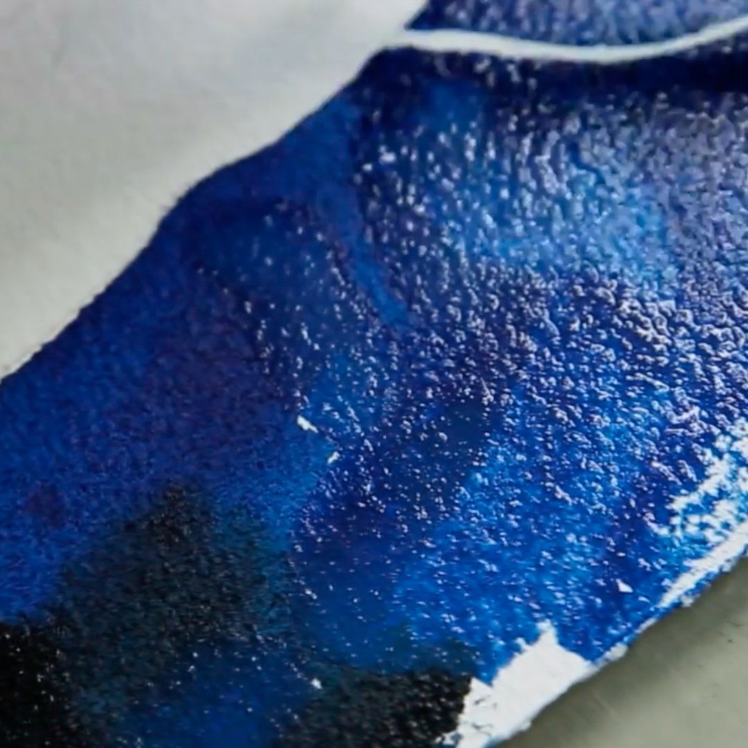
Let's start with dark blue drapery. The main colour is Indanthrene blue - a deep, saturated blue colour with a reddish tint, which has a great strength of tone, created on the basis of Indanthrone Blue pigment with excellent light resistance. For illuminated areas, I add Royal blue, a colour based on a mixture of Ultramarine Blue and Titanium White pigments, which has pastel softness due to whitewash in the composition that we need to convey the matte shine of the fabric in the light. For deep shadows, I use Grey-Blue Mist, a paint from the granulation series consisting of two pigments: Ultramarine Blue (P.B.29) and Lamp black (P.Bk.7) and having a pronounced granulation effect due to Ultramarine Blue and depth of tone due to Lamp black.
Turquoise-blue drapery

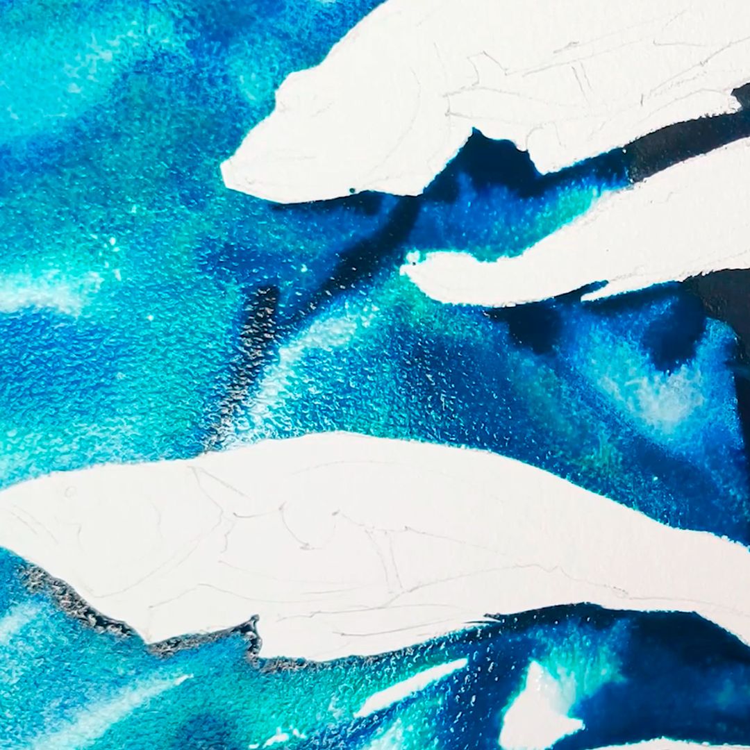
The second drapery in the arrangement is synthetic smooth fabric with laid soft folds of rich turquoise colour in the light and with dark blue in the shadows. Light plays with bright glare on the upper parts of the folds, and dark blue shadows form an interesting rhythm of the folds. I will write this drape on wet paper in order to convey the game of light and shadows on the surface of the fabric as accurately as possible. With a clean brush, I moisturise the paper in place of the fabric, carefully bypassing the contours of the fish so that the water does not flow behind it. The main colour of the drape is Blue mist - a paint from a granulating series, created from a mixture of two pigments: Ultramarine Blue (P.B.29) and Phthalocyanine Green BS (P.G.7). Light and fast pigment particles P.G.7 give the desired turquoise tint in a thin layer of water and paint, when as larger, granulating particles P.B.29 form a saturated blue the colour of ultramarine in shadows. So, by controlling the volume of paint and water on brushes and paper, using one paint, I achieve the necessary colour and texture of drapery.
I use a Royal blue + Blue mist mix to generally fill lighted areas. Titanium White, part of Royal blue, will soften the colour transition and give softness to drapery. And I will strengthen the depth of shadows using Grey-Blue Mist.
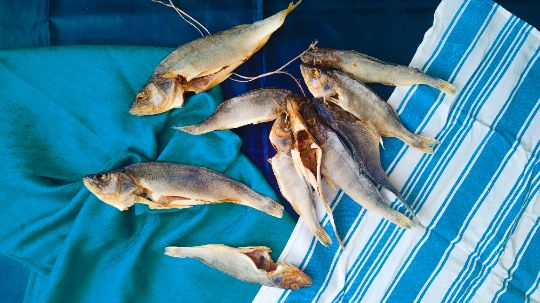
Fish
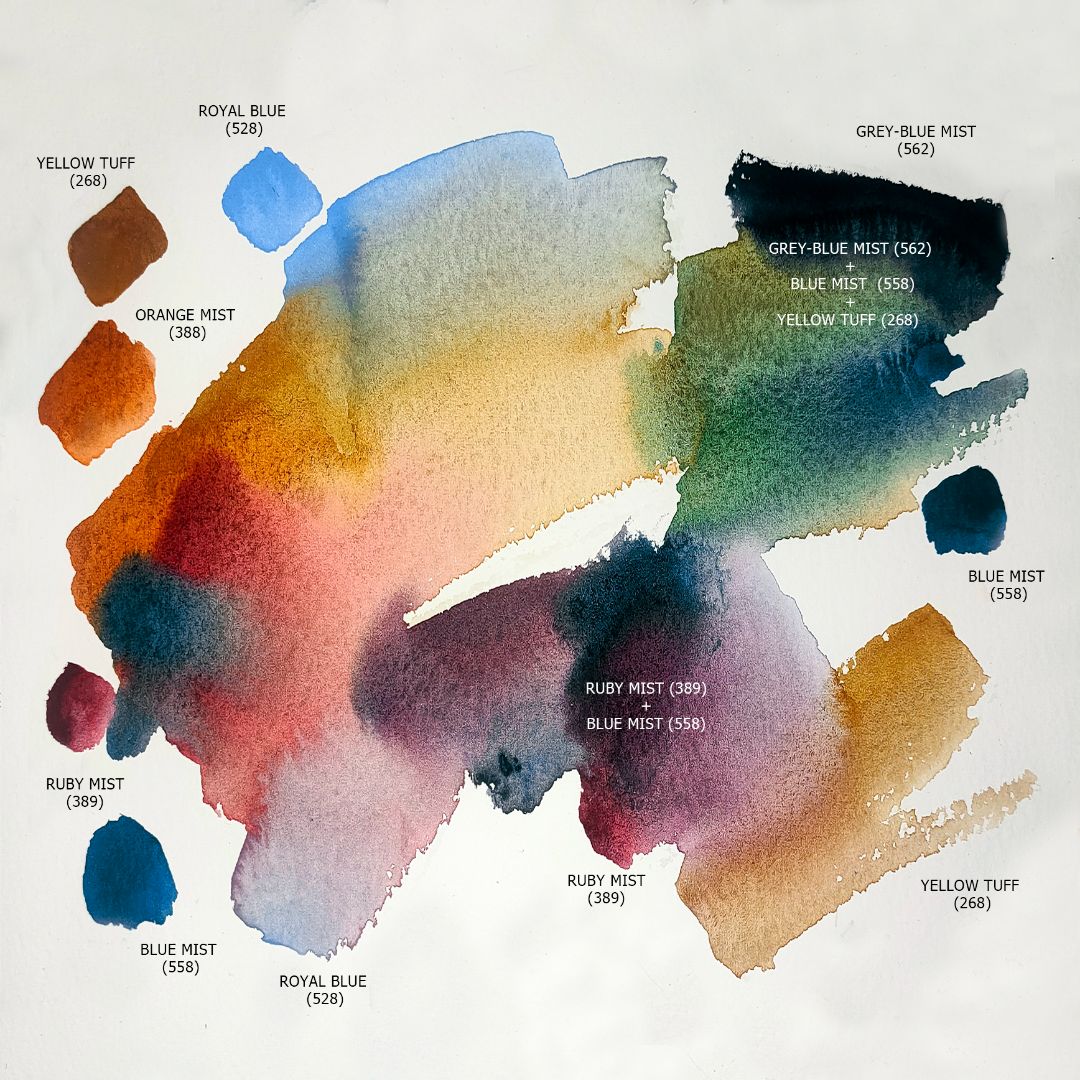

We look at the arrangement from above and see the fish turned towards us on different sides, the lighting is flat - with the top, the shadows fall strictly down. Two species of dried fish are present in the still life: river roach and river perch. The roach and perch have an ocher-silver colour, only the perch is darker with slightly noticeable stripes. The main colour of the fish is the Yellow Tuff + Blue mist mixture. Yellow Tuff- a paint from a granulating series, the pigment of which is obtained from a single natural volcanic mineral brought from Armenia, which is classified by two pigment compositions: Charcoal Black (P.Bk.8) and Natural Yellow Iron Oxide (P.Y.43), has a saturated ochre colour with a pronounced but soft granulation effect of Charcoal Black dark (but not black) particles. The granulating effect of the mixture conveys the texture of the scales well. To enhance this effect, I work on dry paper, creating an additional pattern of scales with the tip of the brush where necessary or applying paint to the side of the brush: in this position, the brush does not fully contact the surface of the sheet, as if "slipping" and leaving white paper, which further emphasizes the texture of the scales.

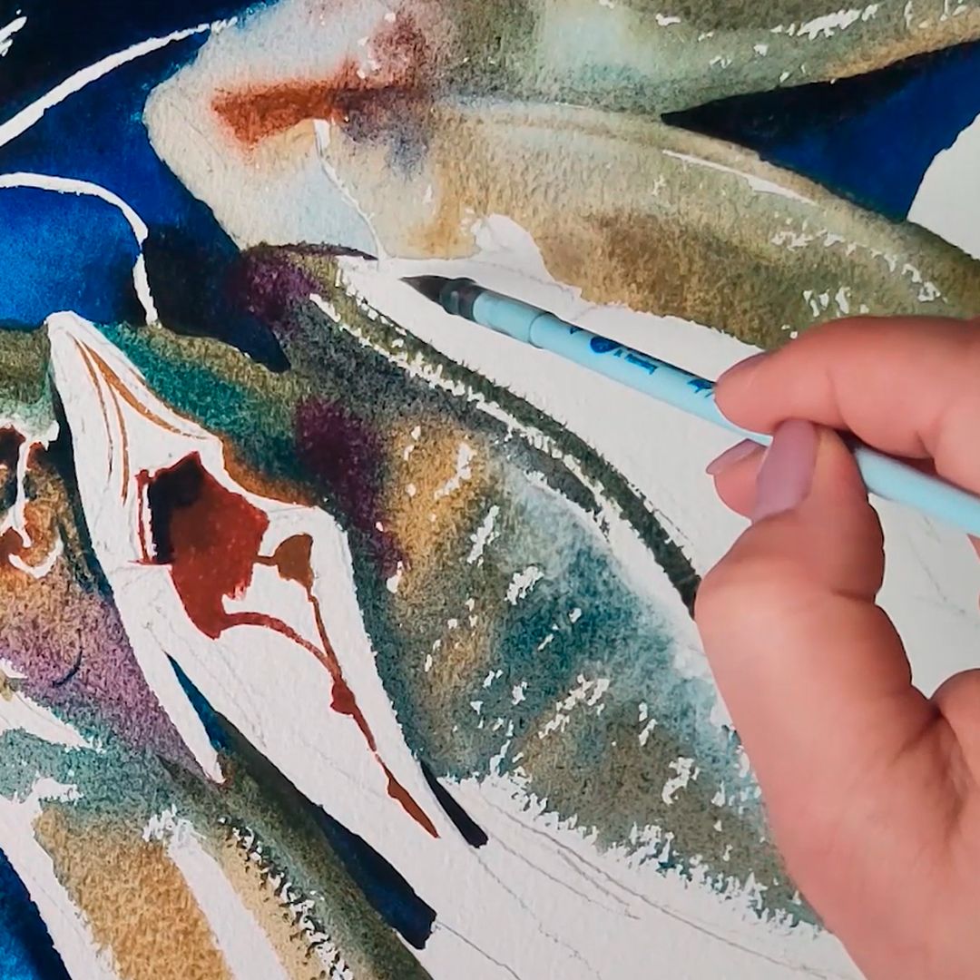
In light areas, I add more Yellow Tuff and very little Blue mist to the mixture, on darker fragments I change the proportions of the colours in the mixture towards Blue mist and get a cold grey shade with a turquoise tint.
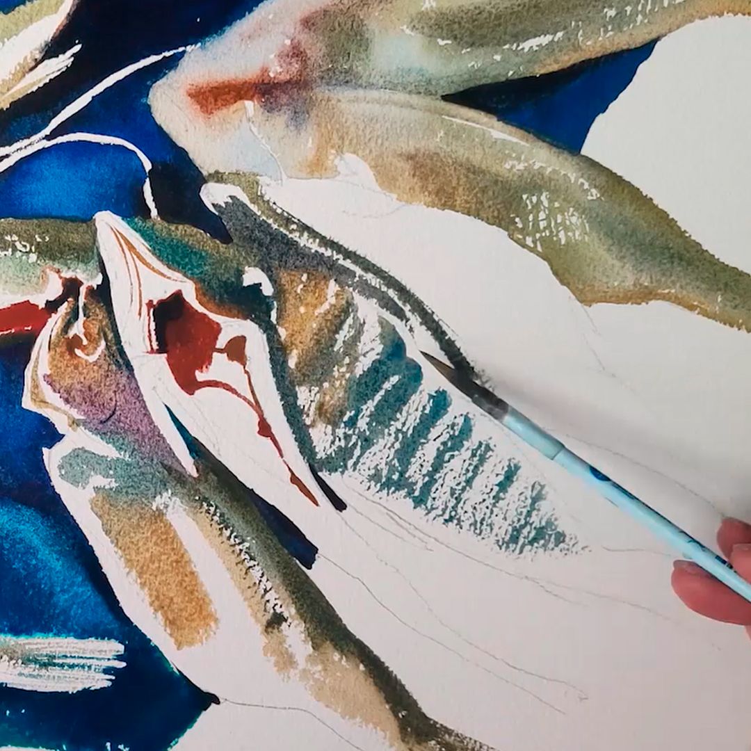
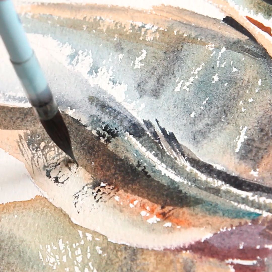
To the main colour of the blend, I add a cold red Ruby mist, producing intricate reddish and violet shades or Orange Mist colour, reinforcing the ochre colour with orange undertone. The Yellow Tuff + Royal blue paint mix gives a neutral silvery grey shade that I use at the chiaroscuro boundary of light fish fragments.
For slightly darker bass, I add Grey-Blue Mist to the mixture, which contains Lamp black (P.Bk.7) and Ultramarine Blue pigments (P.B.29). Lamp black particles enhance the depth of the mixture, and Ultramarine Blue will give the mixture a neutral dark steel hue. In the same colour, I make stripes on the sides of perches.
White towel with blue stripes
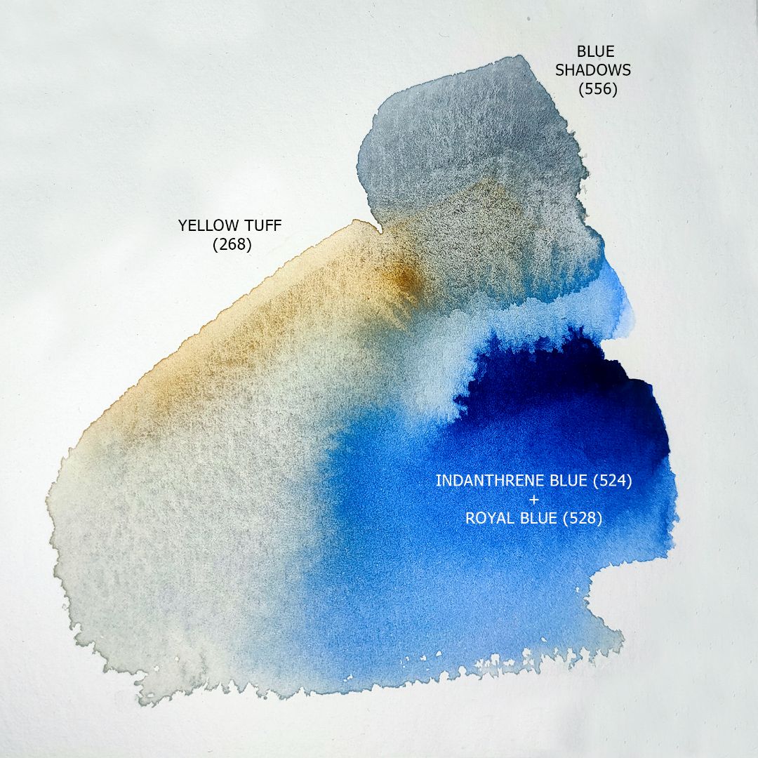
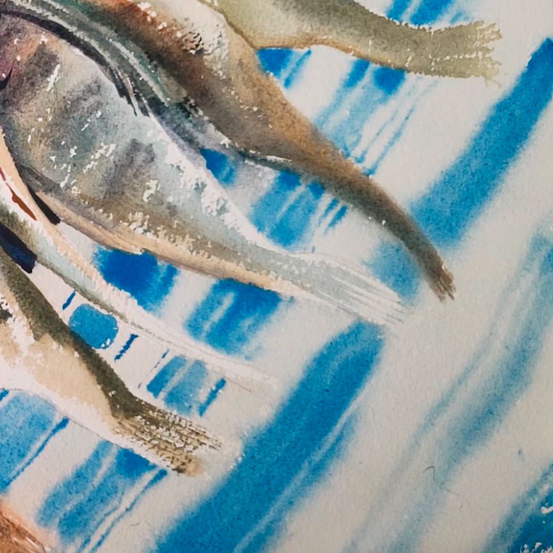
The main colour of the towel is white, but I won't leave white paper to avoid distracting the viewer's attention from the fish and sloshing in light grey - a Blue Shadows + Yellow Tuff colour mix. I'm making a mix with Yellow Tuff, not just using Blue shadows to colour combine the whole still life composition. Yellow Tuff's soft, slightly noticeable shade will connect the fish and towel into a single colour scheme. Also doing the filling, I moisturise the paper and the blue stripes I will do on wet paper. I just want to mark the blue stripes with beautiful overflows of colour, making them the background. I make the stripes themselves with a thick flat brush with a mixture of Indanthrene blue + Royal blue colours. Closer to the fish, I take more paint, making the colour richer. At the end, with a thin brush, I draw several fragments of thin stripes on the fabric.
At the final stage, I once again return to all objects of still life, muffle extra highlights, make a contrast of shadows, finalise some details, summarising and emphasising where necessary, so that the still life looks whole and complete.