Watercolour pomegranate: a clean, readable shape with complex colour
Today I wanted to paint a colour-rich energetic sketch and decided to choose a plot with a pomegranate and dark green drapery. I have already demonstrated this plot many times in different propounding and with different lighting, the works are always interesting, and the process itself is fascinating.
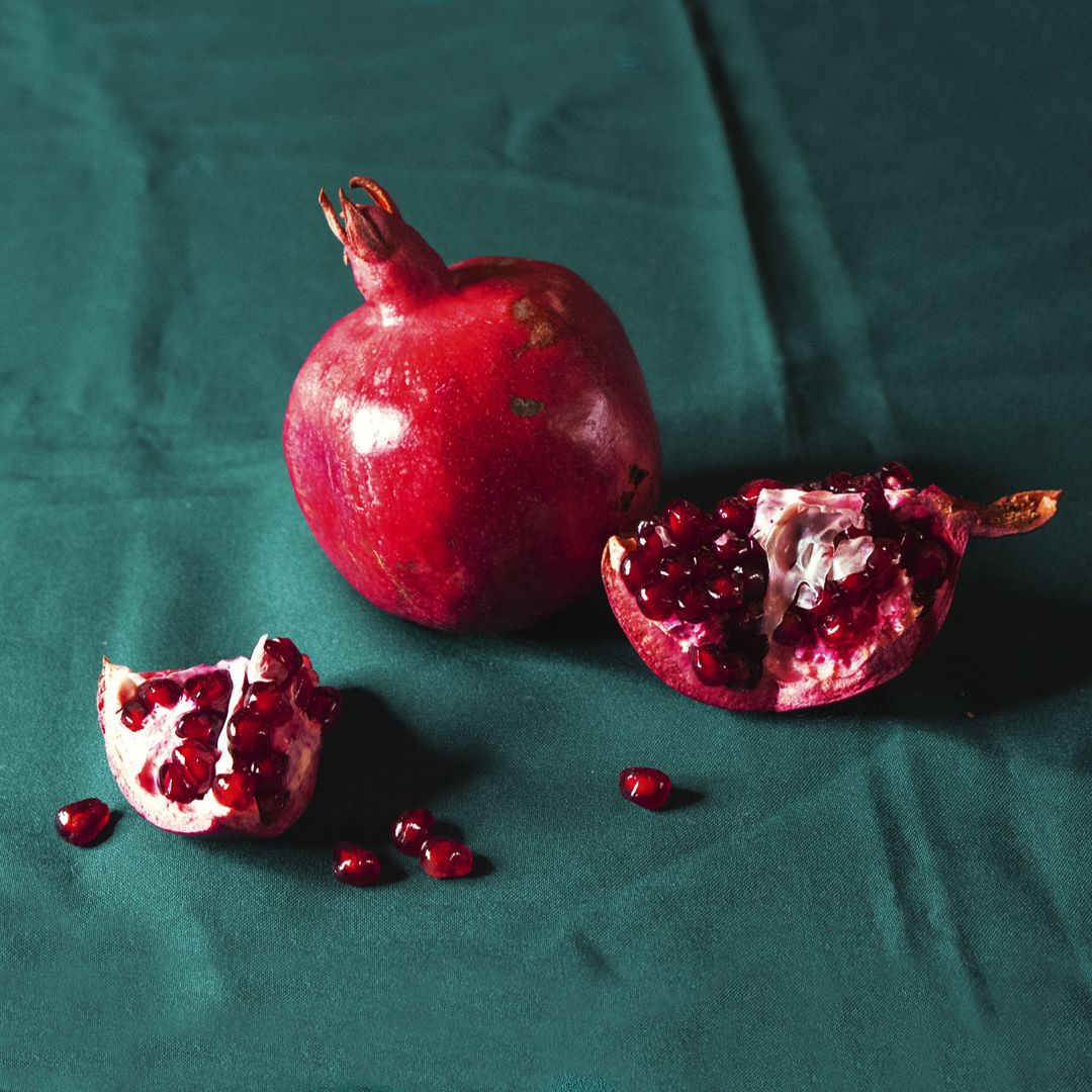
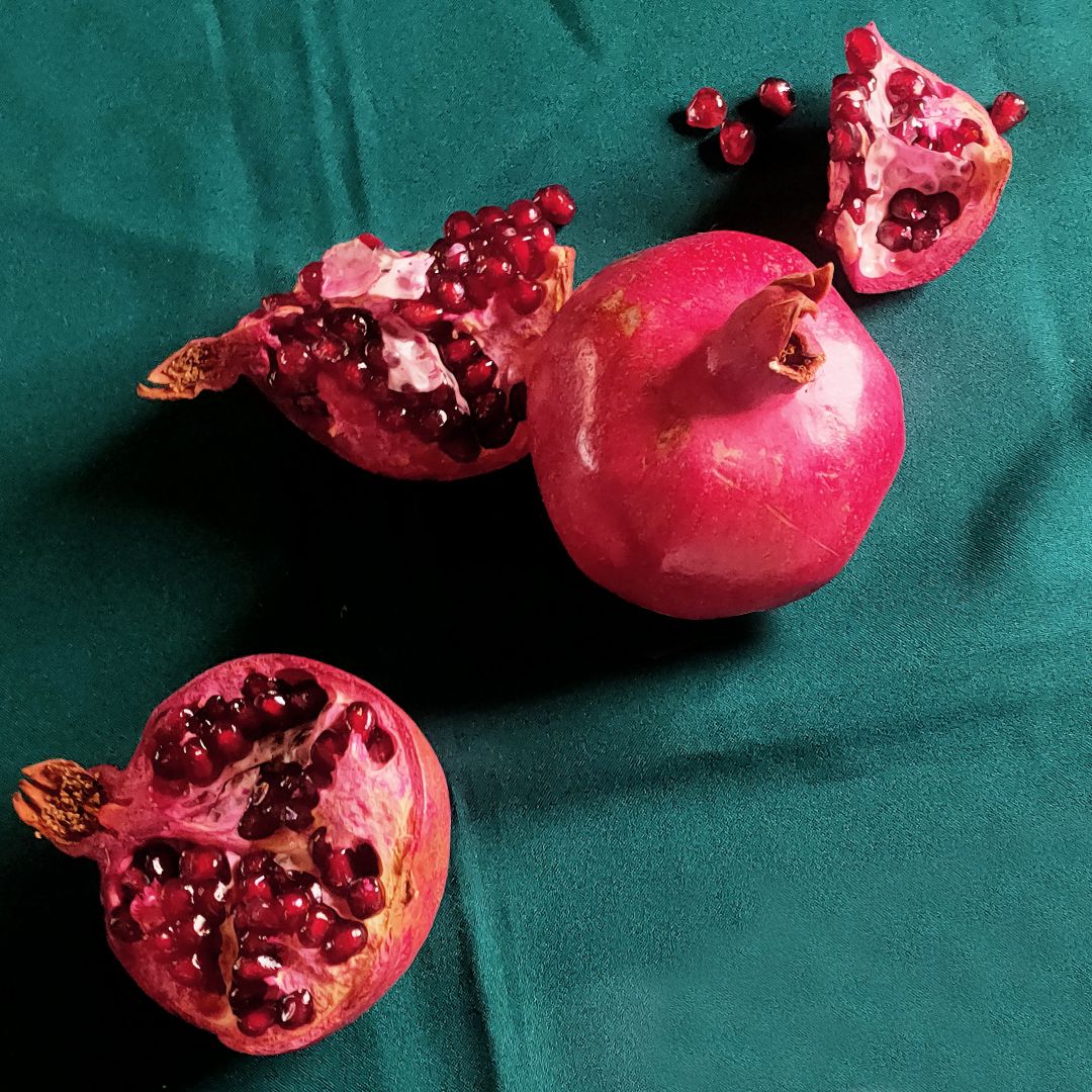
Pomegranate has a clear understandable shape and complex colour, and divided into several parts, fascinates with translucent luminous grains. The pomegranate propounding allows you to catch and convey all the shades of the red palette: from rich and deep burgundy brown, to sparkling pink-scarlet shades with overflows. The fabric's dark greenish-turquoise colour accentuates the red palette's vibrancy, balancing bold, bright accents with deep tones.
On the colour circle, red and green, burgundy and turquoise colours are opposite each other, and in colour theory, such colours are called complimentary.Being around, they strengthen each other, which in practice always means the most contrasting and vivid combination, which can be too intense and pretentious. In order to prevent this, it is necessary to choose a harmonious combination of shades and their proportional relation to each other.
To emphasize the main participant in the propounding (pomegranate) and harmoniously combine the colours in the sketch, I initially decide that there should be more turquoise-green shades in the sketch, not open bright colours, but muted ones: cold turquoise with the addition of a dark warm shade. To do this, I use granulating colouгs:Blue mist (P.B.29 P.G.7),Green shadows (P.Bk.11 P.G.7) andAquamarine mist (P.B.29 P.G.7).They consist of a combination of pigments that delaminate into different shades of colour. These paints mix well with each other. Actively, but smoothly flowing and mixing with each other, fireworks of shades explode. By delaminating in the water layer on the sheet, the pigments move behind the brush and create an interesting texture of the paint layer. Sometimes I don't even want to remove these effects, but I want to play along with them. But in work you always need to remember about priorities: either we create a specific subject form and then form as such is important to us and you need to control and limit the process of pigment movement or we just play with colour. But in any case, I always urge you to work bolder with paints and experiment. You can always learn to control them in the process of work. In the shadows falling from the pomegranate, following the laws of heat-coldness, I use Venice purple (P.R.179),which has a warm, complex red colour and produces a deeper shadow.


After painting the background, I dry the colourful layer with a hairdryer. Somewhere in half of the drying process, it is necessary to interrupt and soften the contours of the pomegranate in the shadow part, at the same time turn the background colour into the shadow part of the pomegranate. The paint, drying, tends to the border, collecting at the contour of the object, from this the contour becomes sharp. To avoid this, you need to blur the boundaries of the background and the subject. This is better done by lightly touching a slightly wet flat brush from the outside of the pomegranate contour, when the background is already dry and the edge of the pomegranate is close to drying out. If the background is too wet, then the paint can spread. Observing such a sequence of actions, the colour at the border of the pomegranate will become lighter, and the excess paint from the contour of the pomegranate will go into a wet brush stroke on the background, like lessening. The pomegranate will organically enter the background space and will not look cut out of it.


Like every artist, I have my favourite palette, presented in the author's set and this is very convenient in open air and on-site master classes, but I love variety, I love to paint complex propounding in different colours and therefore do not limit myself only to her. For easy storage and use, I assemble paint sets by colour groups into metal pencils. To quickly navigate where the paint is, I keep the labels. It turns out convenient both in work and in storage.


Geranium red (P.R.242),Ruby (P.R.170), Quinacridone red (P.V.19), Carmine (P.R.19), Madder lake red light (P.R.187), Venetian red (P.R.102 P.R.187),Venice purple (P.R.179).
After the final drying with a hairdryer, I once again carefully look at the study and make the final adjustments with light lessening: I strengthen the shadows, correct the details. In a large and complex propounding, the final stage of working with details can last for long time, a few hours, it is a thoughtful, serious work. But in the sketch, the main thing is to convey the mood, catch the game of colour, light and shadows, find a harmonious combination.