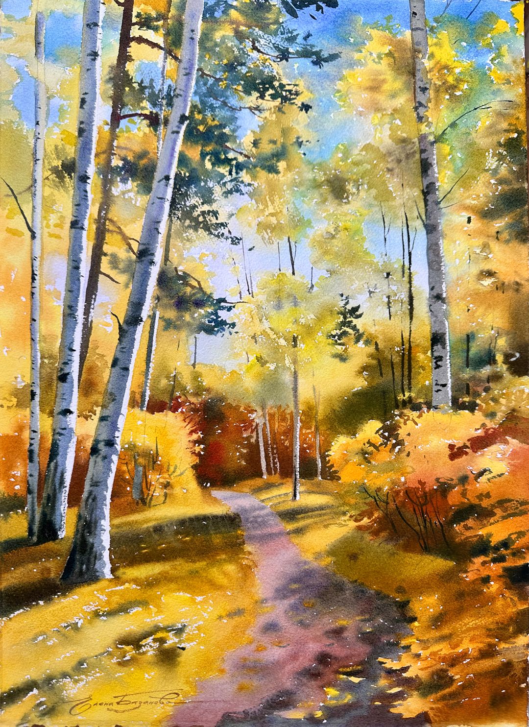
Autumn Watercolour Landscape WITH ELENA BAZANOVA
Autumn is undoubtedly one of the most amazing times of the year. The green colour of the foliage begins to gradually change towards the red-yellow palette. The colour scheme is changing rapidly. And now comes a short period of golden autumn. Everything around is frozen in bright colours. During the day, the remnants of summer heat are still felt, but by the evening it is noticeably colder, and in the morning, hoarfrost appears on the grass from light night frosts.
I always try to catch this short period with the golden sparkling colours of autumn. It usually lasts about one, less than two weeks, and then the weather deteriorates sharply, rains and strong winds begin, and foliage flies around. Everything ends very quickly. This year I was lucky, I managed. I was walking for a long time on one of these clear golden days and I managed to make several sketches and photographs so that, returning to the studio, draw an autumn sketch.

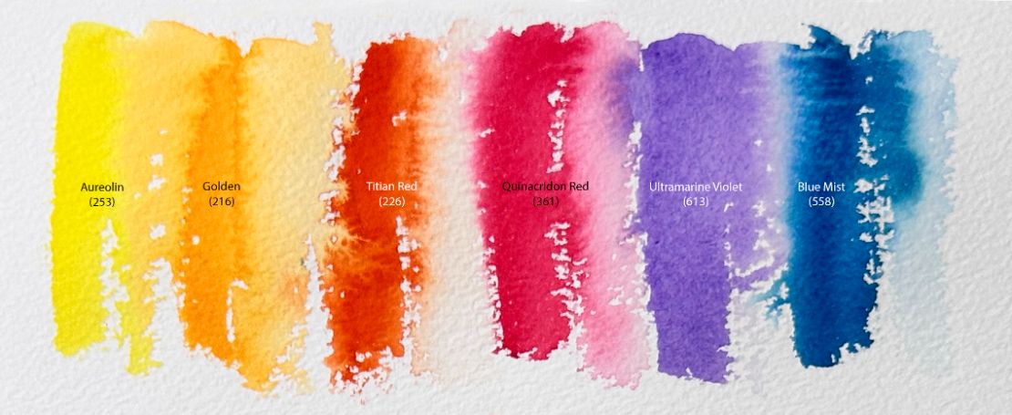
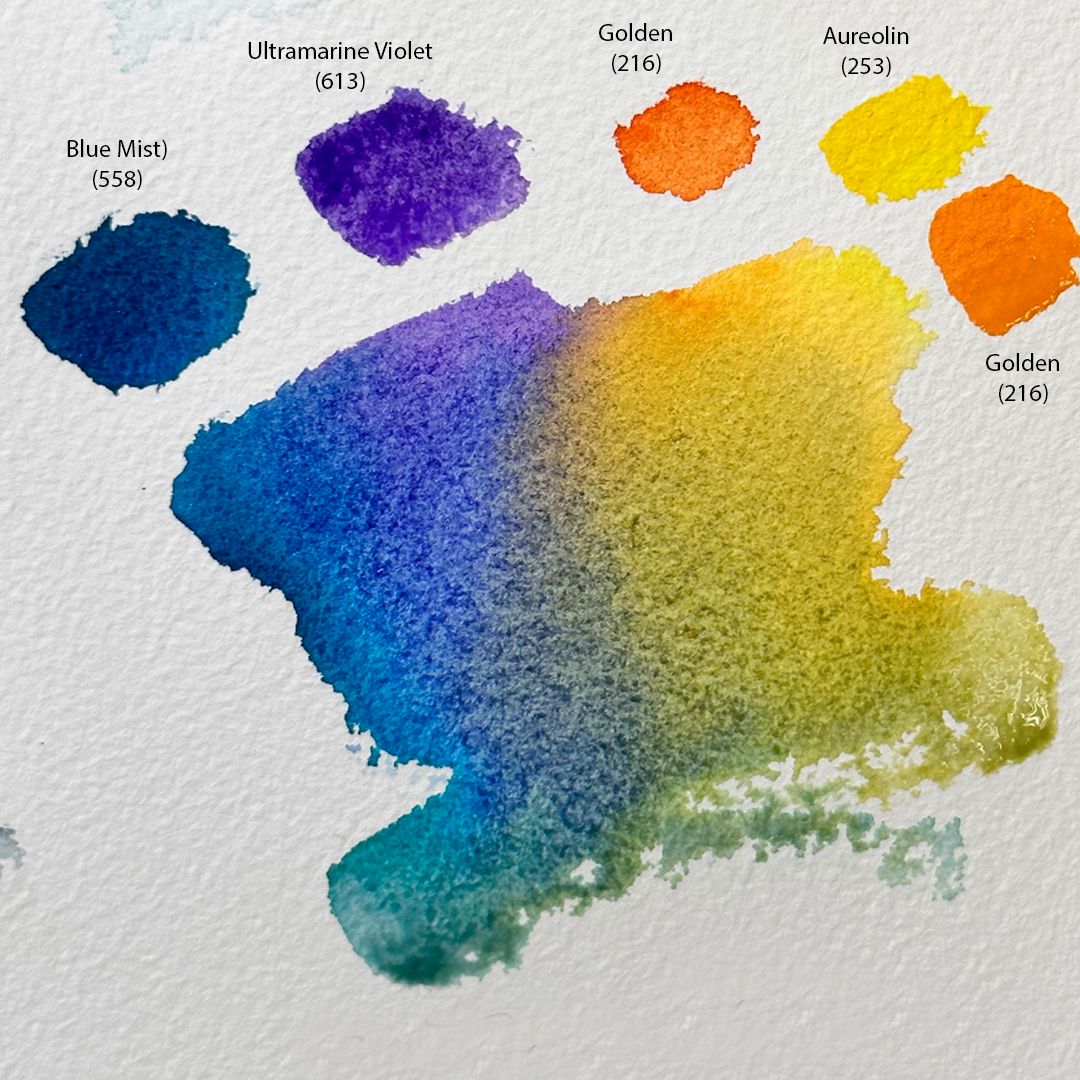
Autumn is a real palette of shades, where warm and cold colours are combined. Warm colours such as Aureolin, Golden and Titian Red fill the autumn landscape with warmth and brightness. The shining gold of the foliage is provided by mixtures of these colours. They create an atmosphere of solemnity and coziness.
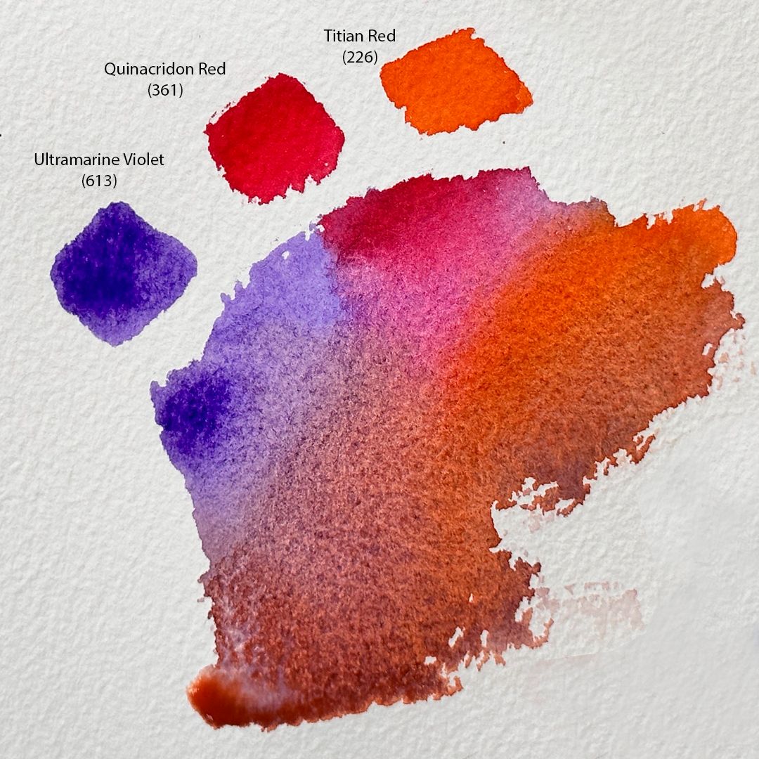
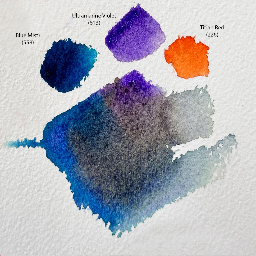
The cold colours, represented by Quinacridon Red, Ultramarine Violet and Blue Mist, give the autumn landscape style and versatility. I will use these colours for sky and shadows. Mixtures with Quinacridon Red give deep and rich shades of brown. Mixtures with Ultramarine Violet are characterized by transparency and a mild granulation effect. Particularly beautiful are the mixtures with Golden, Blue Mist and Quinacridon Red. Blue Mist in mixtures with the rest of the colours gives a variety of shades of green, brown and blue.
For the palette I chose 6 colours: 1. 253. Aureolin (P.Y.151 *** □△), 2. 216. Golden (P.Y.3 P.O.64 *** □◮), 3. 226. Titian Red (P.O.36 *** □◮), 4. 361. Quinacridon Red (P.V.19 *** □▲), 5. 613. Ultramarine Violet (P.V.15 *** ◨△G), 6. 558. Blue Mist (Blue Mist P.B.29 P.G.7*** ◨▲ G).

The main colour of the path

Sky
Shadows on the path
Birch trunks in the shade

Foliage
When I get to work on a study, I make a light drawing. Before working with paints, I wet the paper well from the back and place it exactly on the pad. On the front side, I moisten the surface of the sheet a little with a spray gun. I start from the sky. The primary colour of the sky is Blue Mist. I get a rich blue-blue shade with a mixture of Blue Mist + Ultramarine Violet. Going down below, the colour changes, going into a light, slightly pink undertone, so I add Quinacridon Red to the mixture. I now go through the background, do a general colour fill of illuminated objects, no shadows and no detail, so I denote bright golden yellow patches of foliage using a mixture of Aureolin + Golden + Titian Red.


Having worked on illuminated fragments of the landscape in the upper part, I have to wait until they dry up, so I go down and work with the centre. The path goes to the centre of the composition into the depths of the park. This is the dark, lower part of the forest just above the horizon line of our landscape. I use a mixture of Quinacridon Red + Blue Mist + Titian Red colours. By changing the proportions of the colours in the mixture, I get cold or warm shades of brown. I deliberately work with a fairly fine for this format brush with a sharp tip, since with intermittent fine lines and spots, I create a "curly" foliage texture.


Meanwhile, the paper on top is a little dry. By mixing Blue Mist + Golden, I get a muted green and use it for pine branches. With a thick, water-squeezed brush, I apply paint over the first dried layer in short movements, creating the texture of pine branches. With the same mixture, but lighter in tone, I create the texture of the foliage of trees in penumbra.
Then, I go down and move to illuminated fragments of grass and bushes. For them, I use mixtures, as for tree crowns: Aureolin + Golden + Titian Red. I apply wide strokes of paint, leaving small unpainted pieces of paper, I will return to them later when the paper dries. For shadows, I use a Blue Mist + Titian Red mixture.

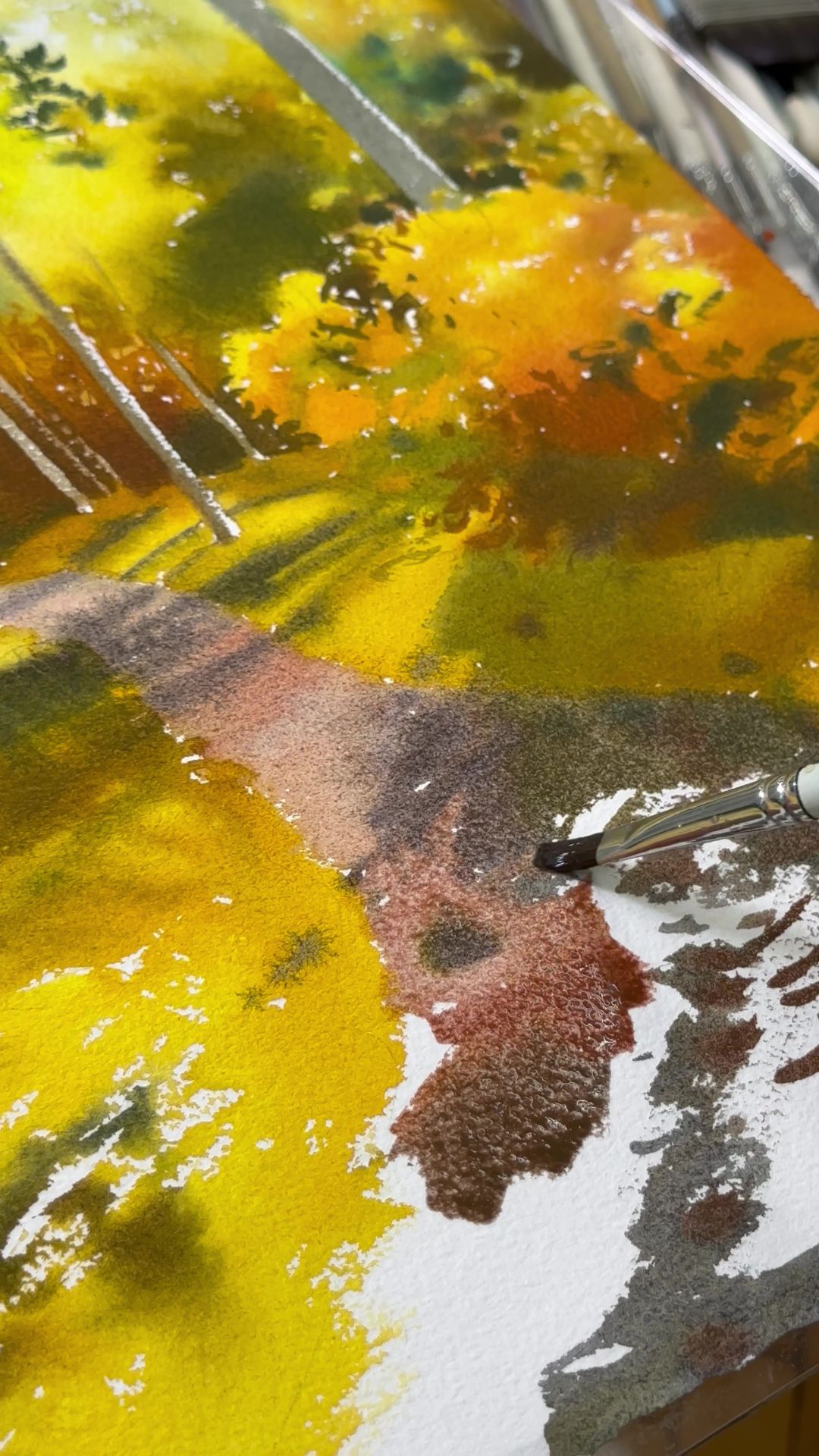
After that, I go to the path. The primary colour is Ultramarine Violet + Quinacridon Red + Golden. The mild granulation effect of Ultramarine Violet particularly highlights the texture of the earth. For footpath shadows, I use a mix of Blue Mist + Ultramarine Violet + Titian Red.
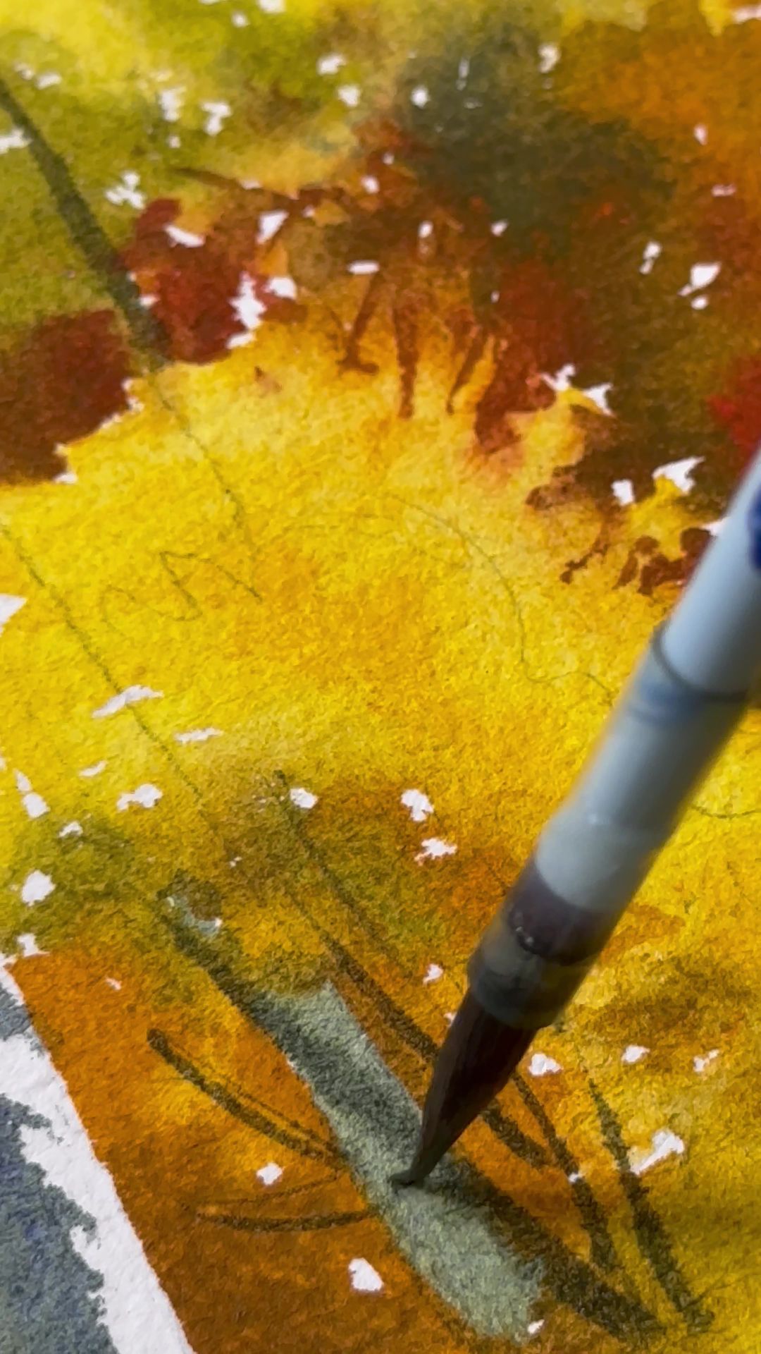
In the final stage, I work with birch trunks using a mixture of Blue Mist + Ultramarine Violet colours in the shade, Golden + Aureolin in the reflex. I leave the brightly lit fragments of trunks white.
Then, I dry the work with a hairdryer and move on to the details. With a rich mix of Blue Mist + Ultramarine Violet flowers, I work on the thin branches and trunks of trees and bushes. Using Aureolin's pure colour, I refine the unpainted spots on the grass, giving the impression of bright glare from the sun's rays on the wet grass.
The presented autumn palette is versatile: soft shades are harmoniously combined with rich, deep colours, and depending on the phase of autumn, they are combined with each other and smoothly flow into each other.