MONOPIGMENT AND COMPOUND
Monopigment colours have always been appreciated by artists for the predictability and purity of the shades obtained from them when mixing: the less pigments participate in the production of the mixture, the cleaner the final tint...
TRANSPARENT, SEMI-TRANSPARENT, OPAQUE PAINTS
Glazing is a multi-layered technique in painting: applying paint with transparent strokes from lighter to darker, one layer over the other.Alla prima is a technique in which a picture...
WATERCOLOUR TECHNIQUES
Glazing is a multi-layered technique in painting: applying paint with transparent strokes from lighter to darker, one layer over the other.Alla prima is a technique in which a picture is created within one painting session before the colours dry completely.
COLOUR COLLECTIONS & MIXING COLOURS
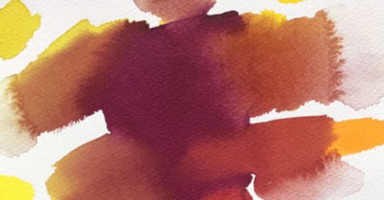
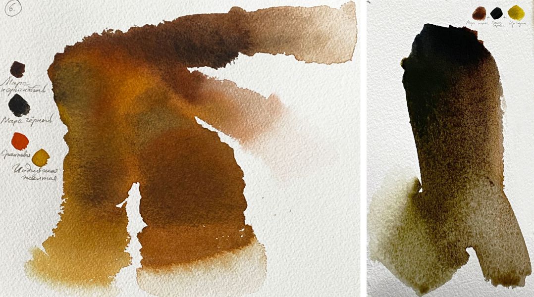
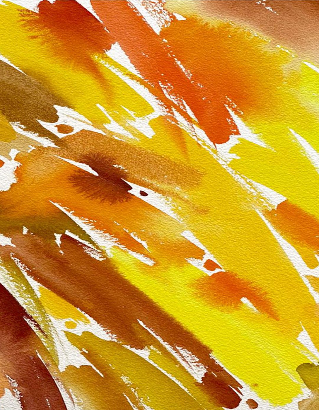
In the palette of ochres and browns there are natural eaths (monopigment colours), iron oxides transparent and opaque (monopigment) and compound colours, in which, as a rule, iron oxide or some yellow and/or red...
COLOURS COLLECTIONS & MIXING COLOURS
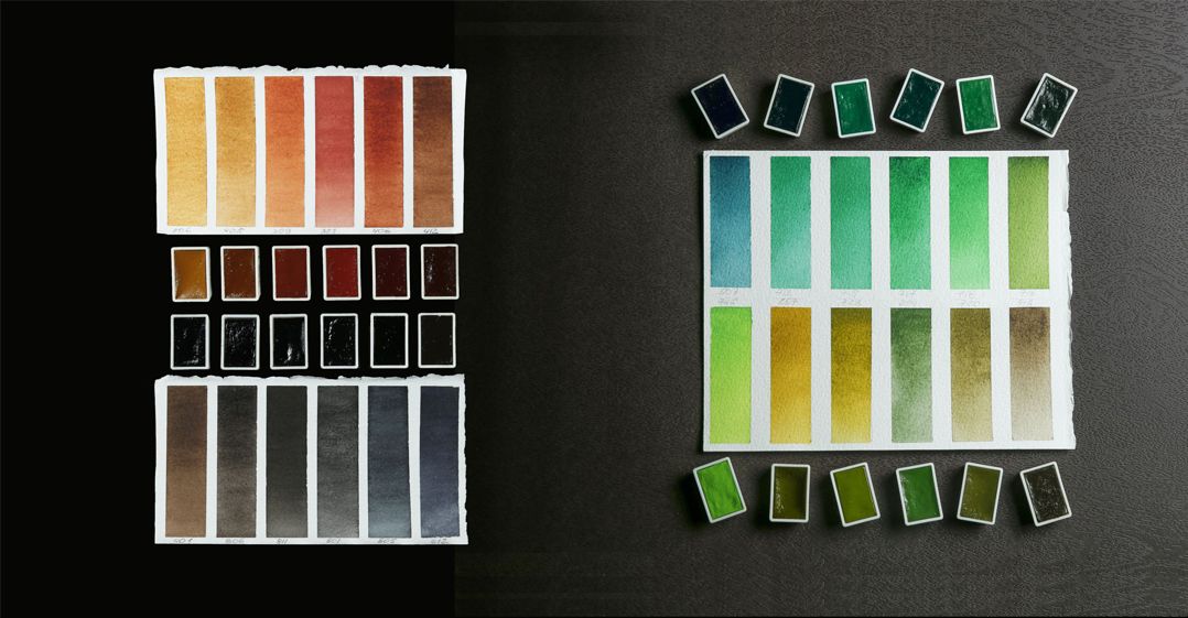
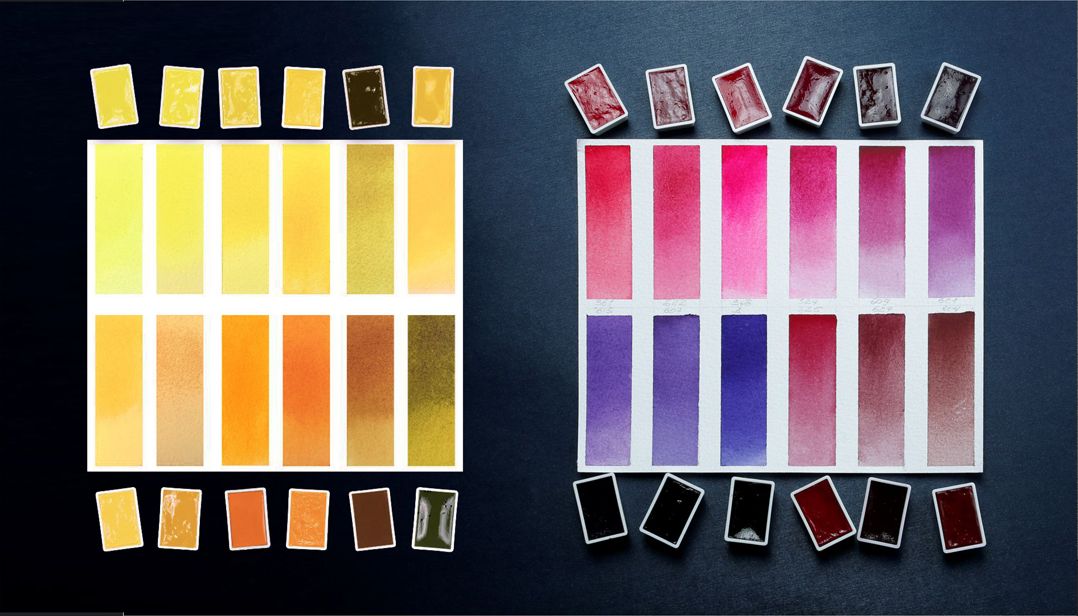
BROWN, GRAY AND BLACK:
OCHRE LIGHT (206), YELLOW OCHRE (218), PETERSBURG OCHRE (258), DUNES (255), RED OCHRE (309), ENGLISH RED (321), MOCHA (433), MAROON (432), RAW SIENNA (405), BURNT SIENNA (406), UMBER (418), BURNT UMBER (408), VANDYKE BROWN (401), MARS BROWN (412), SEPIA (413), VORONEZH BLACK (806), PAYNE'S GRAY (812), PEARL-GREY (819), MARENGO (818), NEUTRAL BLACK (805), IVORY BLACK (811), LAMP BLACK (801), MARS BLACK (800).
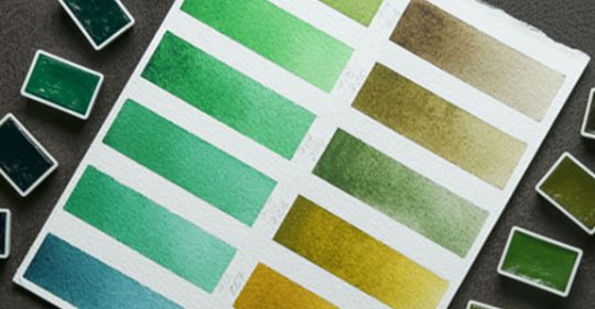
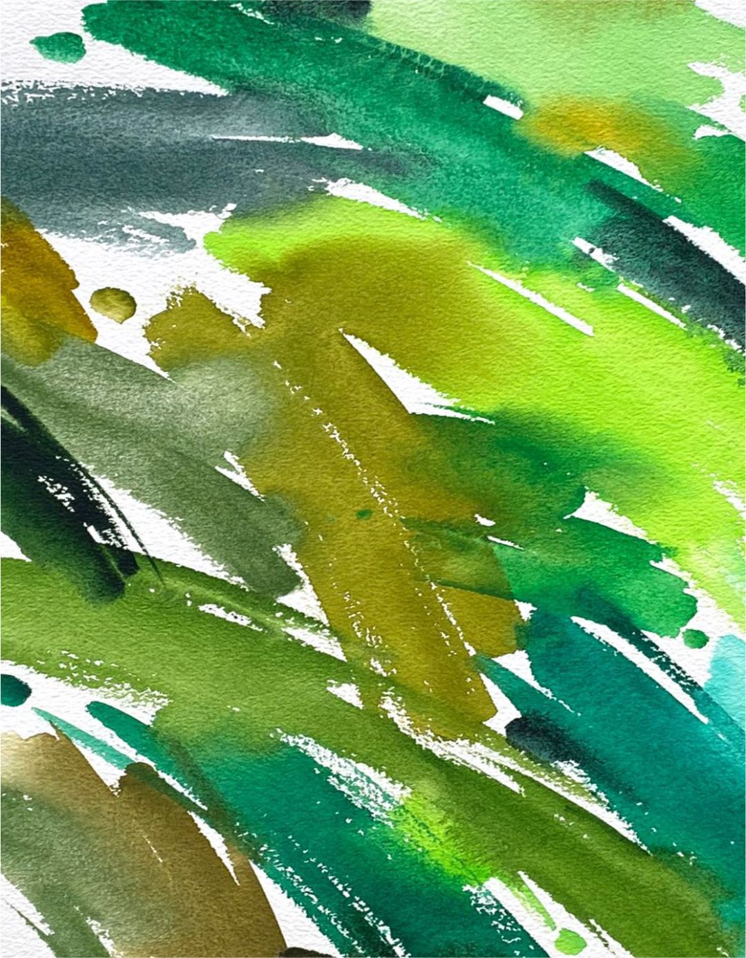
GREENS:
MINT (735), TURQUISE BLUE (507), EMERALD GREEN (713), GREEN LIGHT (717), GREEN ORIGINAL (719), WARM GREEN (747), MAY GREEN (745), YELLOWISH GREEN (718), SAP GREEN (716), OLIVE GREEN (727), IRGAZIN YELLOW (257), CHROMIUM OXIDE (704), GREEN (725), GREEN EARTH (730).
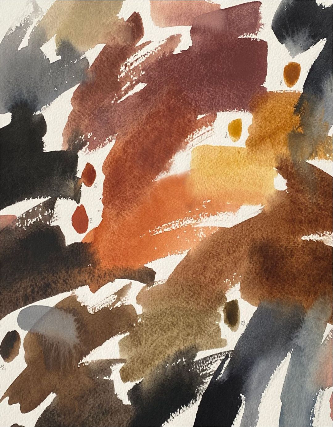
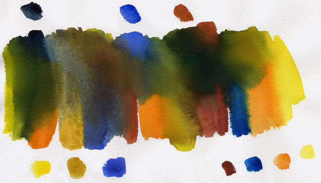
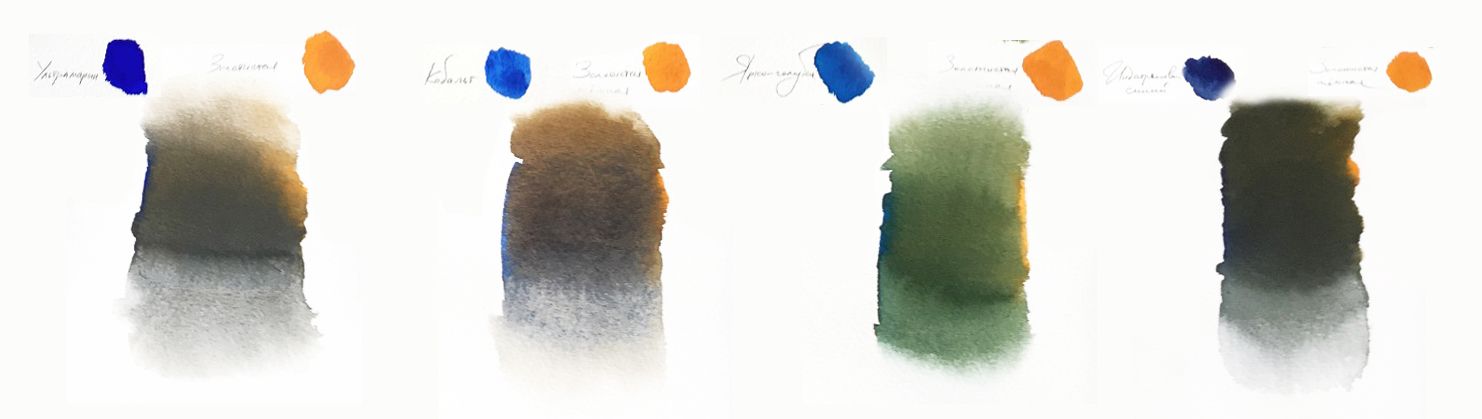
OBTAINING OF MIXES IN GREEN AND BROWN PALETTE.
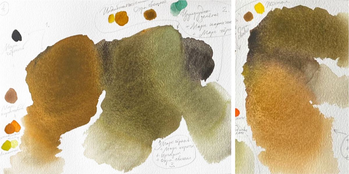
In the palette of ochres and browns there are natural eaths (monopigment colours), iron oxides transparent and opaque (monopigment) and compound colours, in which, as a rule, iron oxide or some yellow and/or red is added to the black pigment. Many browns have a granulation effect.
Browns mix well with almost all colours, especially harmonious combinations are obtained if only two colours participate in the mixing - brown (complex itself in colour) and close in colour paint (ochre, black) or pure and bright in colour (all colours of the main palette).
Glazing paints work in mixes with browns best. Any other colour can be subdued with brown colors. But in complex mixes (more than two colours), brown can produce dirt.
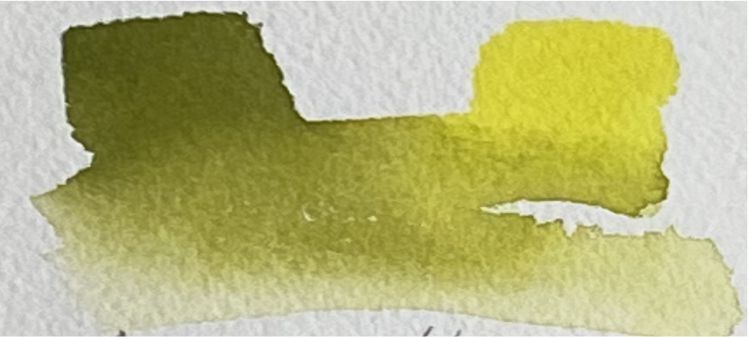
Olive green (727), Lemon (214)
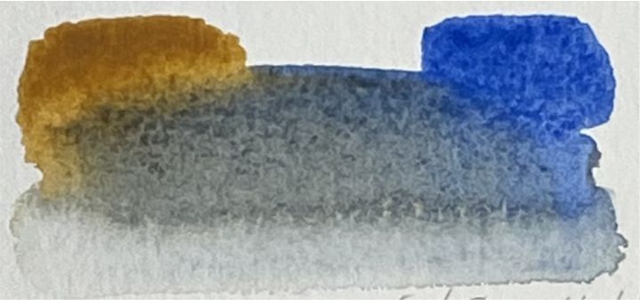
Ochre light (206), Cobalt blue (508)
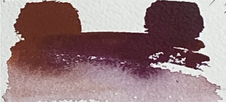
English red (321), Quinacridone violet (621)
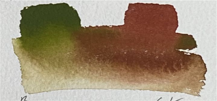
Olive green (727), Venice purple (365)
The brown palette is diverse and self-suffcient, with these colours you can work as ready-made colours, playing on a variety of structures of different colours. In this case, the colours will get a special sound on thin warm-cold ratios. Surrounded by the restrained tones of this palette, single accents of bright colour will sound even more clearly.
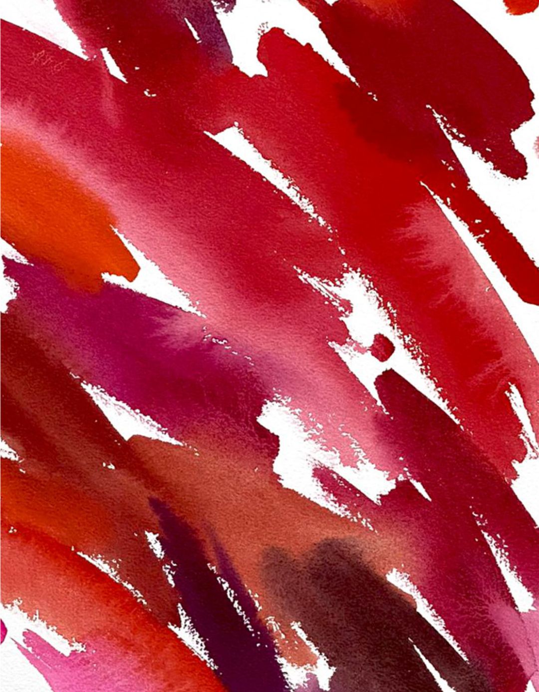
BLUE AND RED PALETTE.
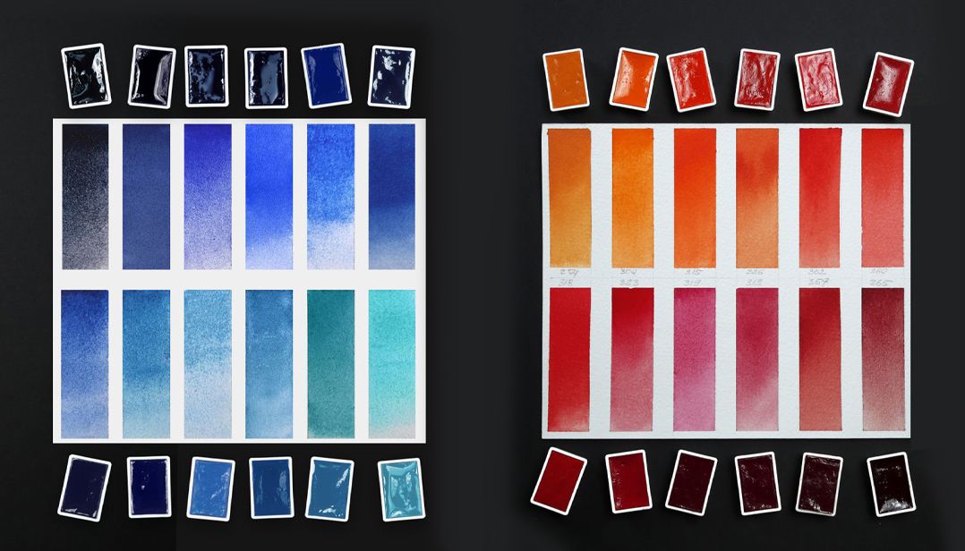
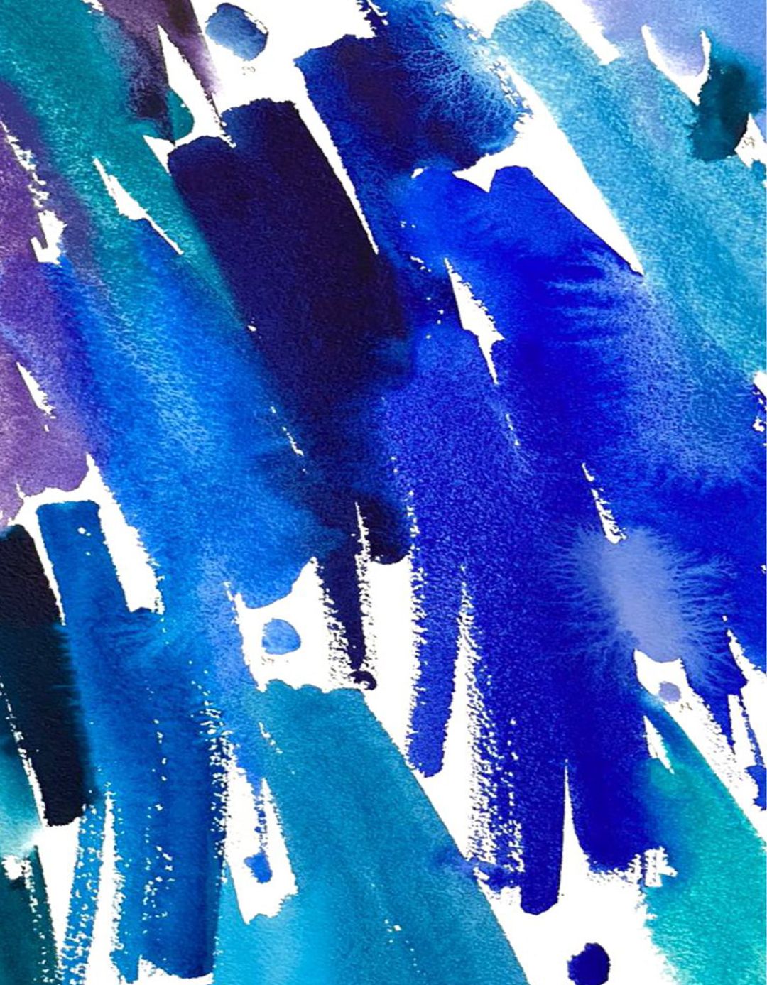
BLUE:
Ceruleum blue (503), Celestial blue (512), Azure blue (519), Cobalt azure blue (532), Bright blue (509), Azure (513), Cobalt blue (508), Royal blue (528), Prussian blue (518), Blue (515), Ultramarine (511), Ultramarine deep (521), Blue lake (510), Indanthrene blue light (537), Indigo (516), Cobalt turquoise (531), Cobalt chrome turquoise (533) Сolours from the violet and pink palette have been added to the colouring: Quinacridone violet (621), Lavender (625), Dioxazin violet (628)
RED:
Titian red (226), Venetian red (357), Cadmium red light (302), Geranium red (364), Scarlet (318), Ruby (323), Carmine (319), Quinacridone red (361), Madder lake red light (313), Venice purple (365). Сolours from the violet and pink palette have been added to the colouring: Neon pink (368), Quinacridone rose (324), Quinacridone violet (621), Perylene violet (627), Rose quartz (367), Magnolia (369).
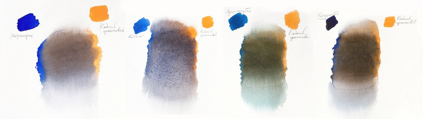
ULTRAMARINE-BASED MIXES.
Mixes based on ultramarine, ochre and red shades give deep pure tones. Also, in the mix of ultramarine with yellow, interesting green shades are obtained, complementing the gamma of browns.
Ultramarine (511), Lemon (214), Cadmium lemon (203), Cadmium yellow medium (201), Yellow ochre (218) | Row sienna (405),Orange (315), Cadmium orange (304), Red ochre (309), Burnt sienna (406)
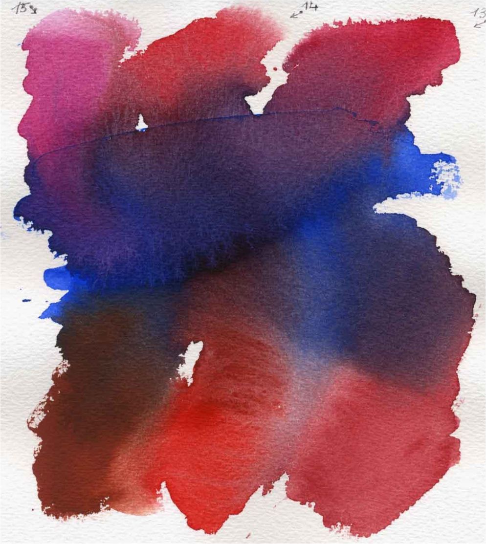
Ultramarine (511), Carmine (319), Ruby (323), Ouinacridone rose (324) | English red (321), Scarlet (318), Madder lake red light (313)
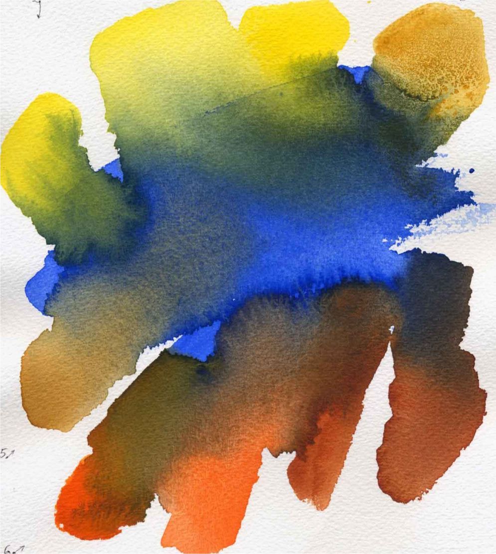
This is a sequential mixing of different colours with the flow of colour into colour, as usually happens in live painting:
Indigo (516), Ultramarine (511), Burnt sienna (406) | Cadmium yellow medium (201), Ochre light (206), Cobalt blue (508) | English red (321), Bright blue (509), Golden deep (217), Lemon (214)
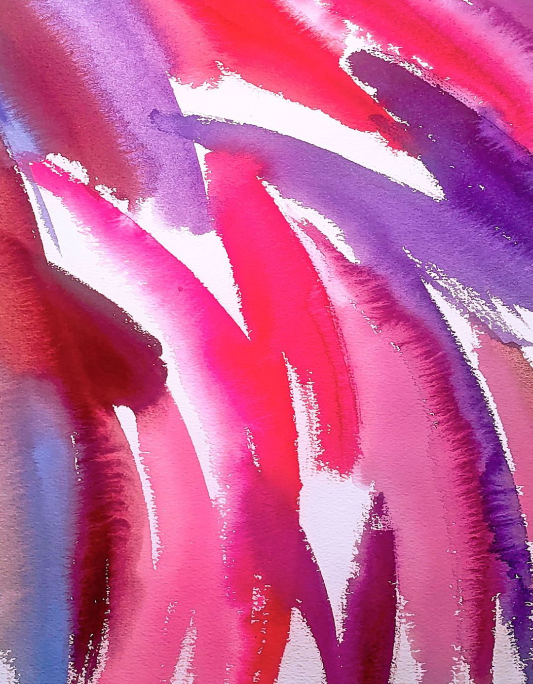
YELLOW, PINK AND VIOLET PALETTE.
YELLOW AND ORANGE:
Yellow (211), Lemon (214), Cadmium lemon (203), Aureolin (253), Cadmium yellow medium (201), Naples flesh (222), Peach (256), Naples yellow (209), Indian yellow (228), Naples yellow light (219), Indian gold (244), Golden (217), Golden Deep (244), Cadmium orange (304), Orange (315).
PINK AND VIOLET:
Quinacridone red (361), Claret (325), Neon pink (368), Rose quartz (367), Magnolia (369), Rose peony (366), Quinacridone rose (324), Quinacridone violet rose (622), Lilac (626), Quinacridone lilac (609), Caput mortuum (604), Perylene violet (627), Quinacridone violet (621), Ultramarine violet (613), Lavender (625), Violet (607), Dioxazin violet (628).
MIXTURES OF COMPLEX GREY SHADES.
Complex greys help to combine the image in tone and get picturesque warm-cold transitions. From the theory of colour studies it is known that a mix of primary colours (blue + red + yellow), as well as mixes of additional (blue + orange; red + green; yellow + violet), lead to a loss of colour: with optical mixing, white light is obtained, and in painting you get a grey tone.
MIXING OF PRIMARY COLOURS OF SPECTRUM.
In a dense tone, the mix of primary colours can be featureless, the chromaticity of complex grey will only appear in light unsaturated tones.
An illustration showing how grey mixes work will make this topic more understandable. In the test, the paints, that are the closest to spectral pure colours and that give pure grey, were used.
A graphite pencil hatch was laid under the draft to make the density of the mix in the layer more visible.
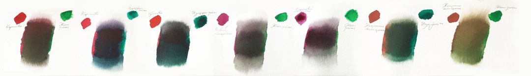
- Test №1: Lemon (214) + Ultramarine (511) + Carmine (319).
- Test №2: Cadmium lemon (203) + Ultramarin (511) + Carmine (319).
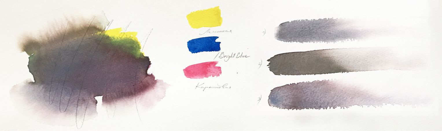
Test №1
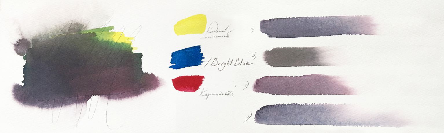
Test №2
RESULTS: It is noticeable that semi-transparent lemon cadmium made the mixture noticeably denser and less transparent than the mix with transparent lemon. Tone stretches show how pigments create a "pearly" placer and the colour tone of grey warms or changes towards red or blue. It all depends on the proportion of different colours in the mixture. It can be seen that pure lemon moves in the mixture more easily than cadmium lemon. Carmine turned out to be the lightest of the three paints, and its pigment particles are noticeable even in the weakest solutions. Therefore, add this paint to the mixture very carefully, otherwise it will give the painting a pink tint.
MIXING ADDITIONAL SPECTRUM COLOURS.
Mixes of additional colours (blue + orange; red + green; yellow + violet), lead to a neutral grey or brownish tint. You need to mix additional colours very carefully: carefully selecting the original shades, since the probability of getting a dull inexpressive grey tone is very high. But it is also important to remember that the sound of colour in the finished work depends on the colour and compositional solution of the work as a whole. Therefore, any grey shade obtained can look harmonious and be the only possible in a particular painting work.
BLUE + ORANGE. Blue + Cadmium orange (304):
RESULTS:
- Ultramarine (511) + Cadmium orange (304) = Grey with soft violet tint
- Cobalt blue (508) + Cadmium orange (304) = Grey with soft violet tint, granulation of the mix is visible
- Bright-blue (509) + Cadmium orange (304) = Warm grey with greenish-brown tint
- Indanthrene blue light (537) + Cadmium orange (304) = Grey-brown with blue undertint
BLUE + ORANGE. Blues + Golden deep (217):
RESULTS:
- Ultramarine (511) + Golden Deep (217) = Greyish-brown
- Cobalt blue (508) + Golden Deep (217) = Greyish-brown, granulation is visible
- Bright-blue (509) + Golden Deep (217) = Greenish-brown
- Indanthrene blue light (537) + Golden Deep (217) = Grey-brown
YELLOW + VIOLET:
RESULTS:
- Quinacridon violet (621) + Cadmium lemon (203) = Complex grey with greenish pinkish tints
- Quinacridon violet (621) + Lemon (214) = Grey with warm greenish-brown tint
- Quinacridon violet (621) + Cadmium yellow medium (201) = Complex brown with transitions from warm yellowish to violet tint
- Quinacridon violet (621) + Ochre yellow (218) = in dense draft – Brown with rough hard texture, in stretching – Ochre and pink-violet tints.
RED + GREEN:
RESULTS:
- Cadmium red light (302) + Emerald green (713) = Brown greyish-green tone with visible granulation of cadmium red particles
- Cadmium red light (302) + Yellowish green (718) = Brown of warm subdued green tone with granulation of cadmium particles
- Cadmium red light (302) + Green (725) = Rough brown with red and green tints
- Titian red (226) + Emerald green (713) = Beautiful subdued warm-green
RESULTS:
- Ruby (323) + Emerald green (713) = Cold grey with violet and greenish tints, beautiful in deep tones;
- Carmine (319) + Yellowish green (718) = Brown impure tone
- Carmine (319) + Emerald green (713) = in stretching – Beautiful cold grey with violetish and greyish tints, in saturated tone – Deep beautiful complex black colour of deep tone.
- Quinacridone rose (324) + Yellowish green (718) = Grey of impure tone
- Quinacridone lilac (609) + Yellowish green (718) = Grey of impure tone
- English red (321) + Emerald green (713) = Brownish-greenish colour
- English red (321) + Yellowish green (718) = Brown of subdued warm-green tone.
SUBTLE GREY SHADES.
Watercolour painting often requires subtle grey shades. We suggest considering examples of obtaining beautiful grey through various other paints. The test was performed with a combination of dry and wet techniques. In these mixes, the properties of different pigments when spreading are beautifully revealed. The most delicate grey tones have an infinite variety, they can complement beautiful colour palettes.
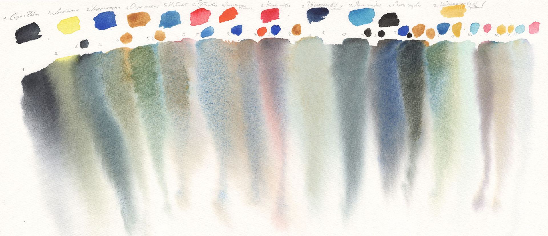
Payne's gray (812), Lemon (214), Ultramarine (511), Yellow ochre (218), Cobalt blue (508), Ruby (323), Golden deep (217), Carmine (319), Indanthrene blue light (537), Bright blue (509), Lamp black (801), Cadmium yellow medium (201)
It is enough to make several combinations of mixes to make sure that different blues, reds and yellows behave differently and give completely different results. The rule is obvious: the more pure the original pigments are in colour and closer to the primary spectral colours, the more often the mixtures with them will turn out to be pure. And the following comment is related to opaque paints: the denser structure the paint has, the heavier the mix with it will be. Therefore, it is so important to feel which colours you can use and get complex beautiful grey ones, which, when working in weak solutions, give a placer of colourful pigment particles and shimmering transitions barely caught by the eye in warm and cold tones. Such greys can indeed be called subtle or pearly.