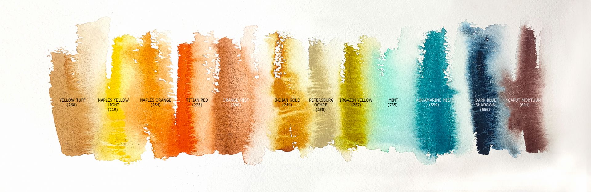
1. 219. Naples Yellow Light (P.Y.216*** ■△), 2. 268. Yellow Tuff (P.Bk.8, P.Y.43 ***□△ G), 3. 254. Naples Orange (P.Y.216 *** ■△G), 4. 226. Titian Red (P.O.36 *** □◮), 5. 388. Orange Mist (P.Bk.8, P.O.64 ** □◮ G), 6. 244. Indian Gold (P.Y.150, P.R.101 *** □◮), 7. 258. Petersburg Ochre (P.Y.42 P.Bk.8 P.W.6 ■△), 8. 257. Irgazin Yellow (P.Y.129 *** □△), 9. 735. Mint (P.G.7 P.W.6 ***■◮), 10. 559. Aquamarine Mist (P.B.29, P.G.7 *** ◨▲ G), 11. 555. Dark Blue Shadows (P.Bk.11, P.B.15:6 *** ◨▲G), 12. 604. Caput Mortuum (P.R.101 *** ■◮).
I apply a light drawing, for work I take paper from 100% cotton 300 gr/m2, floor lamp. I moisturize the sheet well on the back, place and carefully spread it on a plastic tablet. Also, using a wide flute, I apply water to the front of the leaf, carefully bypassing the contours of the central objects: oranges.
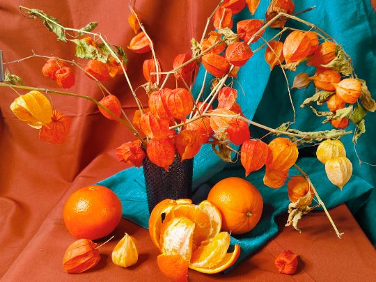
Physalis springs
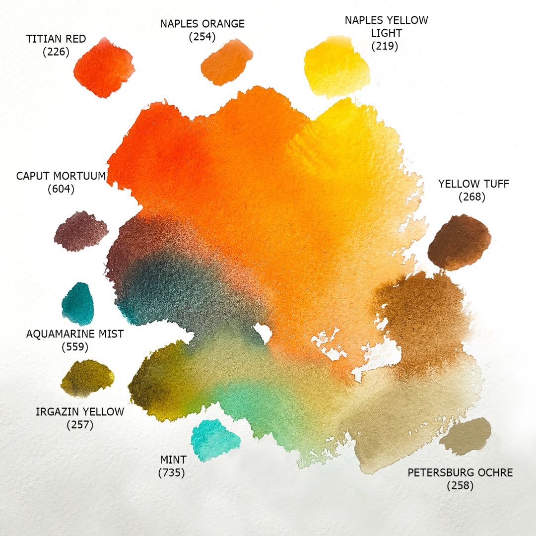
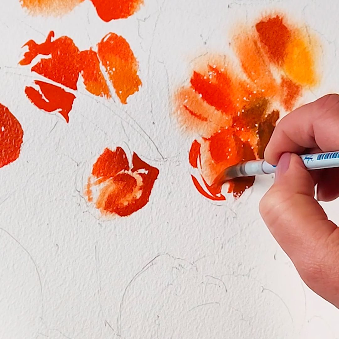
I start with sprigs of physalis. I get the main colour of physalis flashlights from the Titian Red + Naples Yellow Light mixture, sometimes changing the proportion in the mixture of the first or second paint, depending on the illumination. Titian Redis a mono pigment clear paint developed on the basis of Benzimidazolone Orange HSL pigment of excellent light resistance. It has a pleasant complex and saturated orange colour, moves very actively in water.
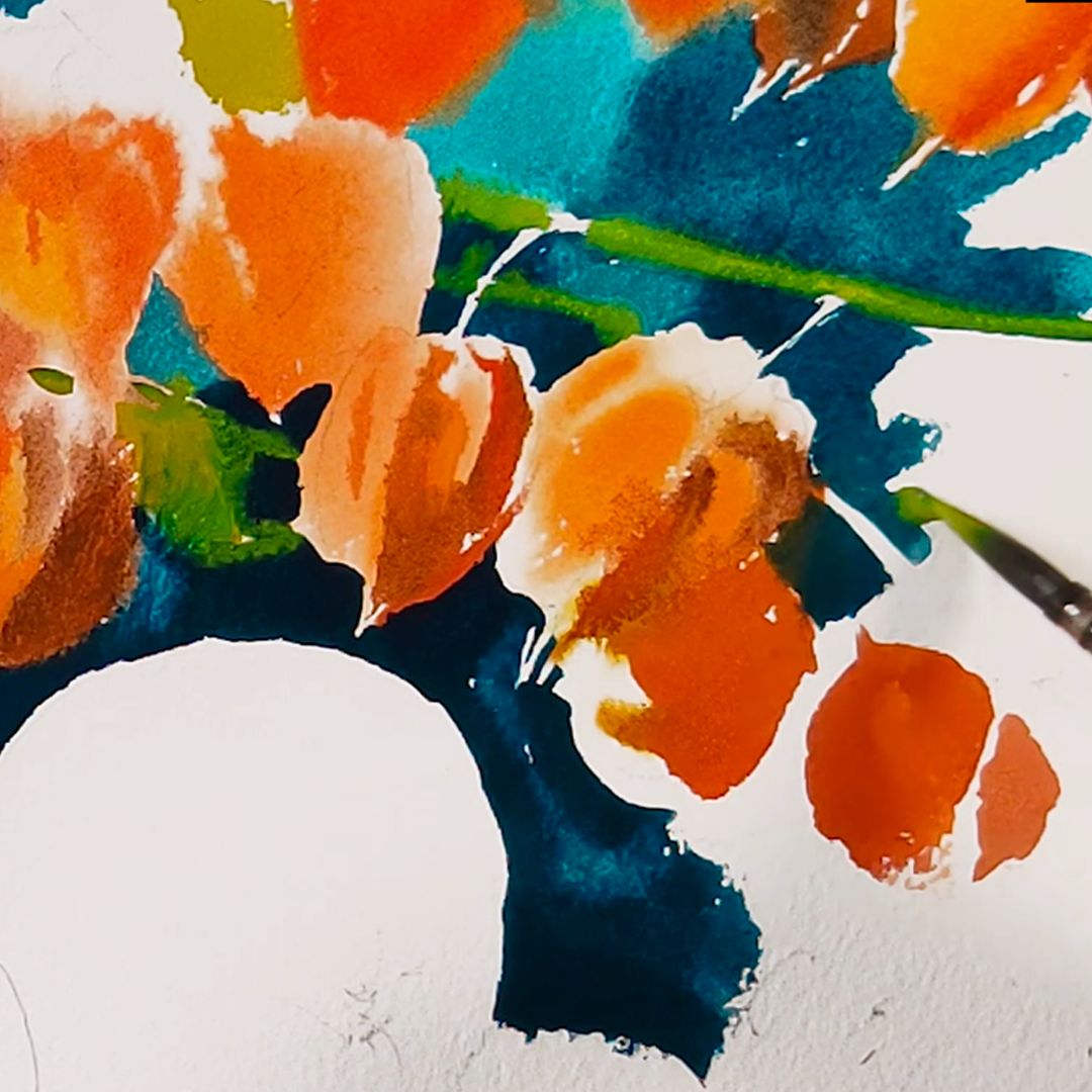
In the shadow part, I add Caput Mortuum to the mixture and get a warm brown tint with a slightly noticeable granulation effect. Adding Aquamarine Mist to the main mix, I get cold reflexes from turquoise blue drapery. Aquamarine Mist - a paint from a series of granulating colours, consists of two pigments: Ultramarine Blue (P.B.29) and Phthalocyanine Green BS (P.G.7). It has a saturated and bright turquoise colour and a pronounced granulation effect due to Ultramarine Blue particles, actively moves in water.
For springs with small leaves, I'll take the Irgazin Yellow + Mint mix for a muted green. Irgazin Yellow - monopigment, transparent, lessening paint, washes well from the surface of the paper, has a unique warm yellow-greenish tint. Made on the basis of the pigment of the same name, Irgazin Yellow with an excellent indicator of light resistance.
Mint is an opaque paint with a rich, soft, cold green hue, evenly applied to paper, giving a colourful layer of velvety and haze. Made from a mixture of pigments Phthalocyanine Green BS (P.G.7) and Titanium White (P.W.6). Due to the presence of whitewash in the composition, Mint is able to displace previously applied colours from paper, smoothly moving in their place, forming a unique texture.
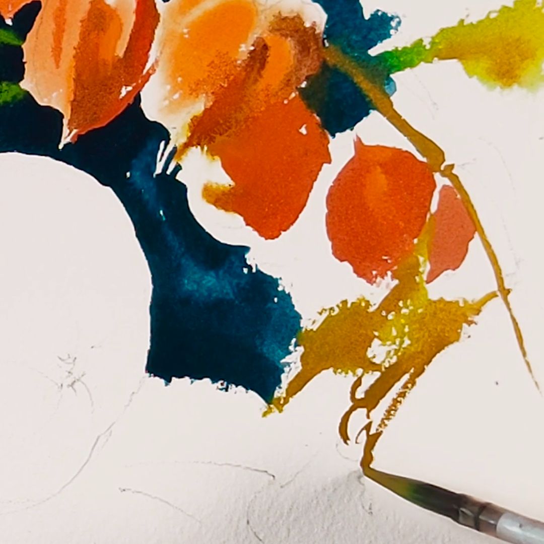
The leaves look yellowish in some places, so I add Yellow Tuff to the main mixture. Yellow Tuff is a new colour of the granulation series, despite two pigment designations, made of whole tuff - volcanic rock brought from Armenia. This is a transparent paint with a pleasant yellow-brown colour, which is darker and richer than the colour of ochre, and is also characterized by a rather pronounced granulation effect due to darker particles of minerals included in tuff. It moves well in water, spreading smoothly and granulating on the surface of the paper.
When the volume of the physalis flashlights are opened, I need to go to the background. Later, when the paint dries a little, I will finalize some details and harmonize the overall colour and tone solution.
Blue-turquoise drapery
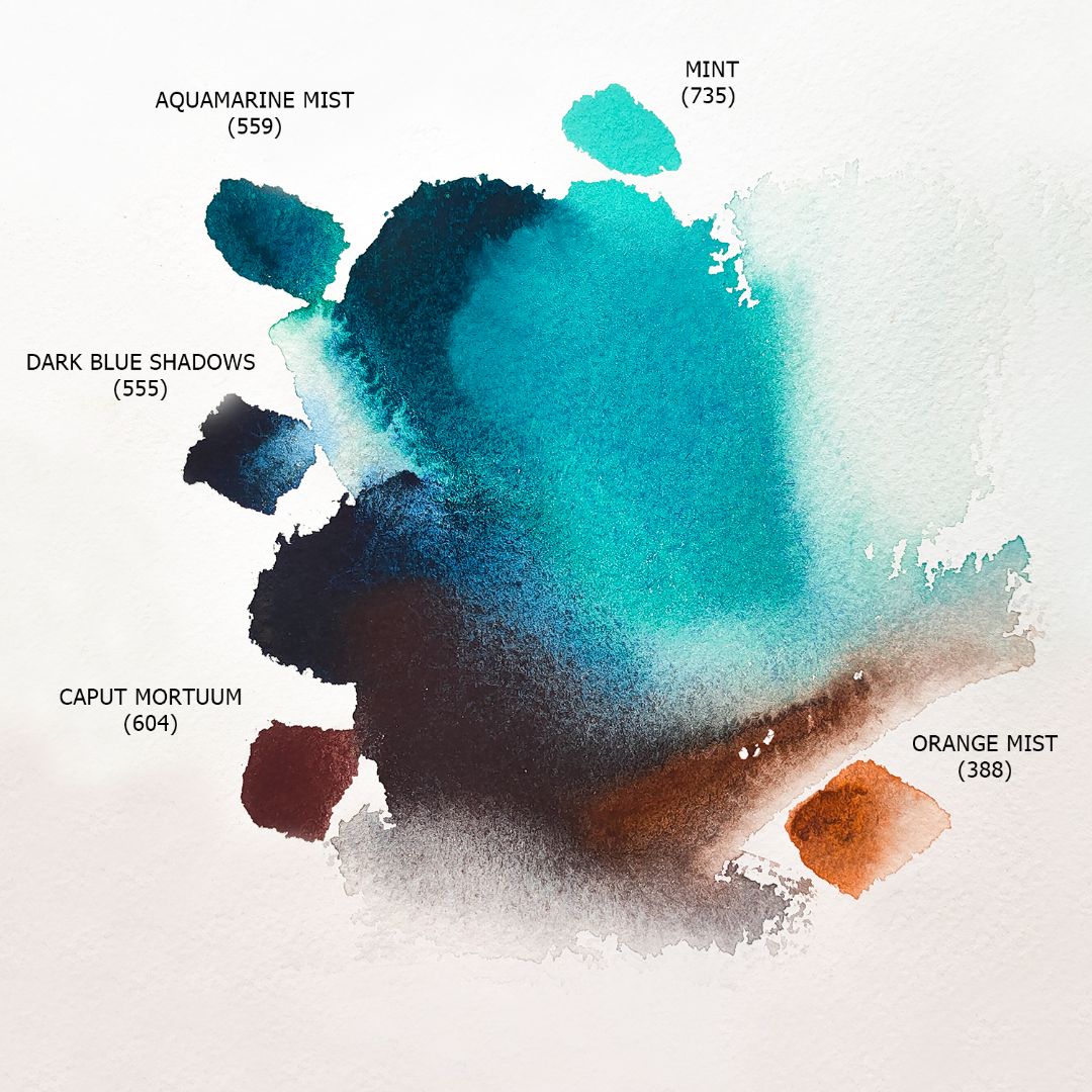

The main colour of blue-turquoise drapery is the mixture of Aquamarine Mist + Mint. This blend gives a soft, rich but slightly muted turquoise hue, just the one we need. Against the background of turquoise drapery, we also have a dark blue, almost black glass vase, but it is slightly noticeable in the shadow of a bouquet of physalis, so I will only designate it a little, but I will leave it part of the background so as not to distract attention from the main items. For vases and deep shadows, I take Dark Blue Shadows. This paint also belongs to the granulation series, developed on two pigments: Mars Black (P.Bk.11) and Phthalocyanine Blue (P.B.15: 6), has a dark blue, saturated colour and a strong granulation effect due to Mars Black particles, moves very actively in water. The soft turquoise colour of drapery in the light and the dark blue colour of shadows in total give us the blue-turquoise colour of drapery we need. I take a lot of paint on the brush, apply it to the sheet and allow it to mix freely on the surface of the sheet with the background paint already available, getting smooth transitions of the shape of the folds in the drapery. I closely monitor the contours of objects, carefully applying paint along the boundary of the contour without crossing them. When the background paint dries, I'll soften the hard boundaries of the background and objects a little with a wet brush, blurring the paint along the boundary of the contour so that the objects do not appear cut out, but become part of the still life space.
Orange-brown drapery
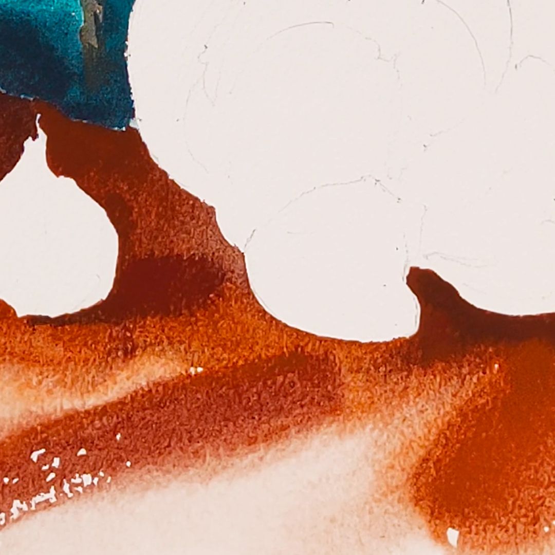
Before working on drapery, you need to soften the touches between the blue background and objects, you also need to moisten the paper at the drapery site to get soft smear spreads. The paint in place of the blue drapery has already dried up, but has not dried completely and its movement can already be directed, so with a damp clean brush I draw along the contour of objects, allowing the background paint to flow a little (and not spread, as it could happen in the case of very fresh paint) into the contour of objects and drapery. This is necessary to form one visual colour space of the still life, place objects in a common environment so that they do not seem cut out and indicate colour reflexes from the blue background on objects and drapery. Also, I constantly make small adjustments to already finished items, constantly comparing them with each other and completing the details in dried places.
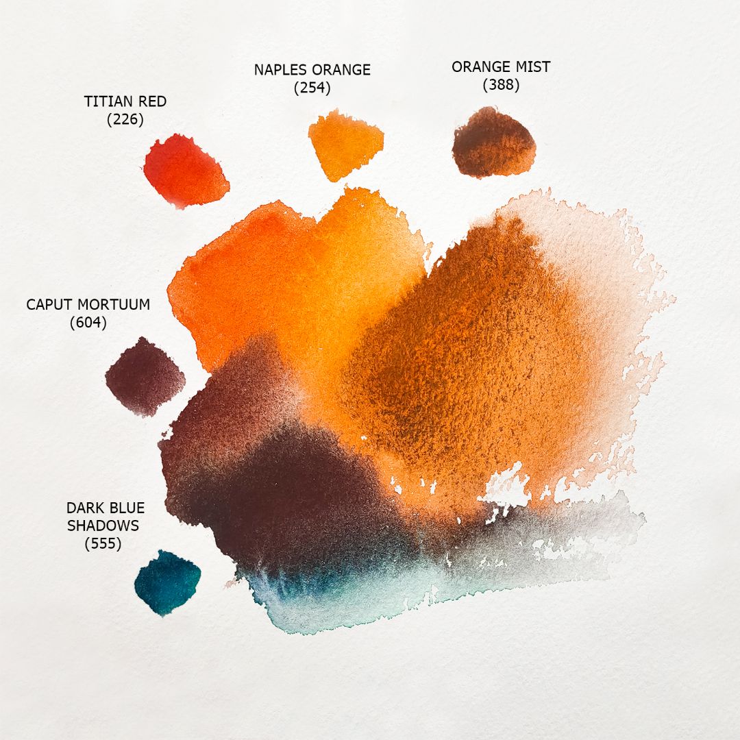
The main colour of the drapery is Orange Mist - another new colour in the granulating series of watercolours "White Nights." It is made from two pigments: Earth Black (P.Bk.8) and Benzimidazolone Orange (P.O.64). It is a mixture of natural inorganic ground pigment, black tuff, which is also often called "black ochre," which has excellent lightfastness and orange synthetic organic pigment with good light lightfastness. The black tuff provides the Orange Mist with a rather soft, compared to its synthetic Mars Black counterpart, granulation, giving no pronounced black flakes, and the mobile and saturated orange pigment provides a soft orange undertone. This paint opens well on the coarse-grained surface of the sheet, and there must be enough paint and water for the colour to flow freely over the surface of the paper. Also, having worked with cotton paper for a long time, I know that part of the colour will go from the surface of the sheet into the depths of the paper, and after drying, the overall colour will become less saturated, so I take the paint on the brush with a "margin" and boldly put it on the sheet. In general, working in the technique, alla prima is the main thing - this is not afraid of colour and give him the opportunity to spread on his own and reveal himself on paper, slightly controlling and directing his movement.
To the main colour of drapery - Orange Mist, I add Caput Mortuum and get a cold brown shade of halftones. For contrast and shadow depth, I add Aquamarine Mist to Orange Mist and take some particularly contrasting hits. This will emphasize the light-shadow game in still life and also give the necessary turquoise-blue reflex from drapery.
Oranges
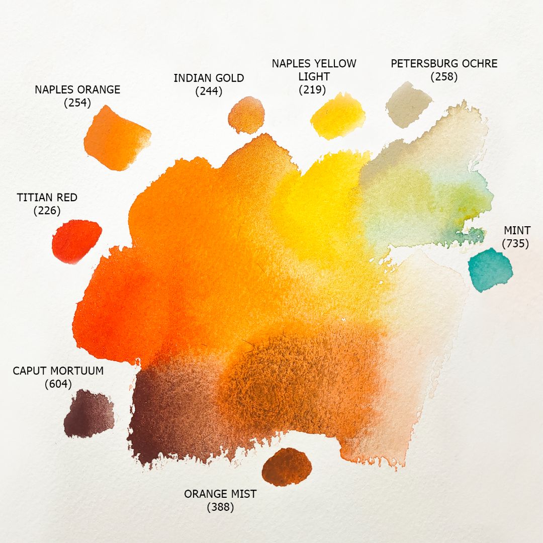
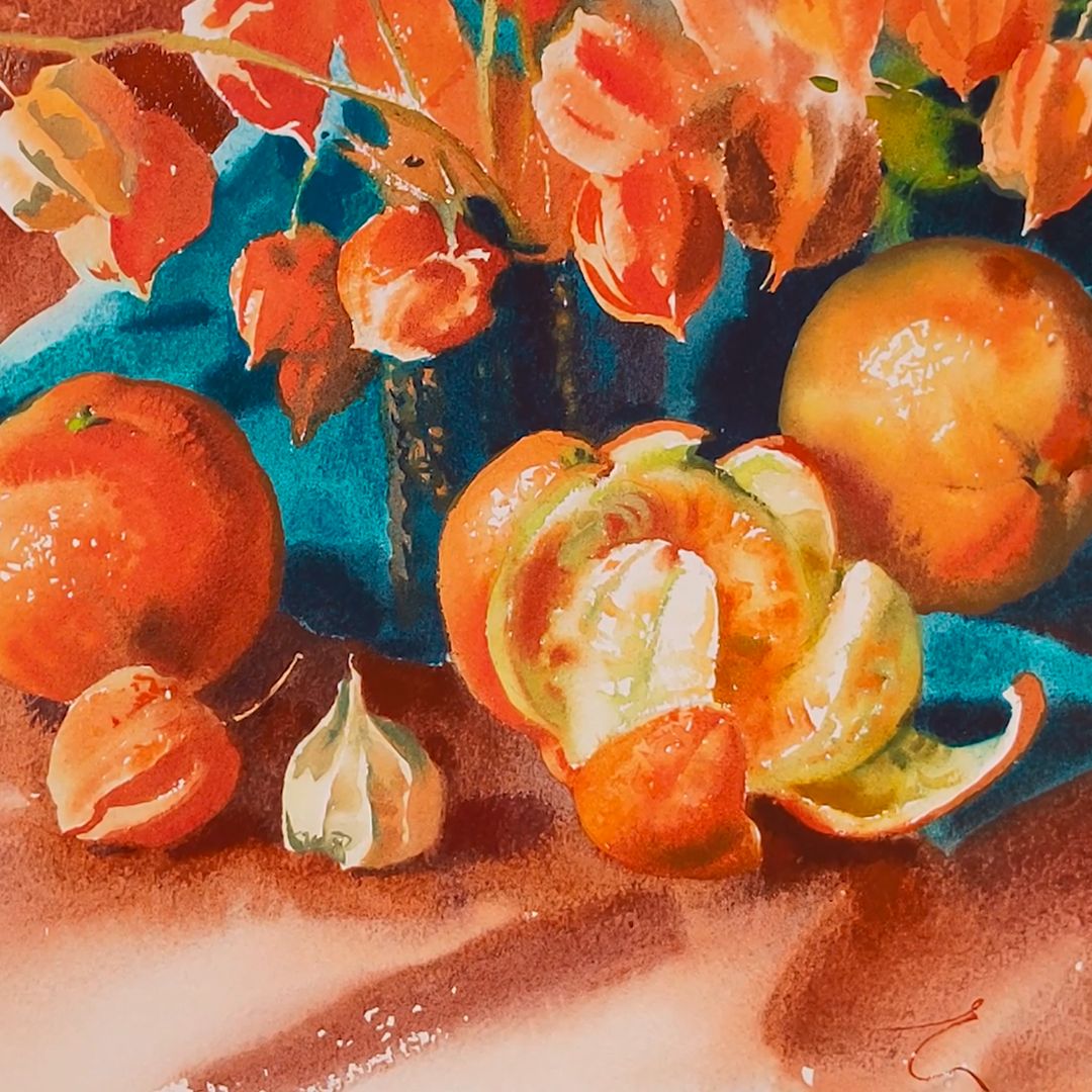
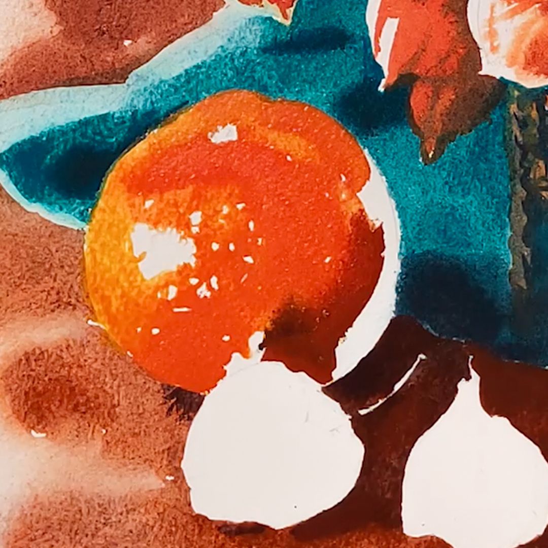
Right orange. The primary colour is a blend of Naples Yellow + Naples Orange. With the tip of my brush, I apply patterns of orange peel, leaving white spots - highlights. This orange has more light yellow, turning neutral at the glare, so there I take quite a bit of Petersburg Ochre. Petersburg Ochre has Titanium White (P.W.6), and has a soft pastel colour of neutral ocher colour. Like all dyes with the addition of whitewash, it is able to actively displace neighboring colours, forming smooth transitions. In penumbra I add Titian Red, and in shadows Caput Mortuum and Aquamarine Mist.
Left orange. The main colour is a mixture of Naples Orange + Titian Red. The left orange has more orange saturated colour, so the main mixture of colours is orange, turning into a brownish-orange hue in the shadows due to the addition of Caput Mortuum, and only at the very edge, a light yellow hue appears on the left - Naples Yellow Light.
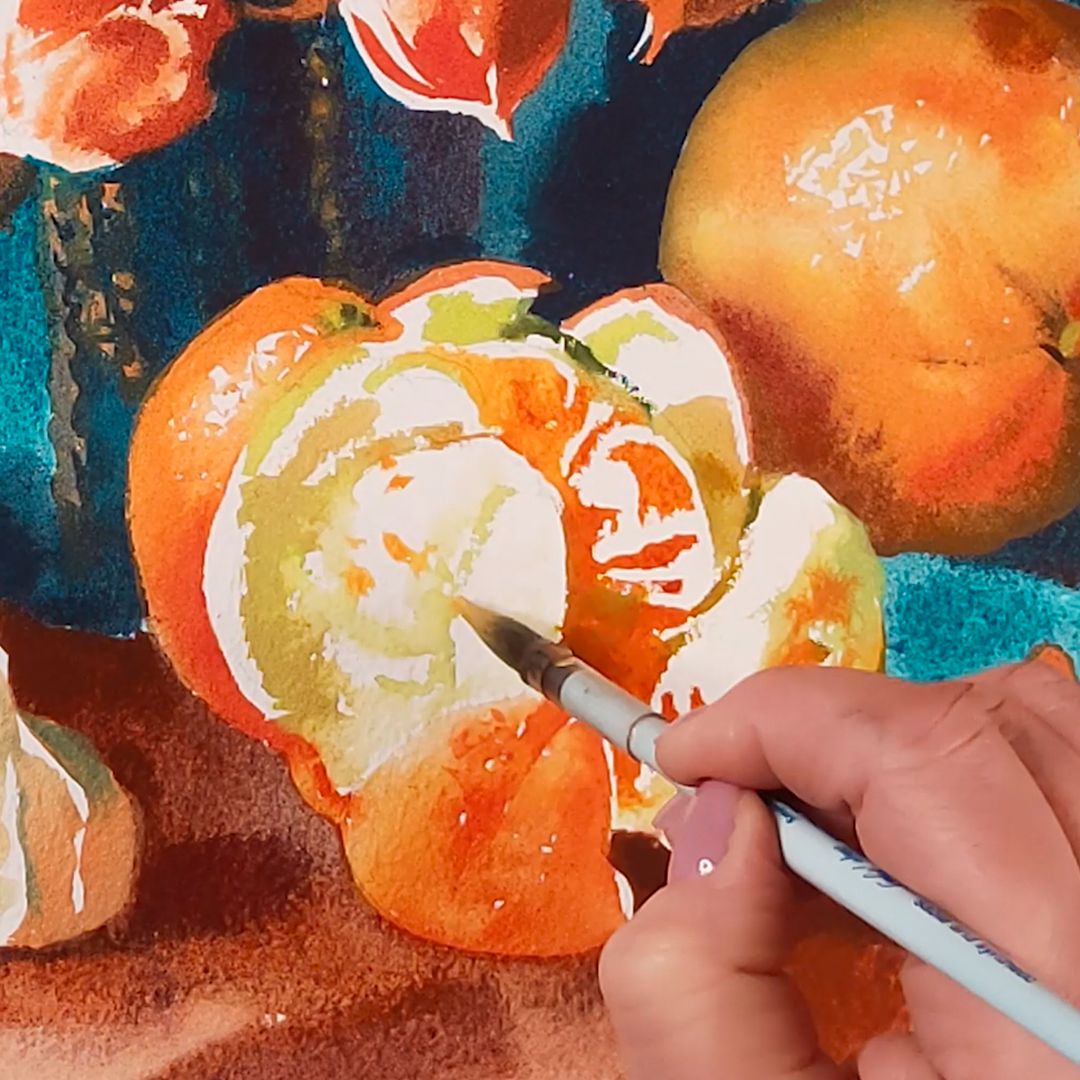
Half-peeled orange. The last central object of the still life is a half-peeled orange. It's a pretty difficult task to map the tenderness of the white skin and the juicy flesh encased in the semi-cracked skin, while preserving volume and reflecting depth. I'll start with the outer skin. The main colour is a blend of Naples Orange + Titian Red with the addition of Caput Mortuum in the shadows. I closely follow the shape: shadows and light forming the volume according to the principle of the ball, maintaining illumination on the left side. Moving on to the orange pulp, I'm a light mixture of Petersburg Ochre + Mint, the tip of the brush, slathering a pattern of delicate light skin on the orange flesh, leaving white pieces of paper. I add a little Naples Orange + Titian Red mixture, as juicy flesh is visible through the translucent skin. The pulp colour is a blend of Naples Orange + Titian Red with the addition of Caput Mortuum in the shadows.