yuri Akopyants. About the artist
I began to seriously engage in watercolour painting at the age of 30. Everything happened by chance. Before that, I came into contact with art at different times throughout my life and even went to art school as a child. At that moment it was not something important to me. Many years have passed, with the advent of the Internet and many sources of information, I saw watercolour in a completely different way. I saw freedom. I wanted to try again. I looked at the works of Joseph Zbukvic (undoubtedly, the romanticism of Joseph Zbukvic wins all hearts), David Taylor, Edward Seago, Alvaro Castagnet and I really liked what I saw. This forced me not to stop my studies and get up again and go to the open air. Thanks to the available materials on the Internet (small video tutorials, reviews, photographs), I was able to improve. When I was a child in art school, there was no Internet.
CITYSCAPE. ST. ISAAC’S CATHEDRAL
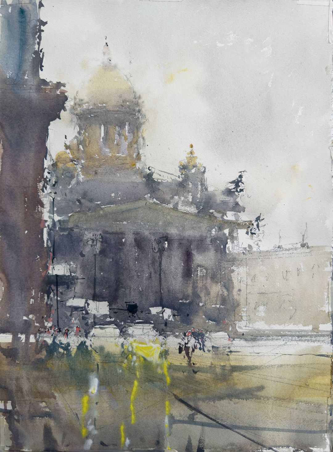
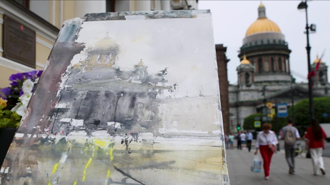
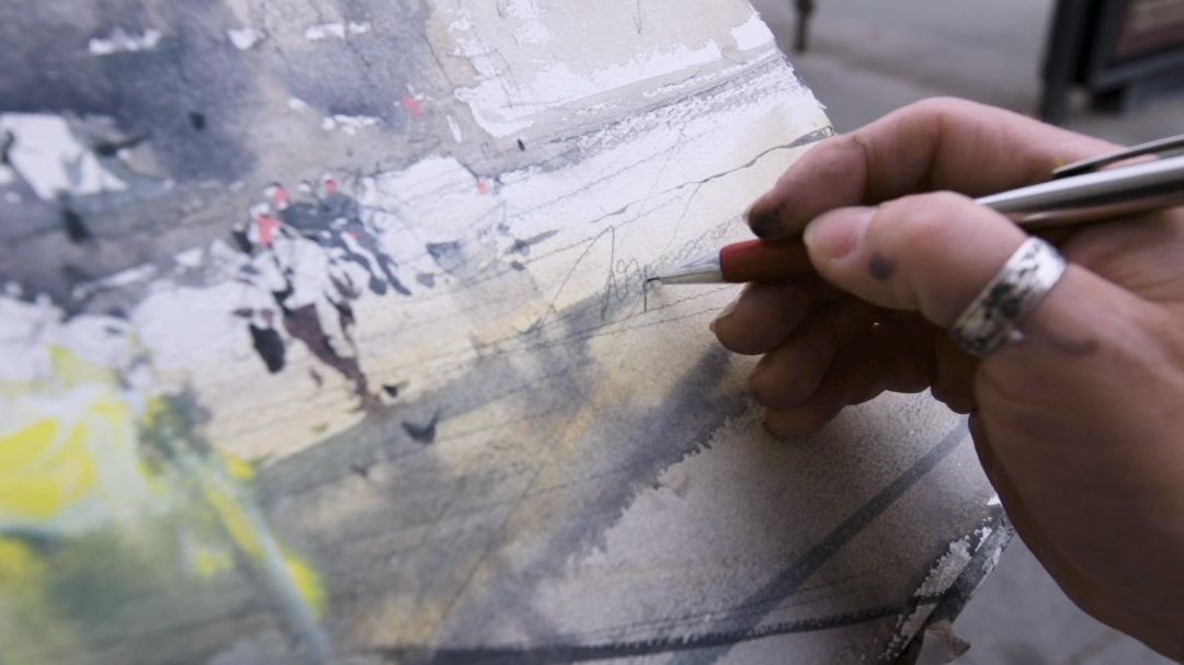
Today I decided to paint a view of St. Isaac's Cathedral in St. Petersburg. To start, I do a light drawing. Pencil lines are very important, I consider them part of painting. I like the pencil lines to stay. The rough surface of the sheet together with the pencil lines create a unique design, which is then covered with a layer of paint. This gives the work some unique charm. Having finished with the drawing, I move on to painting.
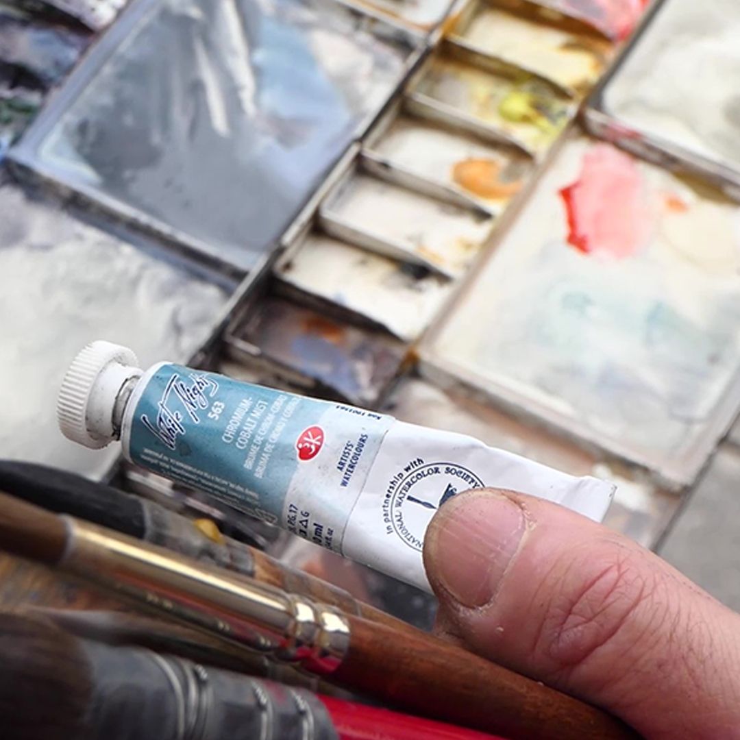
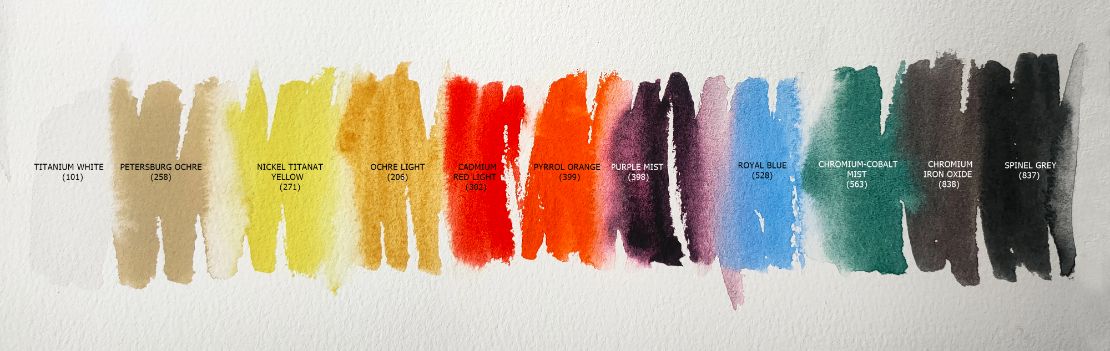
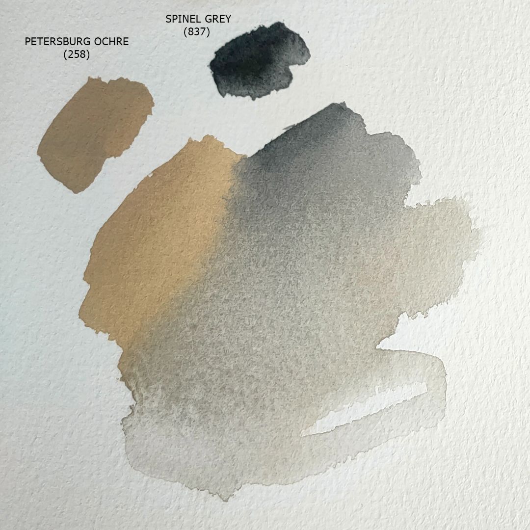
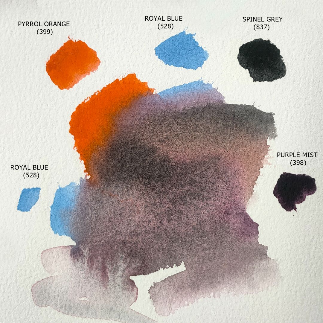
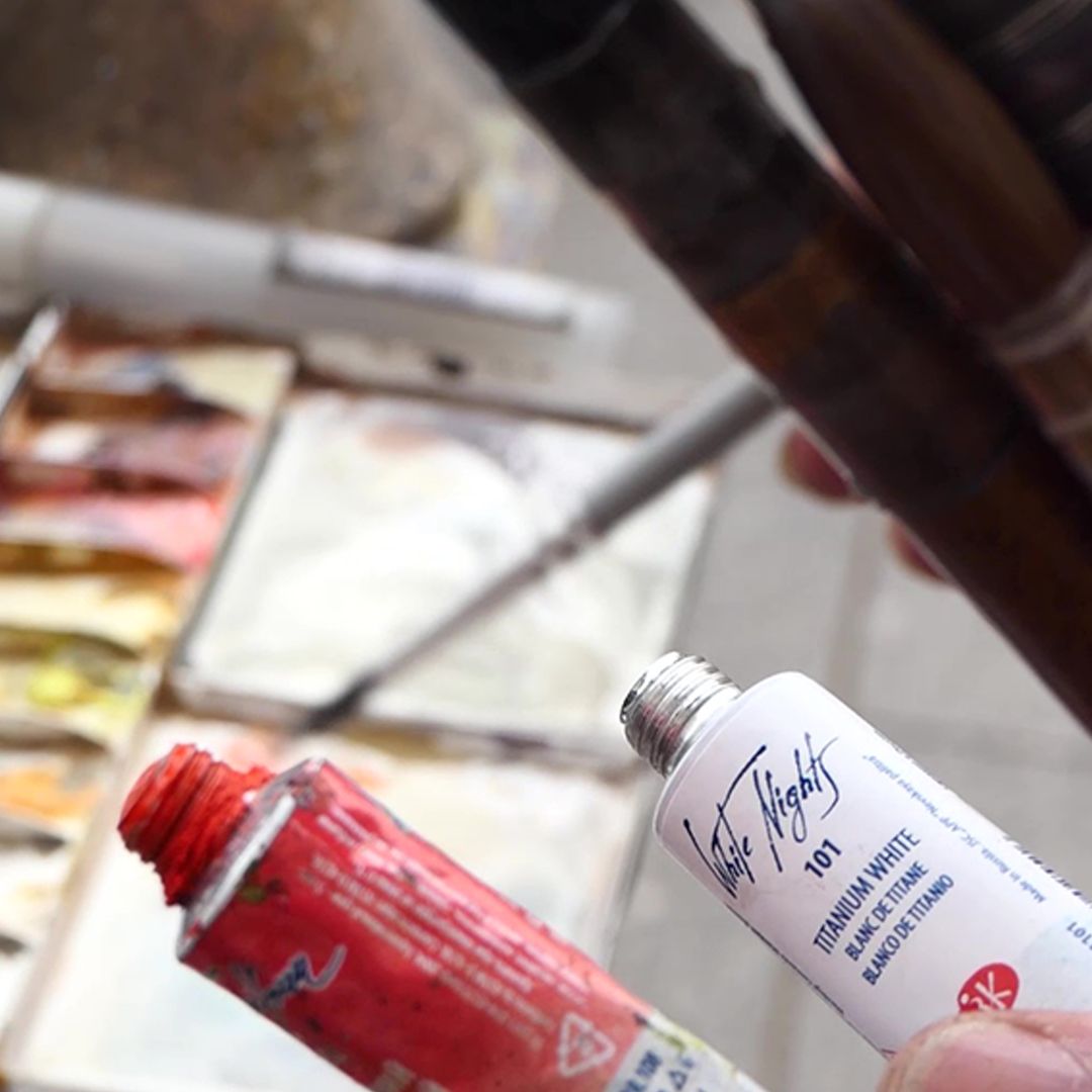
For the palette I chose 11 colours: 1. 101. Titanium White (P.W.6 *** ■◮), 2. 258. Petersburg Ochre (P.Y.42, P.Bk.8 *** ■△), 3. 271. Nickel Titanat Yellow (P.Y.53 *** ■△), 4. 206. Ochre light (P.Y.43 *** ■△), 5. 302. Cadmium Red Light (P.R. 108 *** ■△ G), 6. 399. Pyrrol Orange (P.O.73 *** ◨◮), 7. 398. Purple Mist (P.G.50, P.V.19 *** ◨△ G), 8. 528. Royal Blue (P.B.28., P.W.6 *** ■◮), 9. 563. Chromium-Cobalt Mist (P.B.28, P.G.17 *** ◨△ G), 10. 838. Chromium Iron Oxide (P.Br.29 *** ◨△ G), 11. 837. Spinel Grey (P.Bk.28 *** ◨◮ G).
Sky
Dome and bell towers
drum-dome
Colonnade under the portico
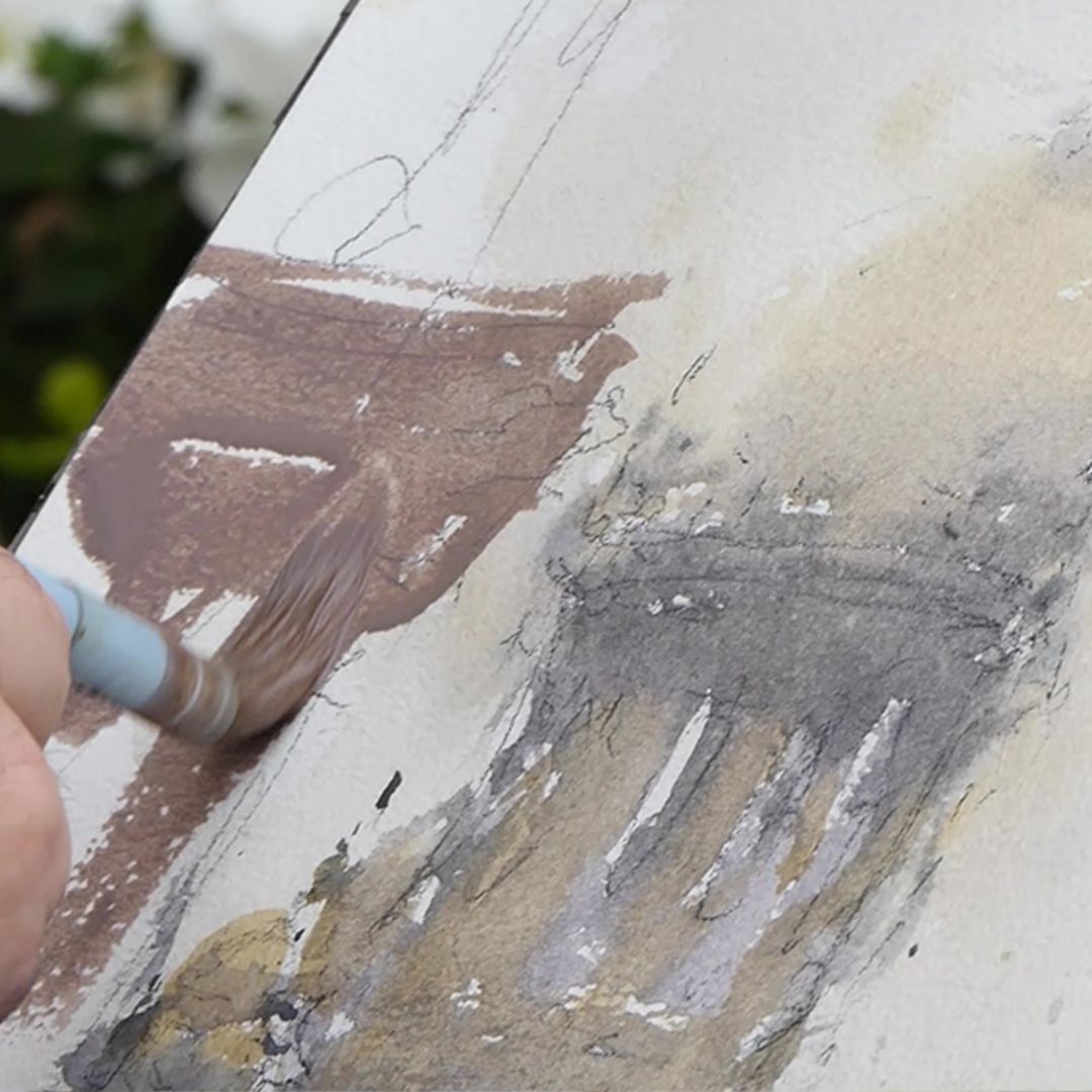
Building left
Building right
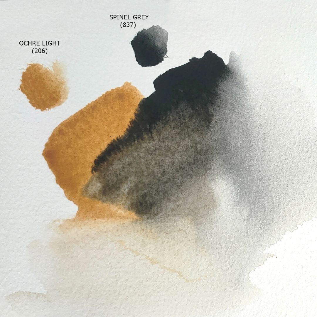
I work in a restrained range of colours, on nuances of grey mixtures of varying density and properties with a small inclusion of colour. I like complex, nuanced shades, using pure colour in small quantities for highlights, reflections or other accents. On the palette, all the colours are mixed in principle, so it’s difficult for me to give clear recommendations on shades and proportions of mixtures, but I’ll try. I place the sheet on the pad and secure it with paper tape. I work on dry paper. I add the required amount of water along with the paint and use a spray bottle. First, I fill in the sky. I take a thick round brush, wet it well so that water drips from it and apply Ochre light to it. I go through my work with smooth strokes. I take Spinel Grey and add it to the top right to indicate light cloudiness. The result is a transparent fill with a soft granulation effect. Ochre light conveys warm sunlight, and Spinel Grey conveys a light, cold haze of clouds.
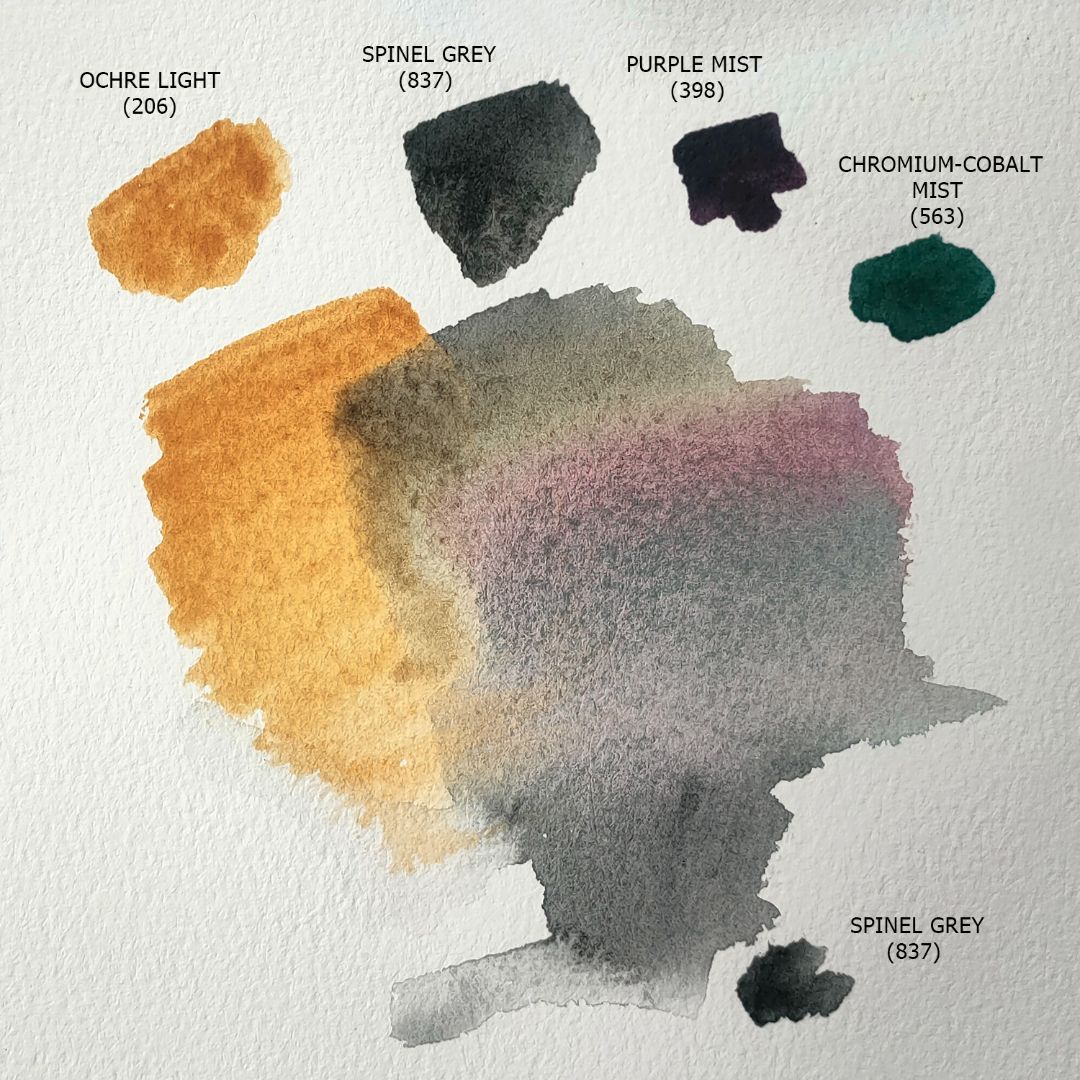
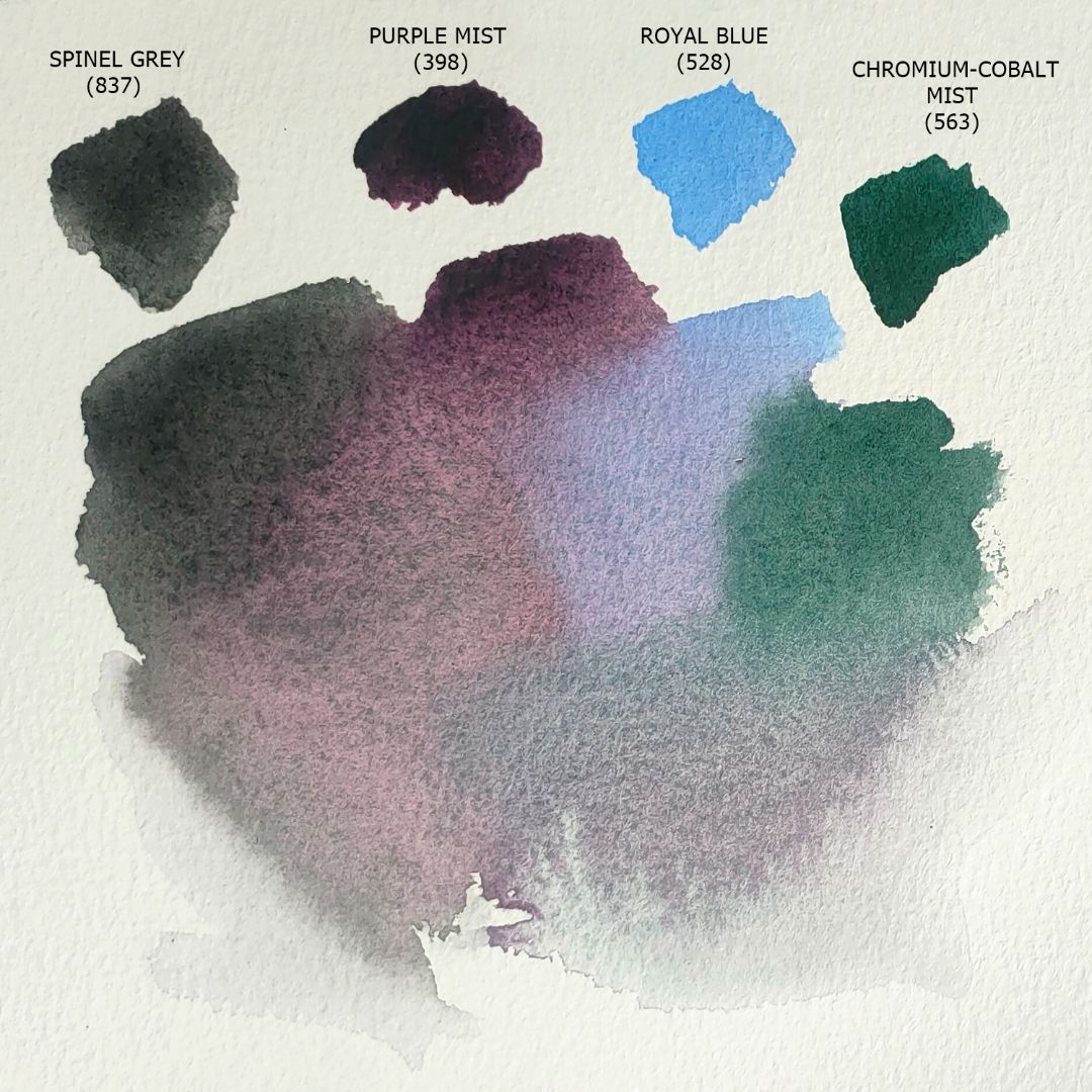
Next, I move on to the dome of the cathedral and the small domes of the bell towers. I take Ochre light, but add less water, so the paint adheres more densely, giving the appearance of gilding the domes. I take a mixture of Ochre light + Spinel Grey + Purple Mist and some Chromium-Cobalt Mist and create volume in the domes with the shadows. Next, with a mixture of Spinel Grey + Purple Mist + Royal Blue with a small addition of Chromium-Cobalt Mist, I go over the colonnade of the dome drum, taking into account the incident light and shadows. I do not recalculate all the elements of architecture, but only reflect the main details and maintain general proportions. I fill everything up to the portico of the cathedral with the same mixture, but with a greater inclusion of Spinel Grey. The portico has amazing bronze high reliefs that have a cool green tint due to the patina, so I increase the proportion of Chromium-Cobalt Mist in the mixture and add a little Ochre light.
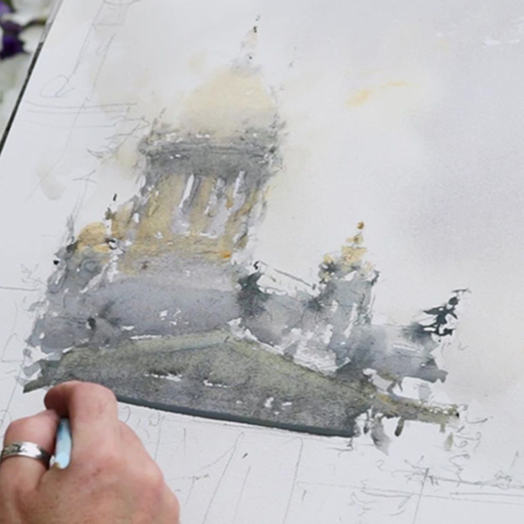
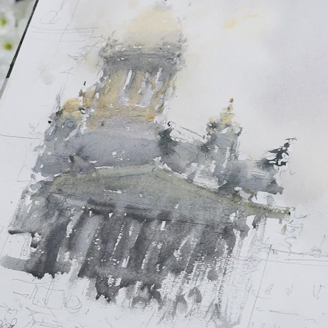
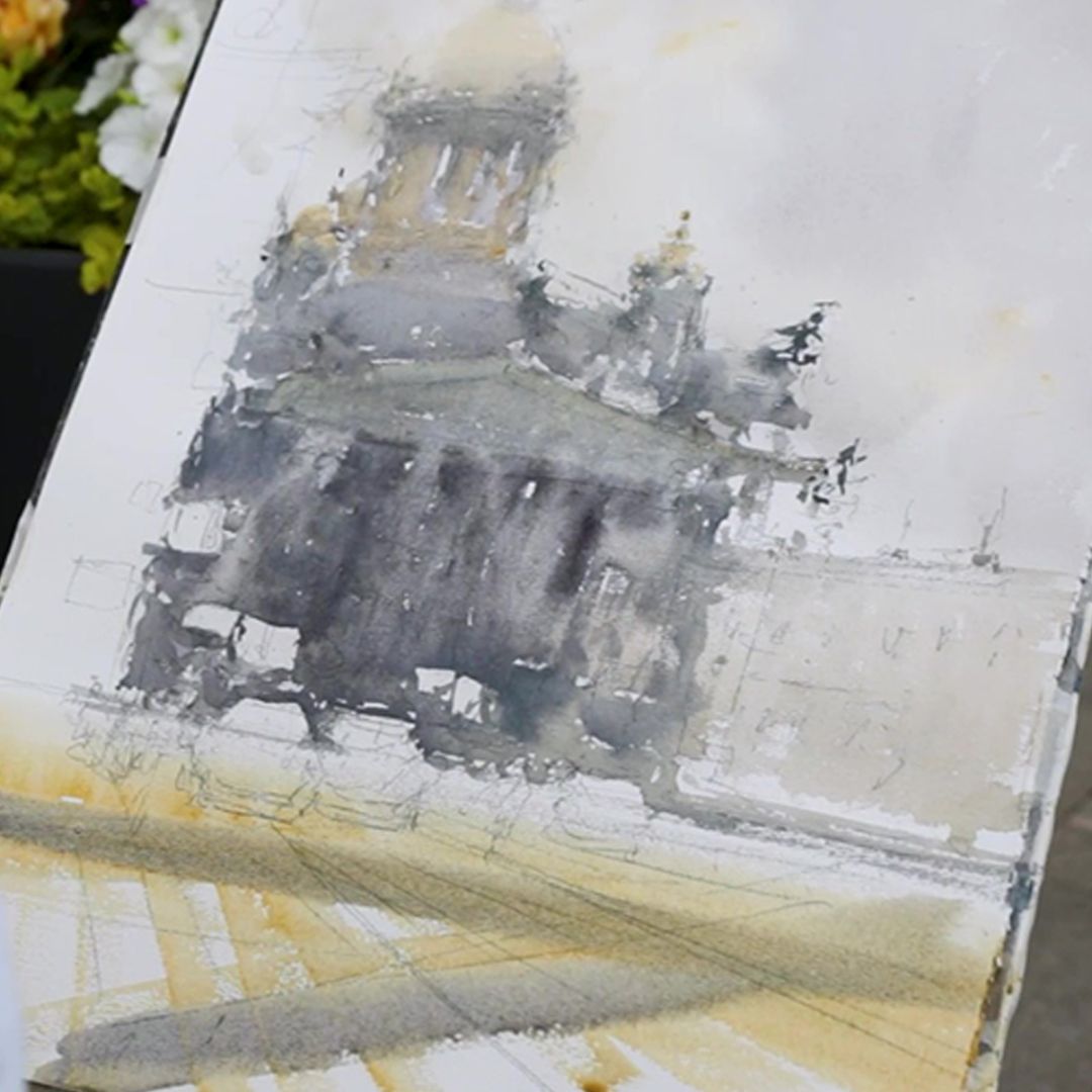
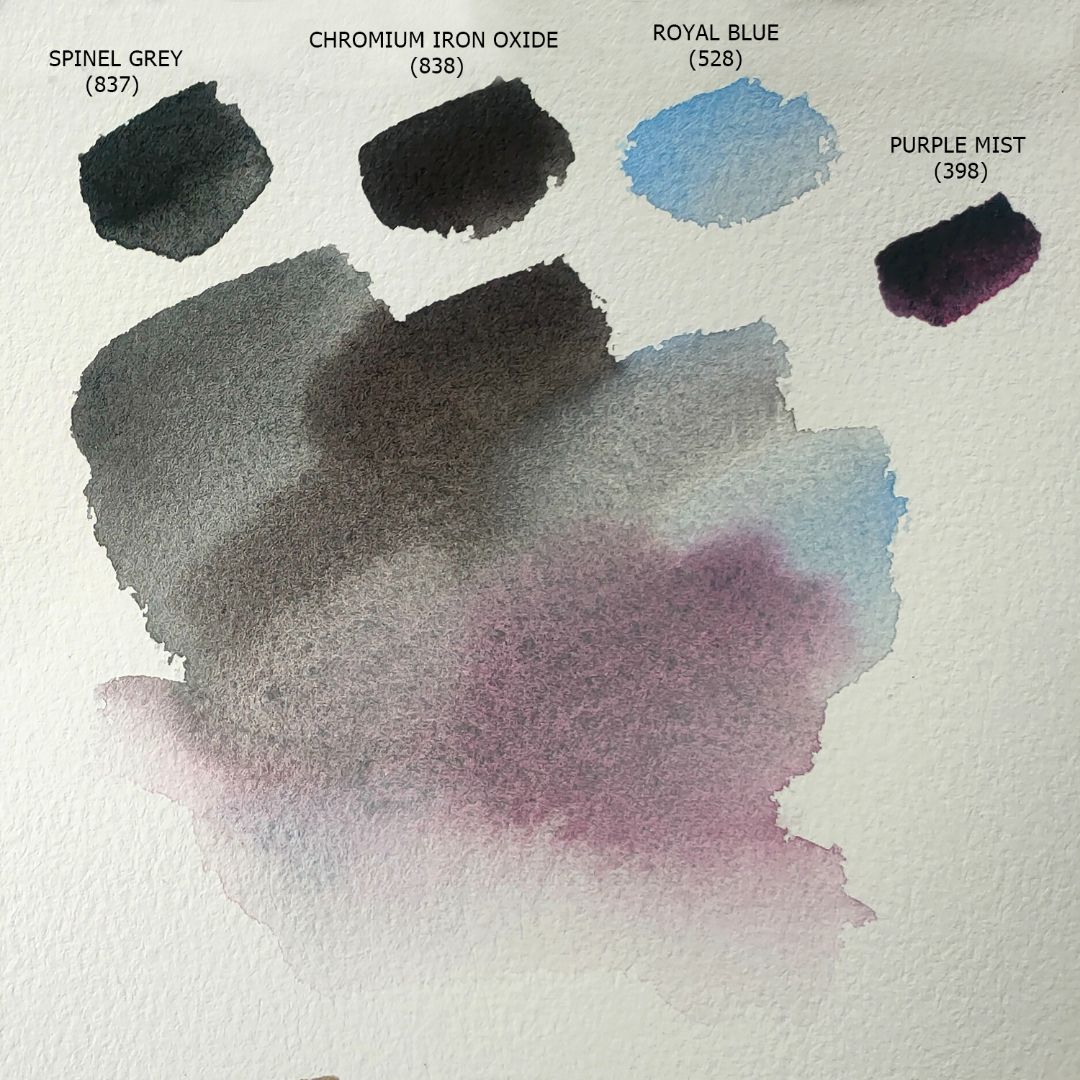
The colonnade under the portico is in deep shadow, so I thicken the tone. I fill with a mixture of Spinel Grey + Chromium Iron Oxide + Royal Blue + Purple Mist, applying the paint to the shape of the columns and shadows. I make the shadows darker by increasing the proportion of Spinel Grey in the mixture. Unlike black paints, Spinel Grey mixes well with all colours without clogging them; the mixture applies delicately, remaining transparent and soft.
I fill the background on the right with a mixture of Petersburg Ocher + Spinel Grey. There is a building there, I just outline it a little in a light tone, leaving the pencil lines to work.
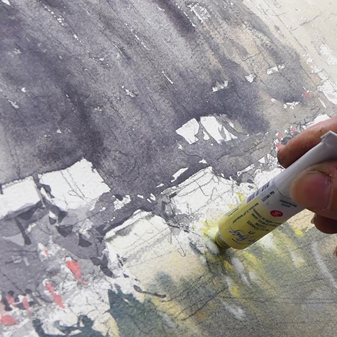
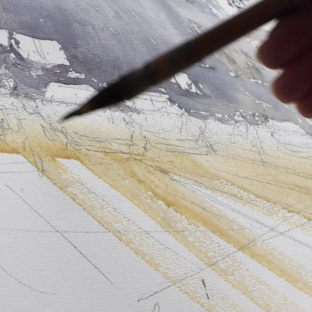
Then I go lower and move to the boulevard and the road in front of the cathedral. When building a scene, I ignore objects that distract from the main thing. In our case, the trees and bushes have disappeared into the background atmosphere, and I just leave some noise, pieces of white paper, without drawing much attention to it from the viewer. I take Ochre light and fill in with broad strokes. Then I take a mixture of Spinel Grey + Purple Mist + Chromium-Cobalt Mist and add it in strokes to Ochre light. Strokes indicate the direction of traffic and create a sense of perspective.
Having almost finished with the center of the composition (there is some detail left, but this can be done when the paper dries a little), I move on to the building on the left.
To the left of the cathedral there is a corner of a high dark one. I take a mixture of Pyrrol Orange + Royal Blue and apply broad strokes to the shape of the building, add Spinel Grey + Purple Mist in the shadows and a little more Royal Blue for cool reflections.
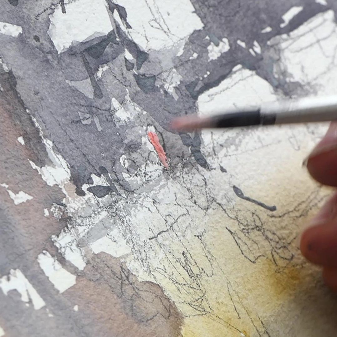
The central part of the leaf has dried out a little, so I move on to the details. I use a mixture of Cadmium Red Light + Titanium White to mark people's faces. Using a mixture of Royal Blue + Spinel Grey, I outline human figures and city transport with a thin brush. Bright accents Nickel Titanat Yellow and Titanium White reflect glare and reflections from the bustle of the city. And once again I draw in the shadows and apply dark graphic lines in the direction of movement, uniting everything into one urban, rather chaotic and fussy space.