Watercolour Sunset
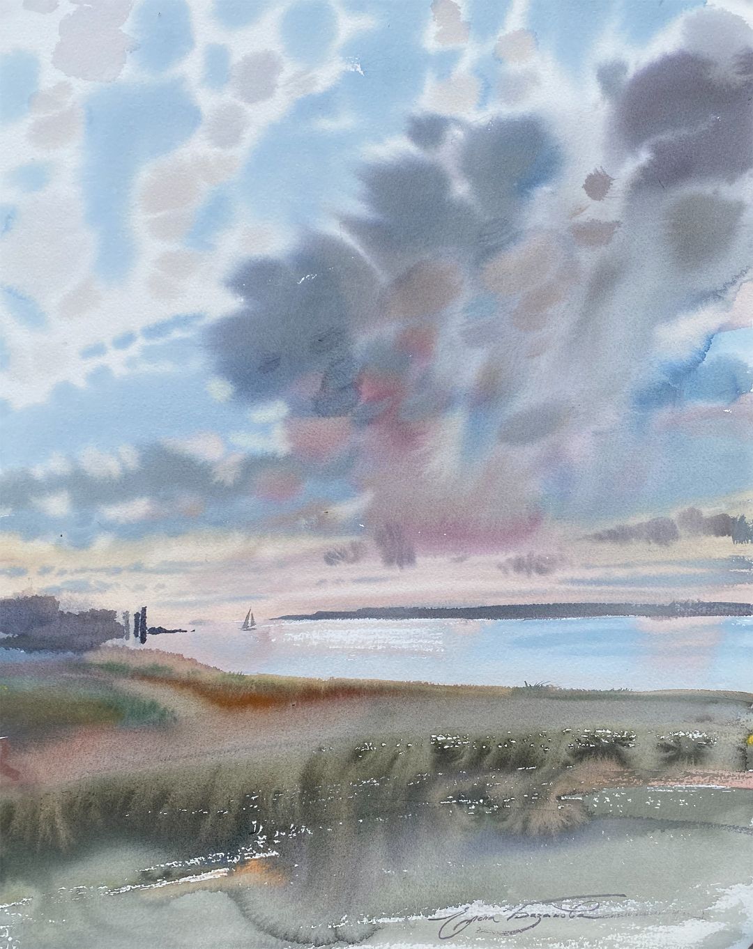
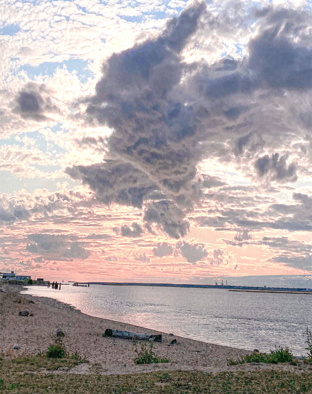
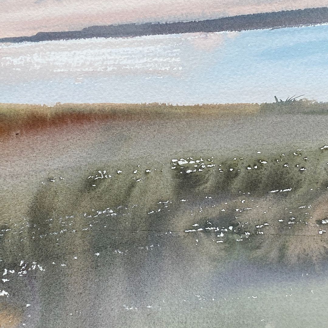
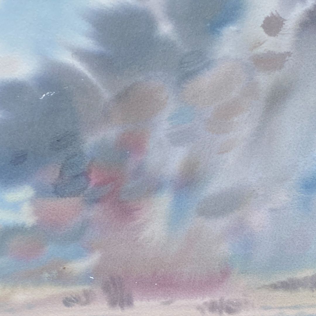
I chose a place on the embankment of the Gulf of Finland on the outskirts of the city. A view with a wide horizon and a high sky filled with clouds. The rays of the setting sun flood everything with a soft warm light. The light of the setting sun is reflected from the upper light clouds and breaks through the heavier low clouds, so the upper clouds look brighter and whiter, because they are well lit, and the lower ones are darker, because they are in the counter-illumination. At the horizon, the sky is orange-pink, above – golden-yellow, and even higher blue with purple tints.
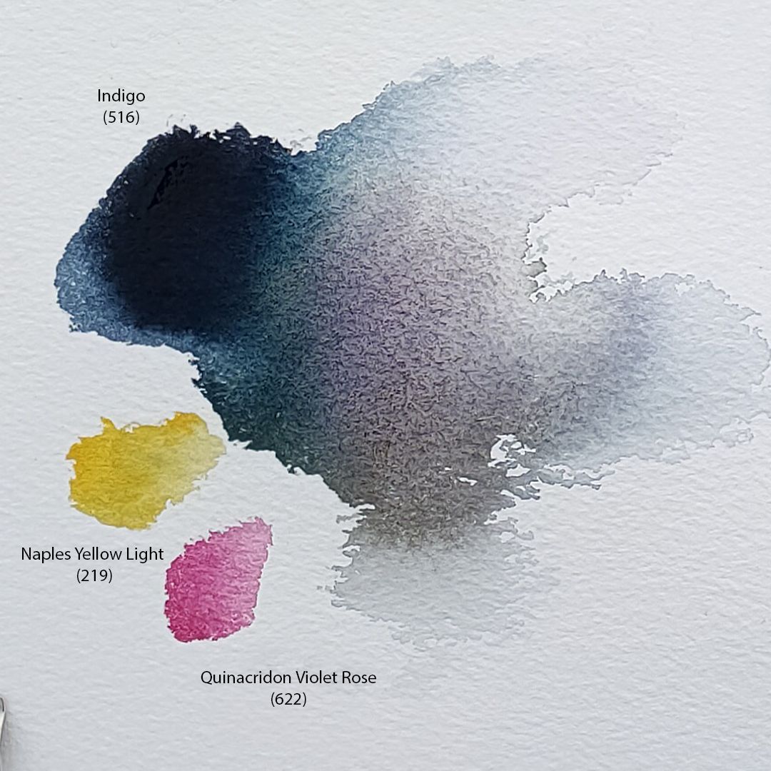
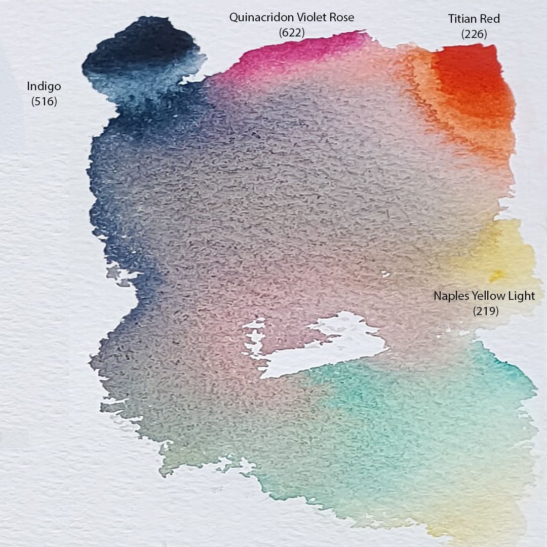
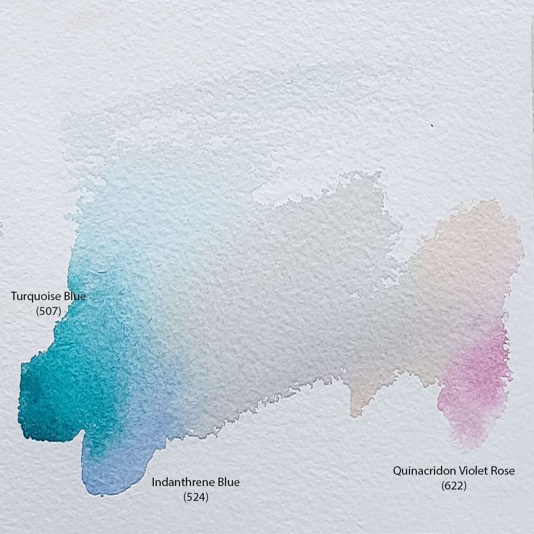
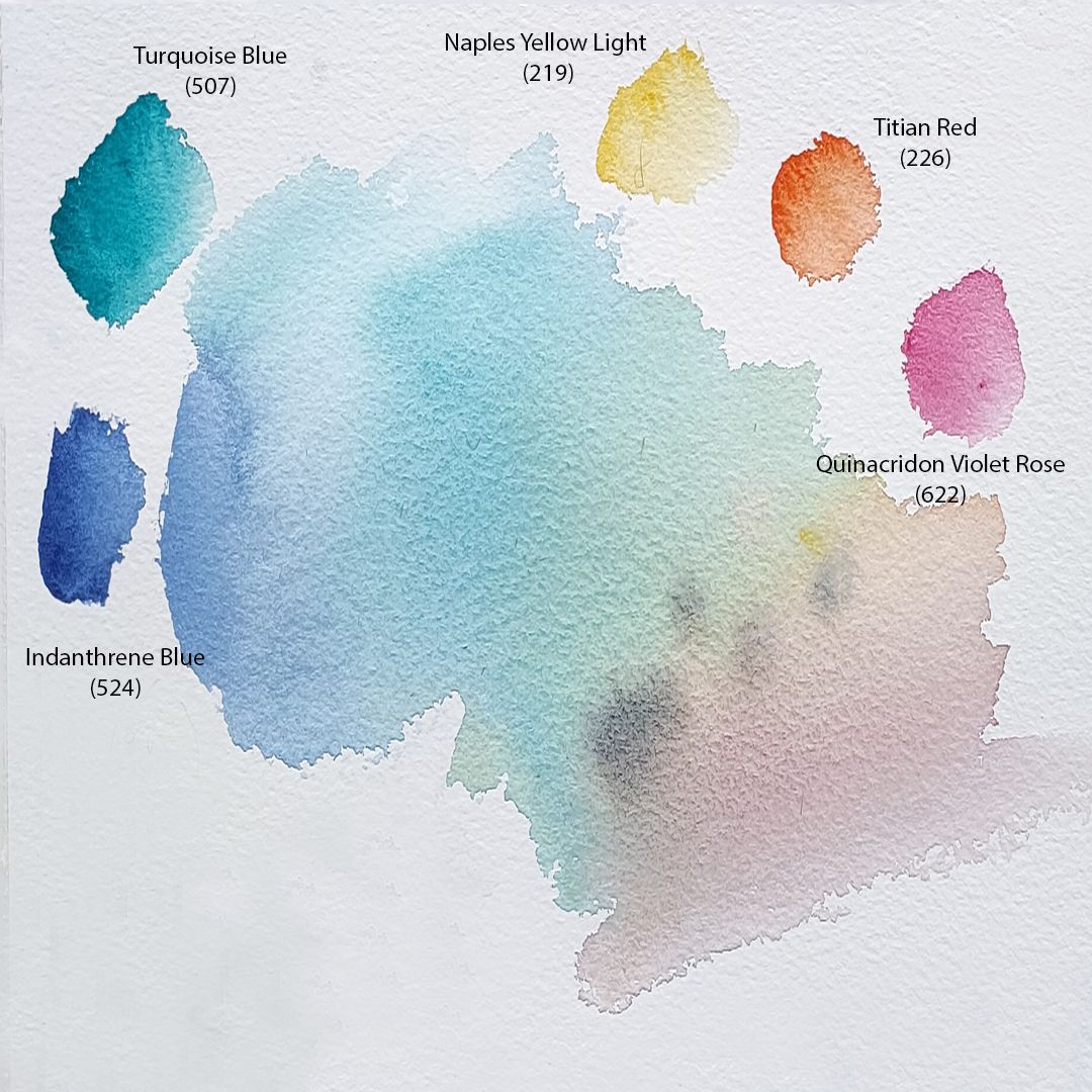
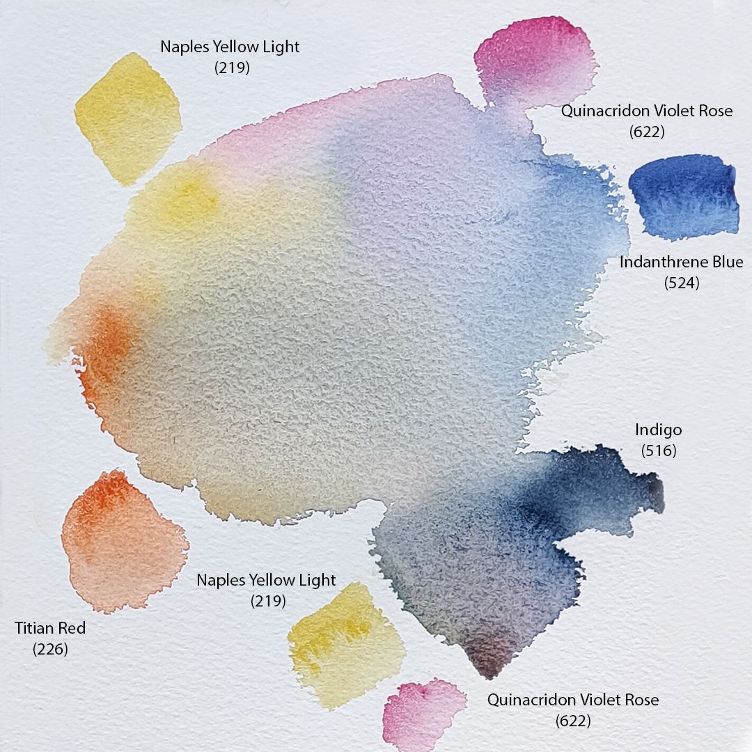
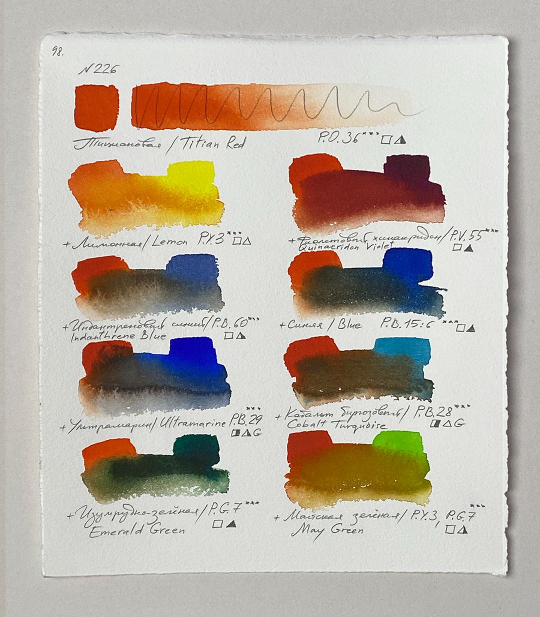
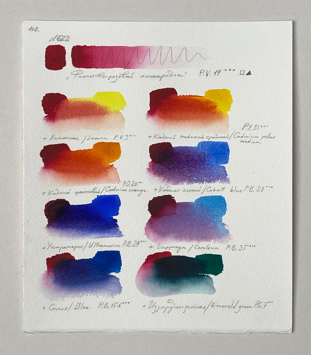
For the palette I chose 6 colours: 219. Naples Yellow Light (P.Y.216 ***■∆), 226. Titian Red (P.O.36 ***□◮), 622. Quinacridon Violet Rose (P.R.122 *** □▲), 524. Indanthrene Blue (P.B.60 *** □◮), 516. Indigo (P.Bk.7, P.B.15, P.V.23 *** ◨▲), 507. Turquoise Blue (P.B.15:3, P.G.7 *** □▲).
clouds
coast
water
upper part of the sky
sky
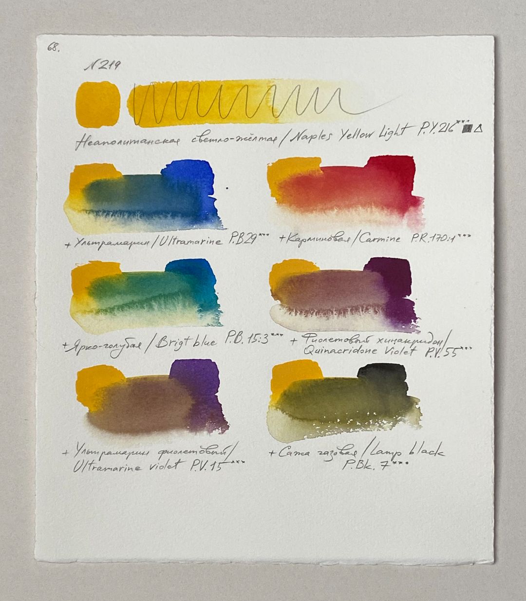
1. 219. Naples Yellow Light (P.Y.216 ***■∆)
Adds a soft pastel yellow colour to the palette. It works perfectly in the ala-prima technique, in painting landscapes, bouquets of flowers, and the human body. The colour has opacity and pastel softness, without the content of white in the composition. Mixed with Titian Red, warm golden-orange shades are obtained, and mixed with Quinacridone Violet Rose, cooler golden-pink colours are obtained.
2. 226. Titian Red (P.O.36 ***□◮)
Transparent paint, a pleasant muted orange colour. Enriches the palette in complex colour transitions of sunset painting. It gives interesting shades in mixtures, goes well with paints of a similar colour group, also in mixtures with transparent blue, purple and turquoise colours.
3. 622. Quinacridon Violet Rose (P.R.122 *** □▲)
Transparent paint that expands the palette of cold reds. Gives good pure colours in mixtures. Allows you to get noble shades of different purple and purple mixed with blue. Mixed with Neapolitan light yellow, it gives a soft golden-pink shade of the sunset sky.
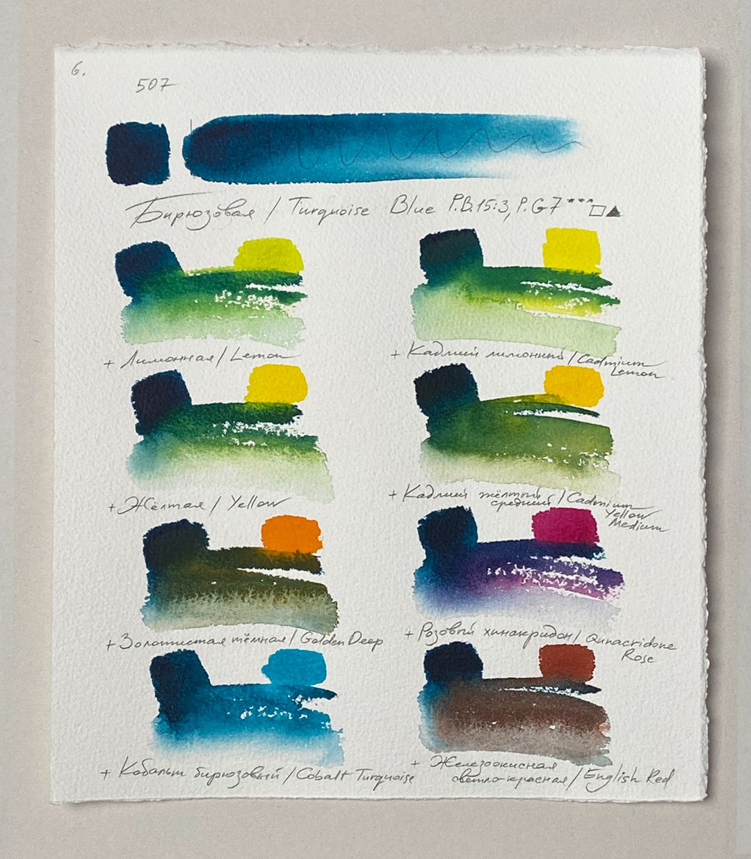
6. 507. Turquoise Blue (P.B.15:3, P.G.7 *** □▲)
One of the most complex shades of green, muted with a cold undertone. In mixtures with Petersburg Ochre or Yellow Stuff gives warm shades of green, and when mixed with Hematite Mist or Blue Shadows, pure cold shades are obtained. Lightfast, opaque, easily washed off with water, granulating.
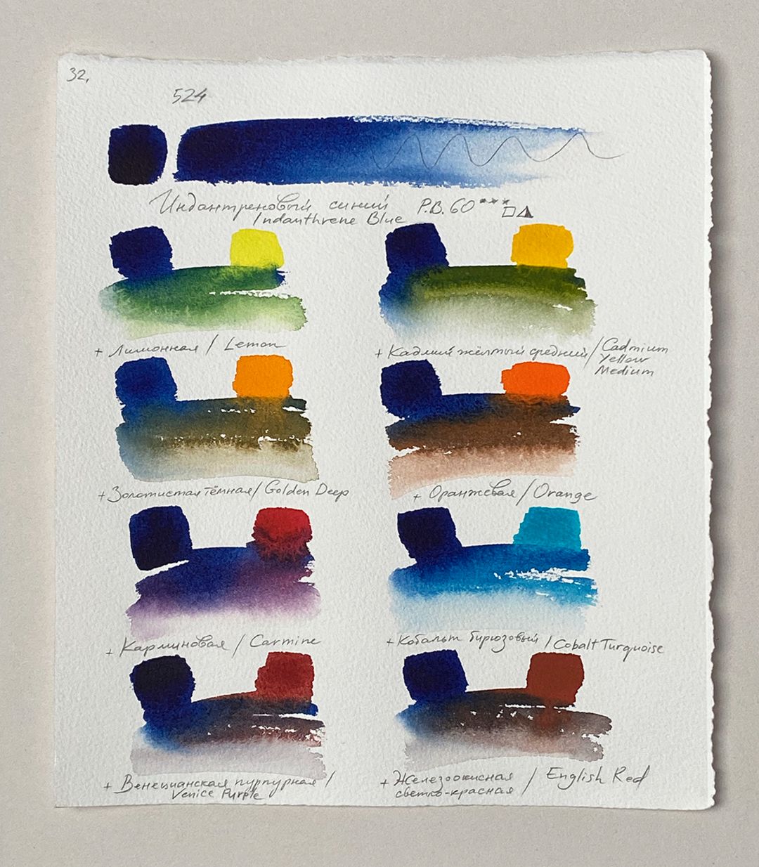
4. 524. Indanthrene Blue (P.B.60 *** □◮)
Light yellow colour with a cool undertone, soft shade and velvety texture. A unique colour that is combined with the entire palette and is present in every detail of the landscape. It is combined with everything else. Complements each colour, as if it highlights the whole composition and enlivens it. Lightfast, opaque, easily washed off with water.
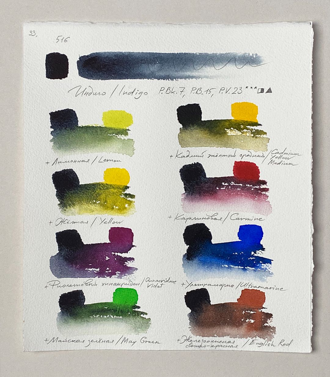
5. 516. Indigo (P.Bk.7, P.B.15, P.V.23 *** ◨▲)
A rich brick shade with a cold undertone. Allows you to make clear restrained accents of red. In mixtures with chromium oxide, it gives a rich, warm brown colour. Lightfast, opaque, relatively resistant to washing-off.