Watercolour Sketch of Peonies. Plein air with Elena Bazanova
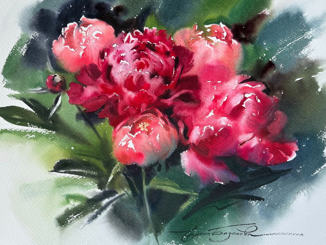
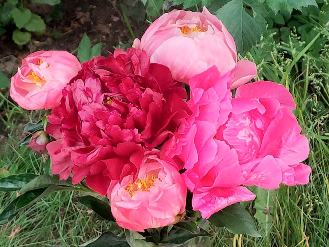
Today we will paint a sketch with peonies. I made a small bouquet with large pink and rich red flowers. One large central flower has a dark deep burgundy-purple colour. The second flower is red-pink, bright and saturated, and 3 half-opened pale pink buds. Green leaves will become a harmonious background, and the yellow center of the bud will become a colour accent.
At the beginning, I make a light drawing on which I indicate the total volumes of buds with a small detail of petals and leaves. Having finished with the drawing, I moisten the sheet well from the back and place it on the tablet. With the help of a wide brush, I moisten the front side of the paper without going beyond the contour of the buds. And I start painting.
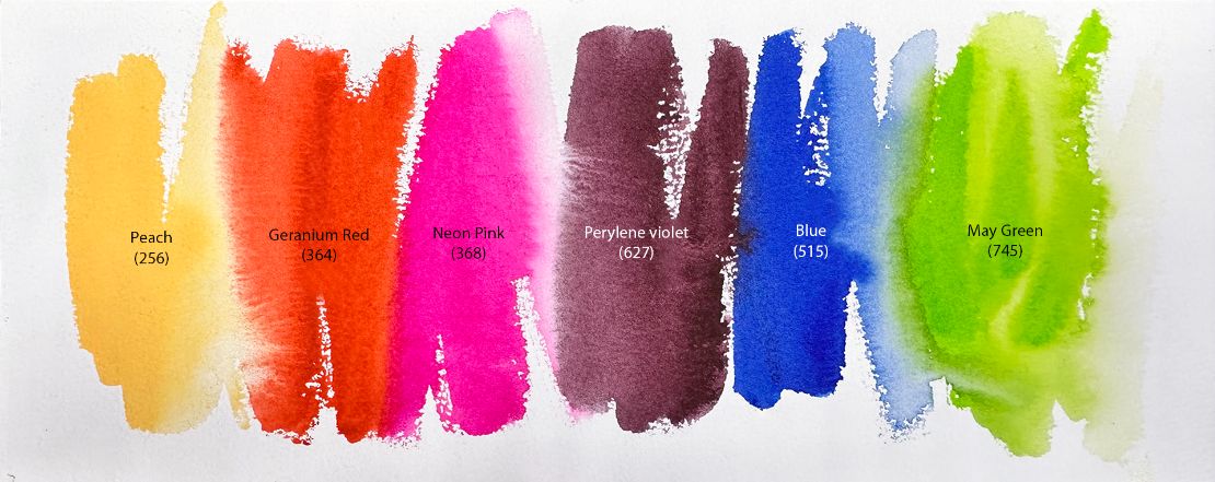
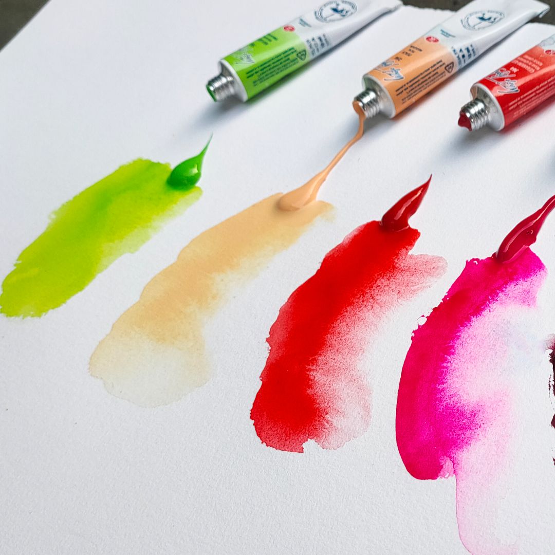
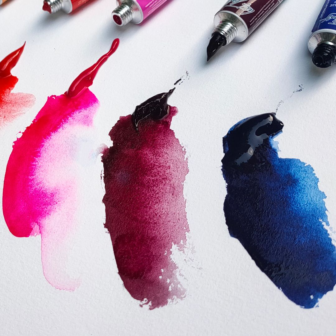
I chose a palette of 6 colours: 1.256. Peach (P.Y.3 P.O.64 P.W.6 *** ■◮), 2.368. Neon Pink (P.R.122, fluor. * ■◮), 3.364. Geranium Red (P.R.242 *** ◨▲ ), 4.627. Perylene violet (P.V. 29 *** □◮), 5.515. Blue (P.B.15:6 *** □▲), 6.745. May Green (P.Y.3, P.G.36 *** □◮).
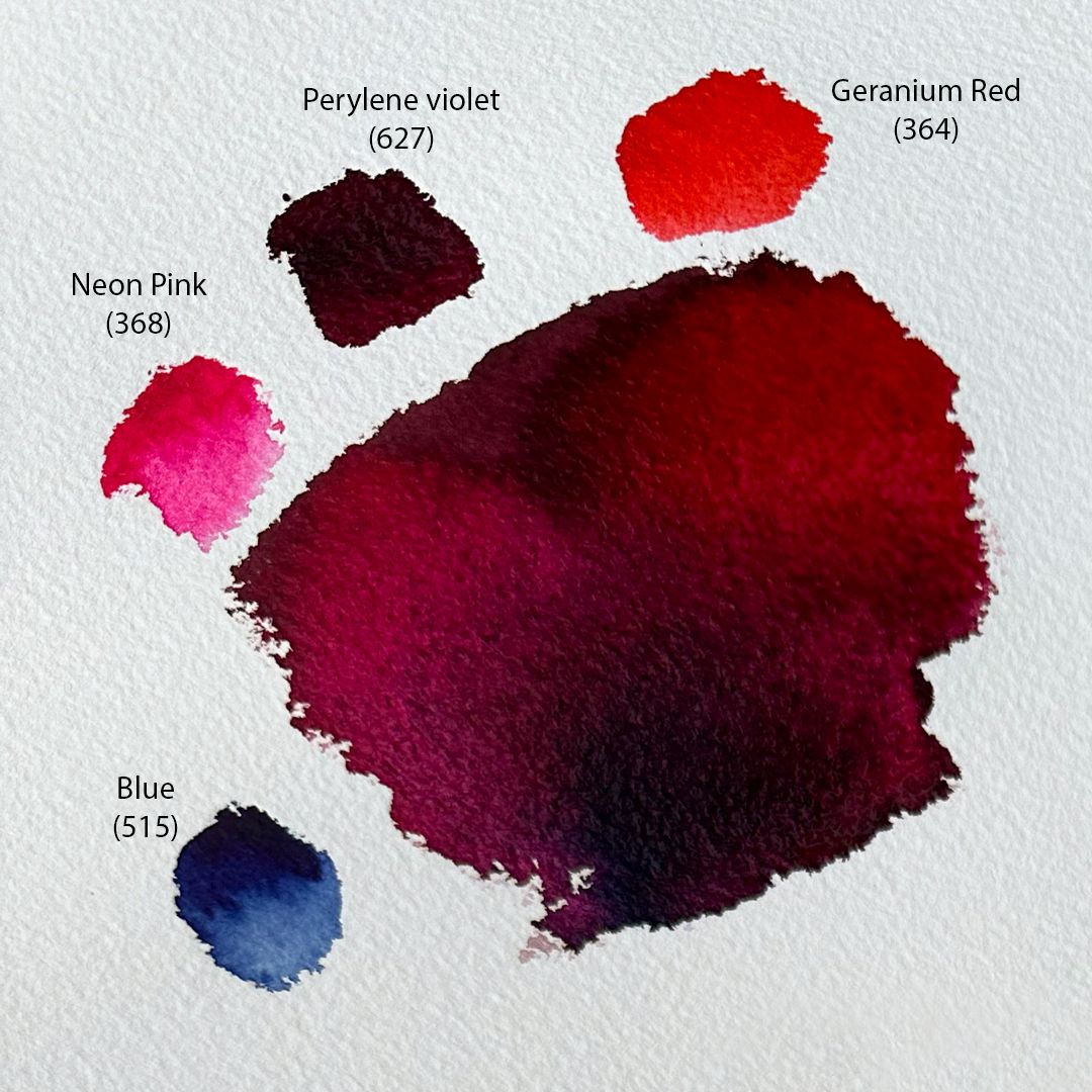
For the central flower, I make a basic mixture of Perylene violet + Geranium Red and get a deep and sonorous purple colour. With them I write shadows in the depths of the bud. Towards the end of the petals, I lighten the mixture and make it colder by adding Neon Pink or Blue with lots of water.
For the second flower, I make a mixture of Neon Pink + Geranium Red and get a rich pink (rose) colour, which I use as the main one. In the shadows, I add a little Perylene violet and Blue to the main colour, getting soft highlights and shadows.
central flower
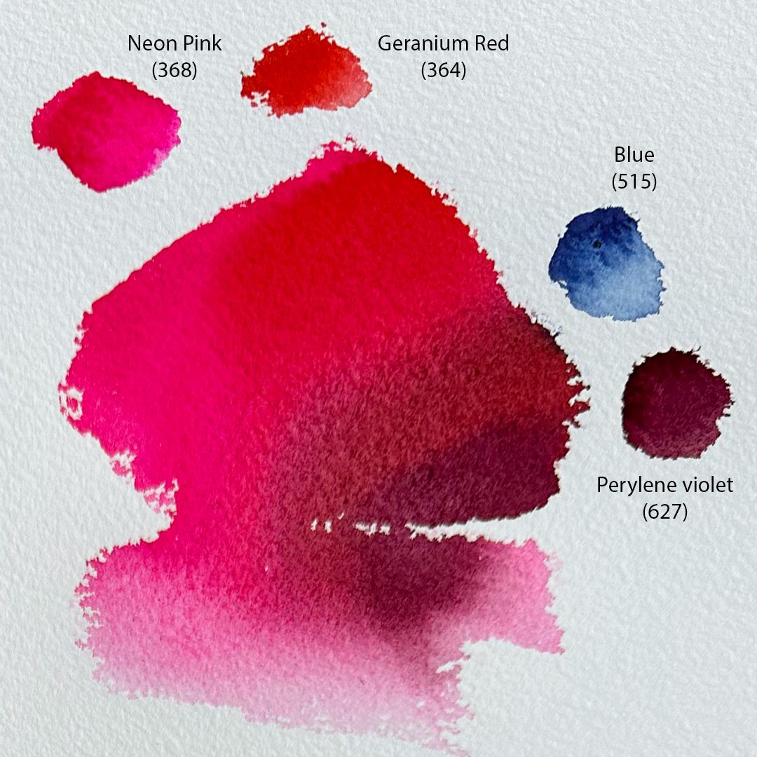
second flower
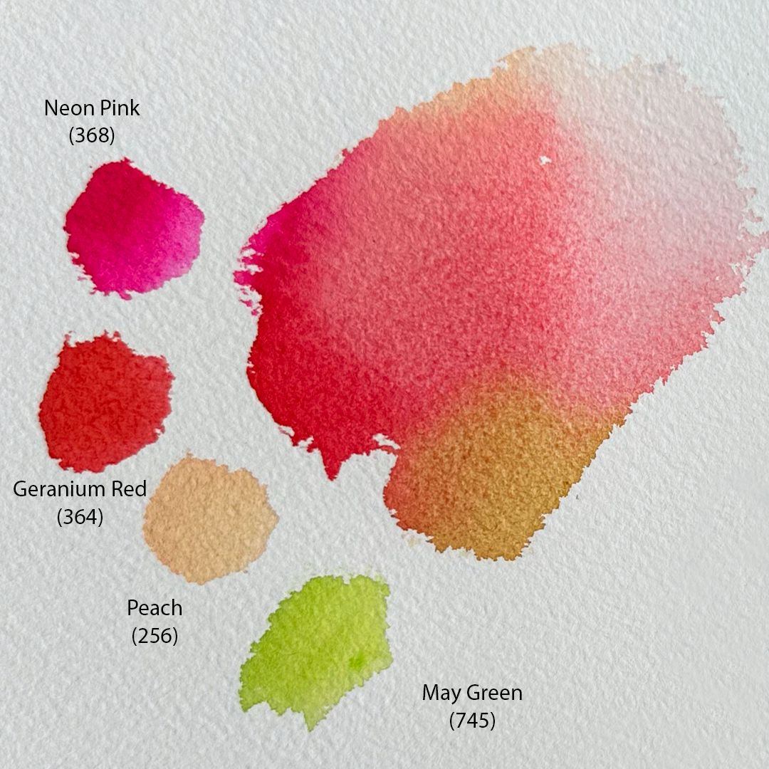
three half-opened buds
colours of the palette
colours of the palette
BACKGROUND
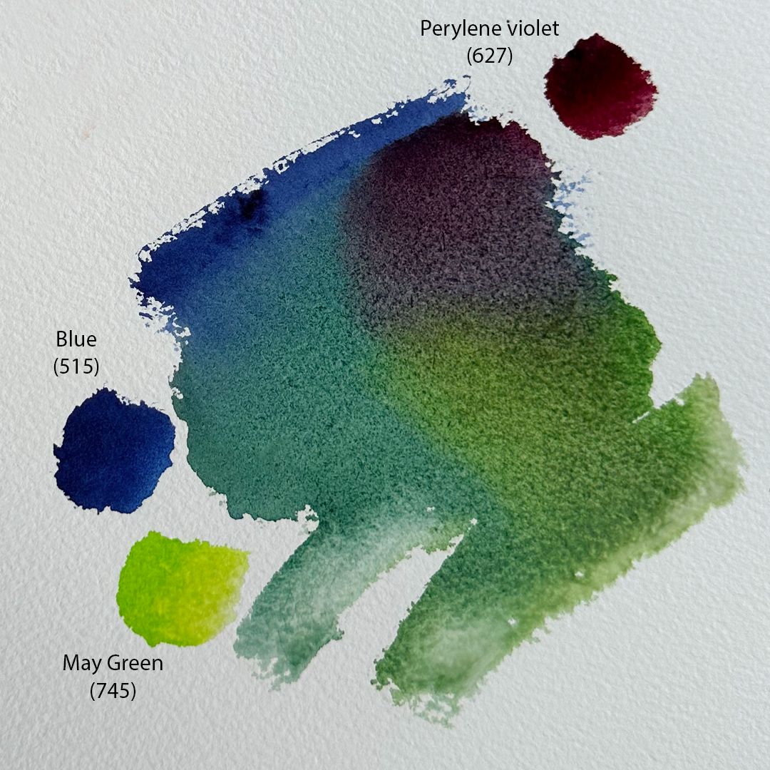
The background, consisting of a mass of green peony leaves, I write wet, using a basic mixture of Blue + Ray Green colours. By changing the proportions of the colours in the mixture, I get a colder or warmer green shade, and by adding Perylene violet, I get a soft shade of cold brown or a deep complex shade of purple.