SUMMER SKETCHES WITH ELENA BAZANOVA. TWO VIOLET SKETCHES
Studying the possibilities and properties of new watercolour colours, I decided to test them by painting two quick sketches of violets. Flowers differ in shades of inflorescences and leaves, so I selected a palette of new colours for each sketch. I will paint both sketches using the Alla Prima technique, with active, rich strokes. And I will carefully emphasize the necessary accents and details that give the work completeness with a second layer on the dried surface of the paper.
The first stage is a sketch. I work with a thin stylus B. At the very beginning, it is important to fix the main volumes, large spots of flowers, masses of greenery. I constantly compare whether the silhouette is similar. To more accurately determine the similarity, measure the proportion, it will help you draw the picture more accurately. We clarify the details, carefully draw each leaf, flower, and twig. The watercolour drawing should be thin, neat and almost transparent.
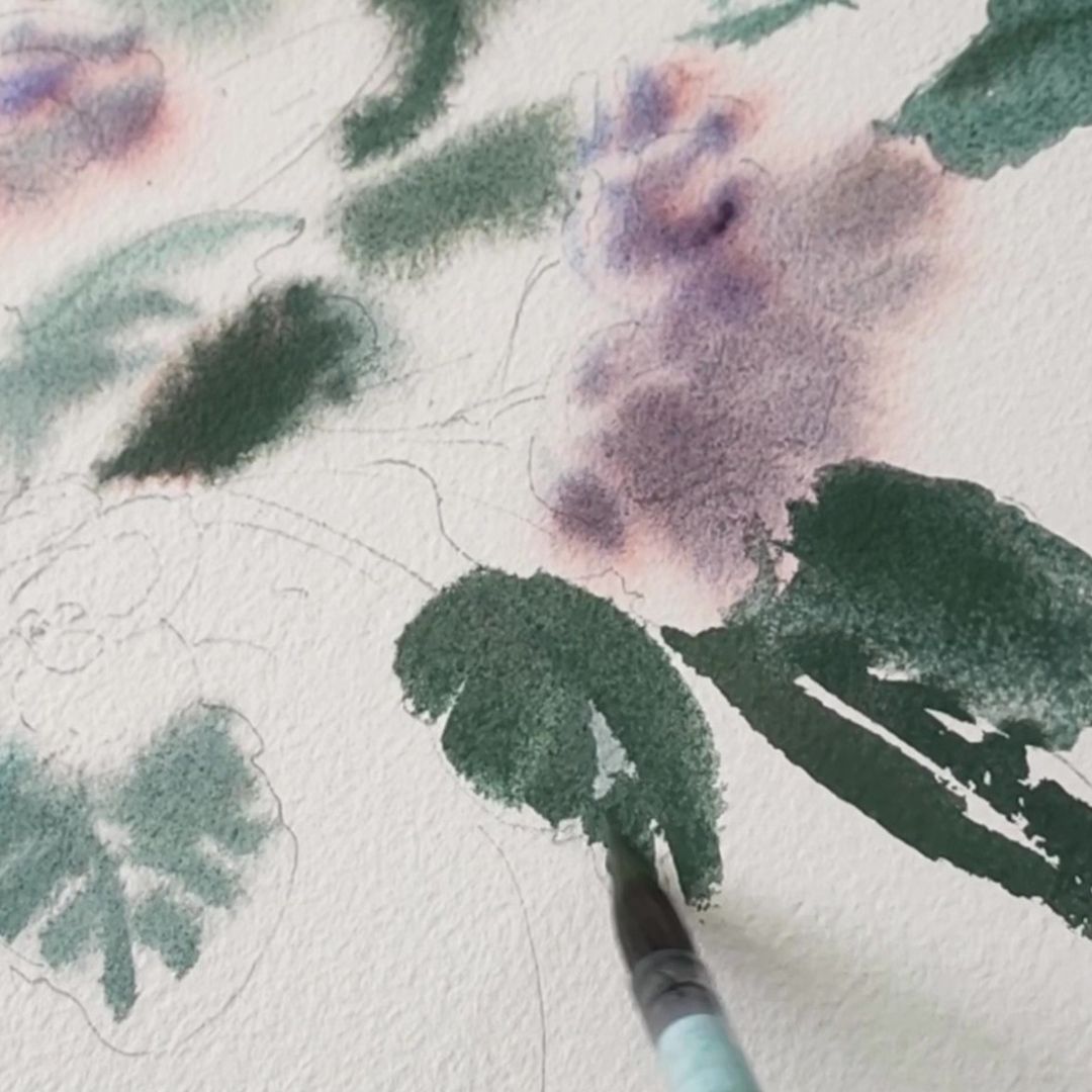
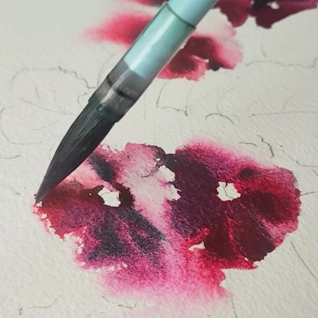
Before starting to work with paints, I wet the sheet well on the back side, place it evenly on the pad, then wet the sheet from the side of the drawing, increasing the degree of moisture of the paper in the shadow parts of the greenery, background and along the edges of the paper. It is best to start painting the flowers themselves with simple forms, clear and bright. This way you will give the work the main colour accents. At the beginning, the paper is the most wet and the paint flows freely over the surface of the sheet, breaking down into the constituent pigments of the granulating paint, conveying the complex iridescence of the petals and the depth of the inflorescences. The technique for performing the sketches is the same, only the colour palette is different, so below I will describe the colours used and mixtures with them separately for each sketch.
Flowers.
It is best to start painting the flowers themselves with simple forms, clear and bright. This way you will give the work the main colour accents. At the beginning, the paper is the most wet and the paint flows freely over the surface of the sheet, breaking down into the constituent pigments of the granulating paint, conveying the complex iridescence of the petals and the depth of the inflorescences. The technique for performing the sketches is the same, only the colour palette is different, so below I will describe the colours used and mixtures with them separately for each sketch
VIOLET
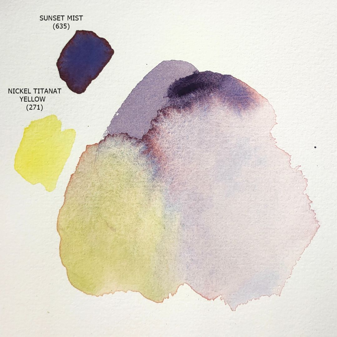
For the palette I chose 6 colours: 1. 271. Nickel Titanat Yellow (P.Y.53 *** ■△), 2. 399. Pyrrol Orange (P.O.73 *** ◨◮), 3. 635. Sunset Mist (P.B.29, P.O.73 *** ◨◮ G), 4. 765. Cobalt Titanat Green (P.G.50 *** ■△ G), 5. 595. Sea Mist (P.G.50, P.B.15:3 *** ◨◮ G), 6. 837. Spinel Grey (P.Bk.28 *** ◨◮ G)


GREENERY
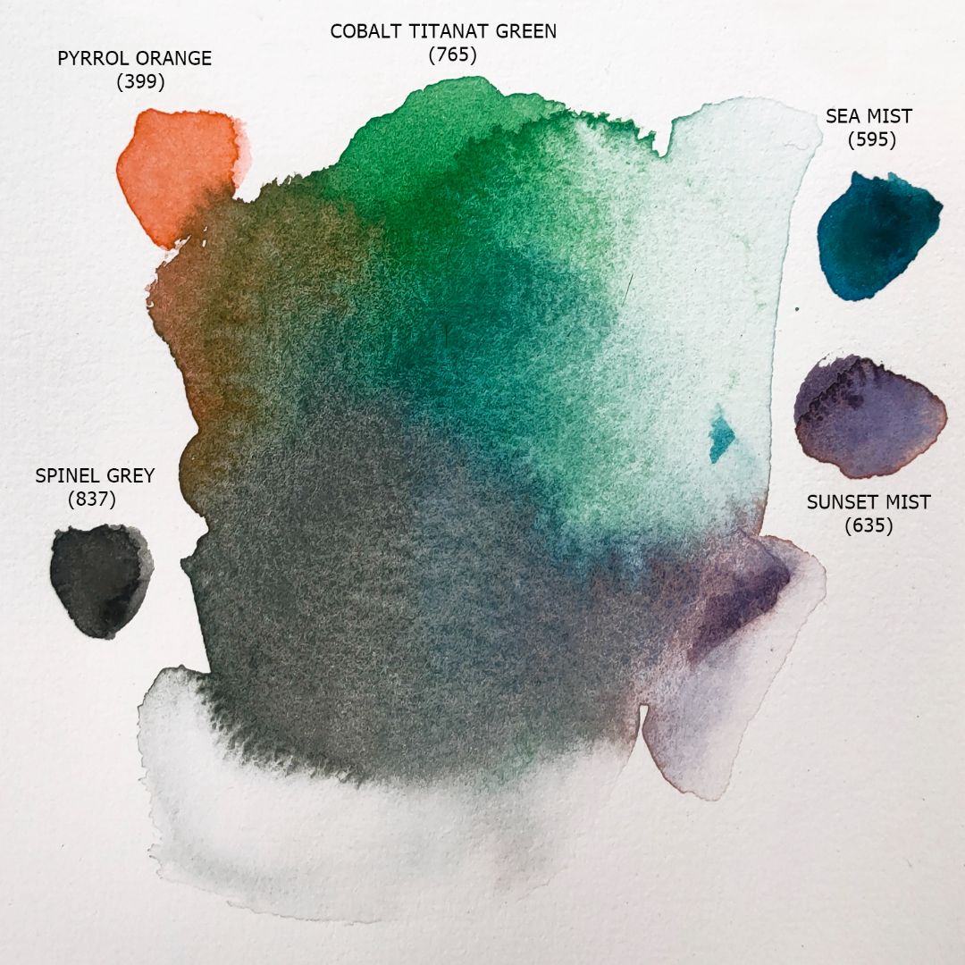
The base paint for the greenery is Cobalt Titanat Green with Sea Mist added for a cool tone or Nickel Titanat Yellow for a richer warm green colour in the light. Cobalt Titanat Green has a warm green colour with a soft granular effect. Pastel softness is provided by the pigment property, like Nickel Titanat Yellow, Cobalt Titanat Green has a “milky” colour that softens the saturation and gives softness to the shade. These paints do not contain white, so, despite their hiding power, they retain the purity and transparency of the shades in mixtures.
Flowers

GREENERY
Shadows
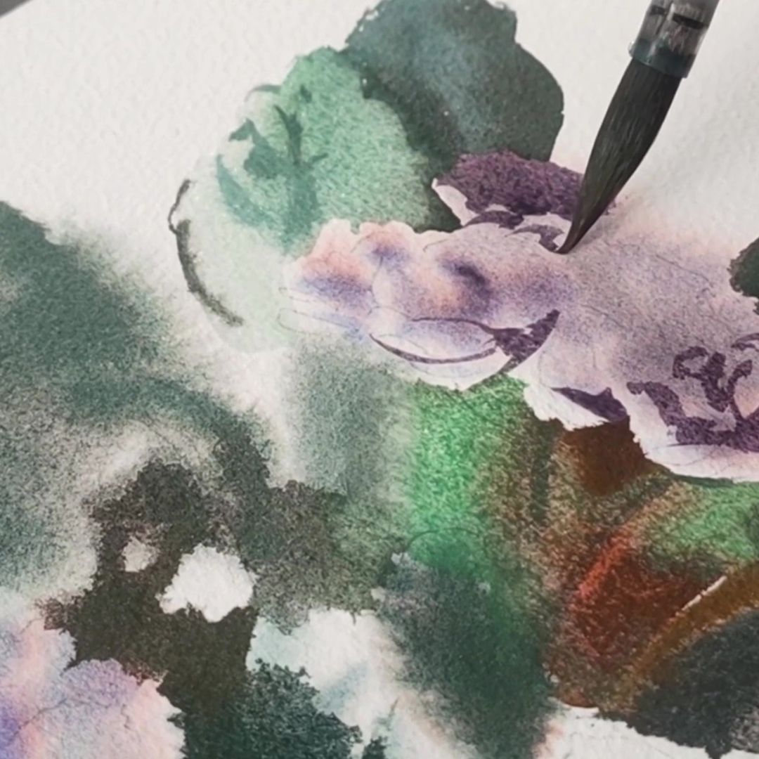
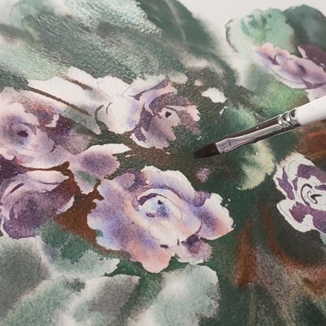
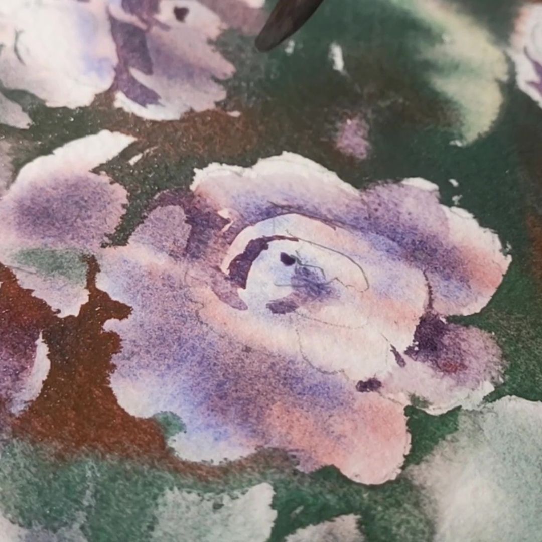
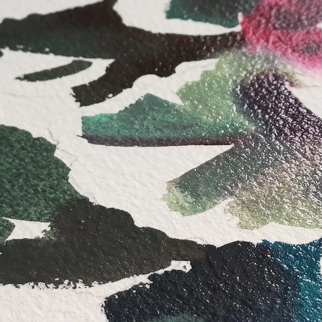
Sea Mist is a paint from the granulating series, consisting of 2 pigments: Cobalt Titanate Green and Phthalocyanine Blue. The pronounced granulation effect is provided by dark green cobalt particles, surrounded by a rich transparent Phthalocyanine Blue colour.
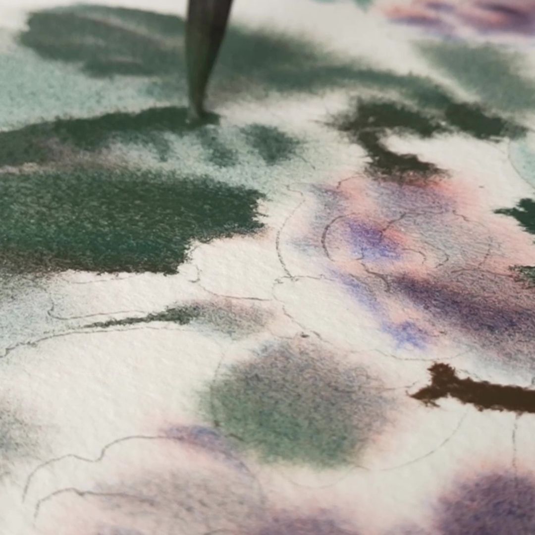
When the first layer of paint, applied wet, has dried (you can check this by looking at the surface of the paper at an angle - the surface should be matte), I emphasize the volume and depth with the second layer, working with shadows. For the buds, I also use Sunset Mist, sometimes adding Pyrrol Orange, changing the warmth and coolness of the colour. For depth of shadow in the greenery, I add Spinel Grey to the cobalt base colour to create a dark, cool, clean grey-green colour. Adding Pyrrol Orange gives a deep brown tint. Spinel Grey is a pure, translucent dark grey colour that extends broadly to a pearly silver. This paint, with a soft granulation effect, is able to add depth to any colour in mixtures, shading the main shade, while remaining light and transparent, an amazing ability!
PURPLE VIOLETS
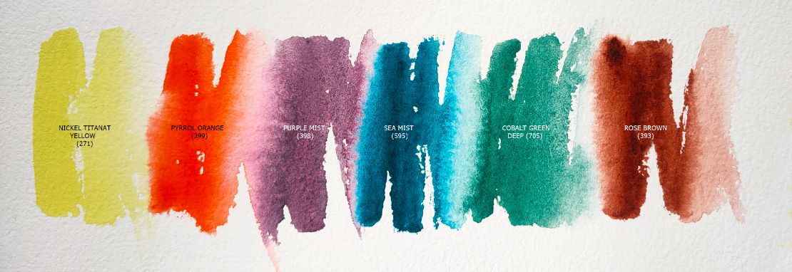
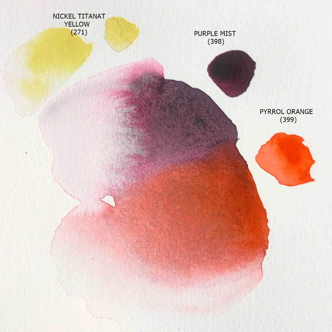
For the palette I chose 6 colours: 1. 271. Nickel Titanat Yellow (P.Y.53 *** ■△), 2. 399. Pyrrol Orange (P.O.73 *** ◨◮), 3. 398. Purple Mist (P.G.50, P.V.19 *** ◨△ G), 4. 705. Cobalt Green Deep (P.G.50 *** ◨△ G), 5. 595. Sea Mist (P.G.50, P.B.15:3 *** ◨◮ G), 6. 393. Rose Brown (P.Br.25 *** □▲)
Greenery and background.
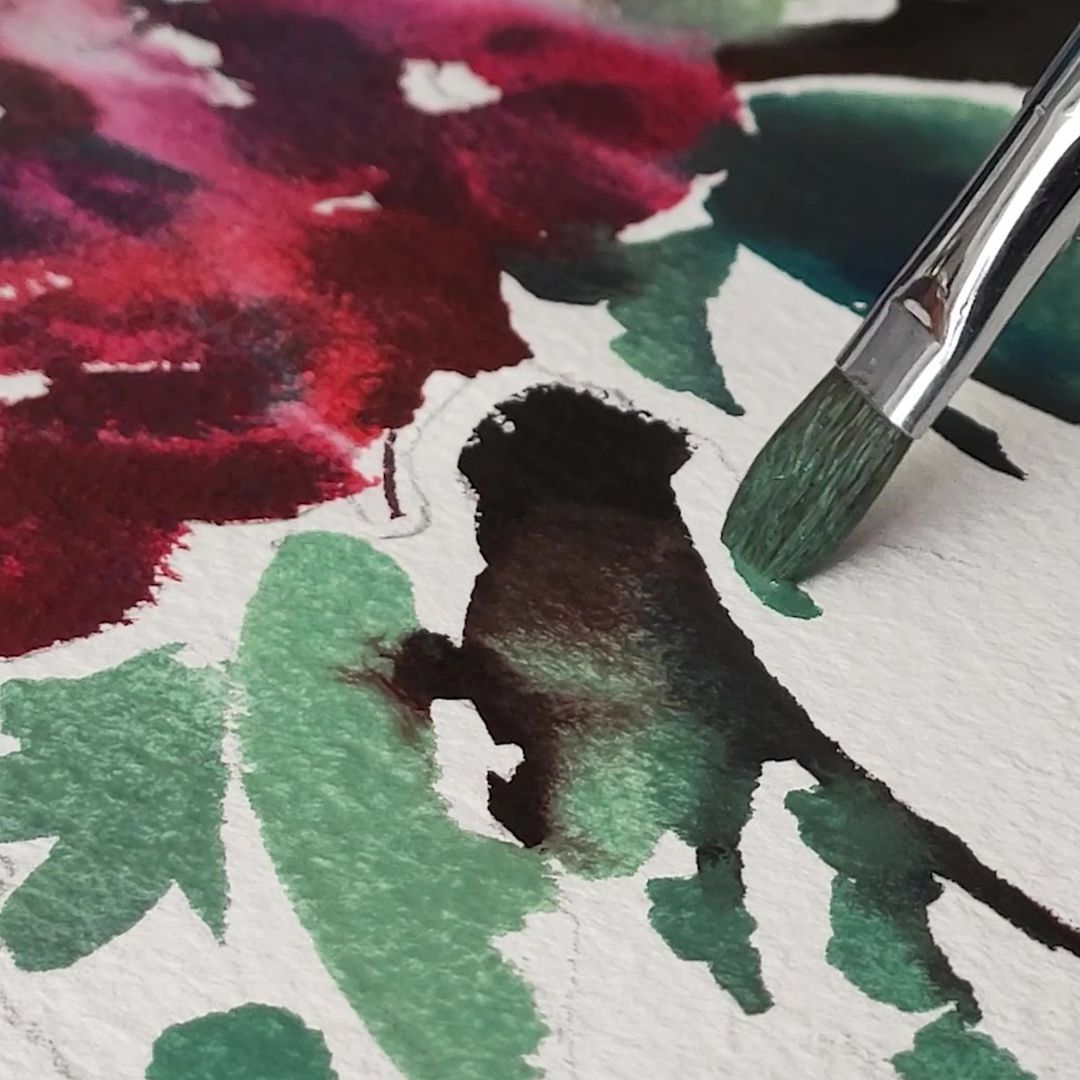
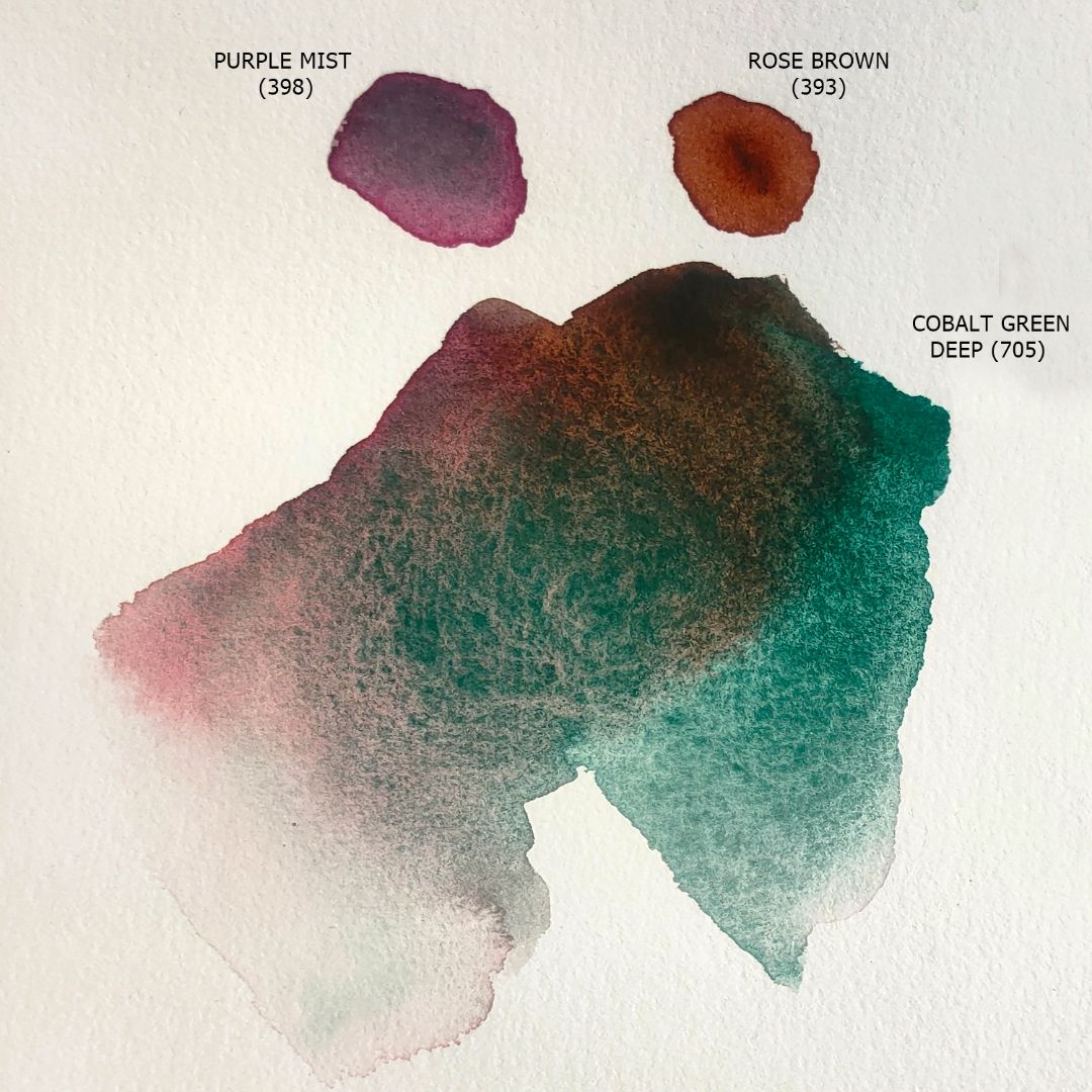
The main colour of the greenery is Cobalt Green Deep, this colour consists of one pigment - Cobalt Green, but a different, darker and cooler shade than the one I used in the previous study, but it also has a pastel softness of colour and soft granulation properties. Adding Nickel Titanat Yellow or Sea Mist to the cobalt gives me warm and cool green tones in the light, while adding Spinel Grey gives me a light, neutral, greenish-grey tone. For deep shadows I use a mixture of Cobalt Green Deep + Purple Mist + Rose Brown. Rose Brown is made with the pigment Benzimidasolone Brown and has a very clean, transparent, rich, brown colour with a cool light pink undertone and a wide tonal range.
Flowers

Greenery
Shadows
Background
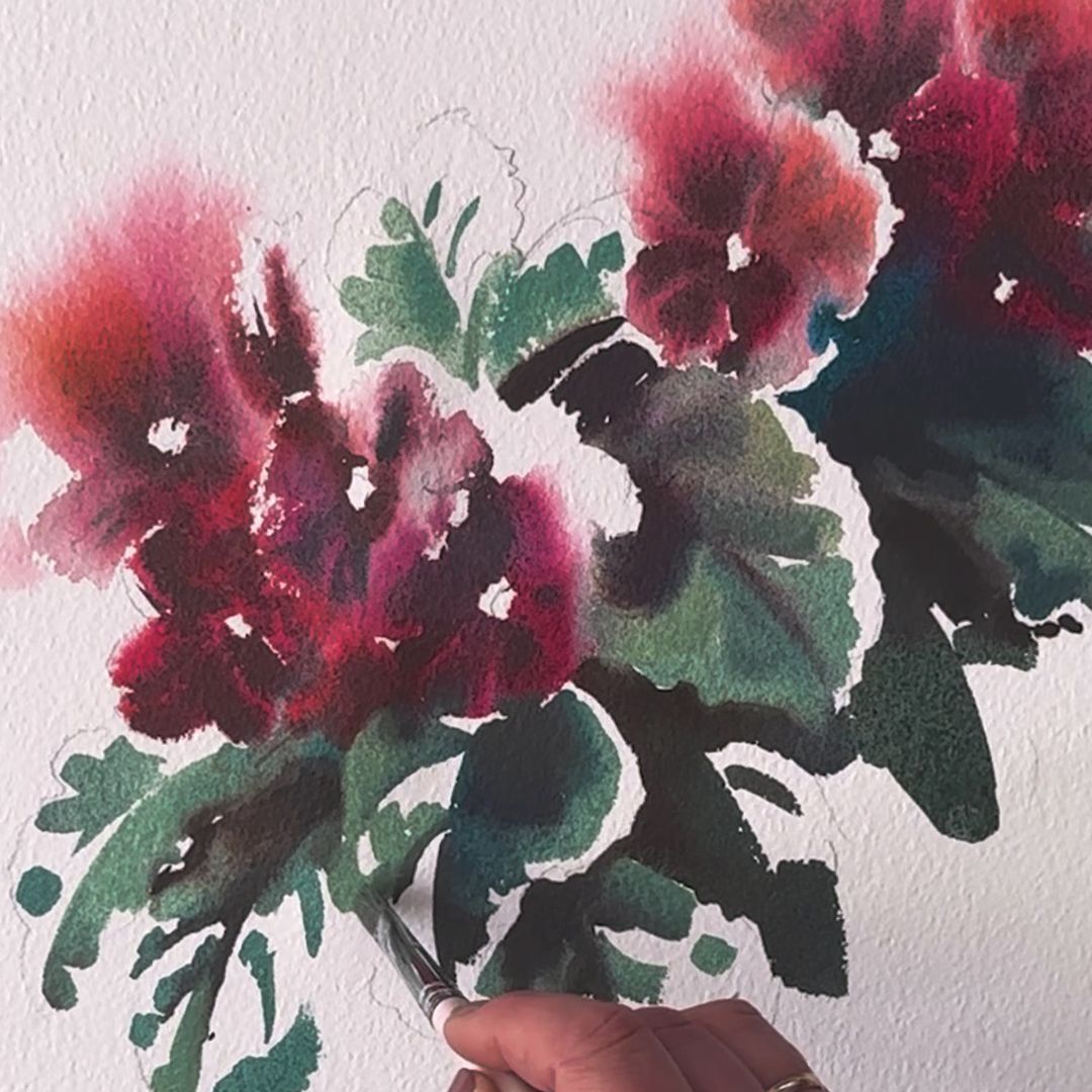
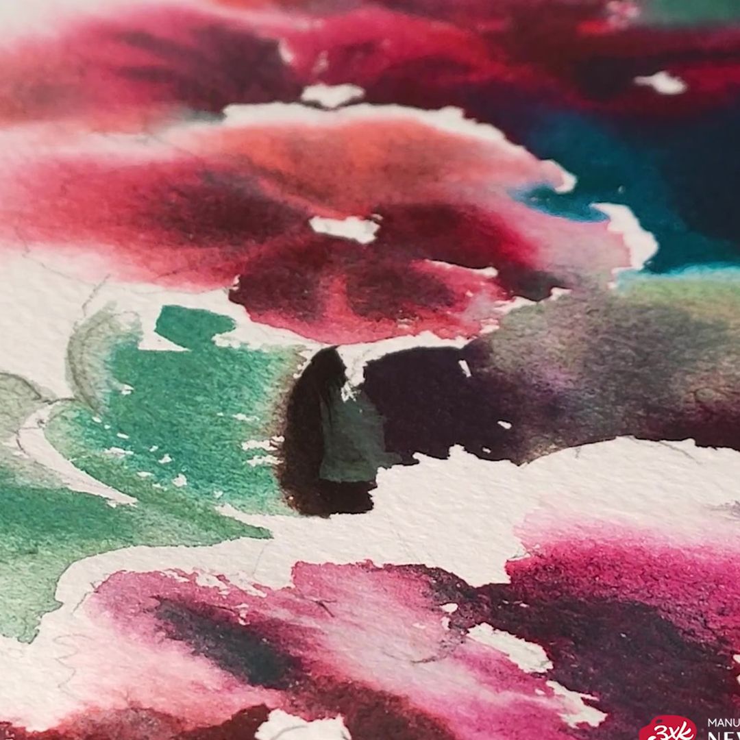
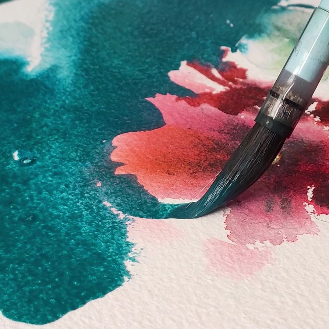
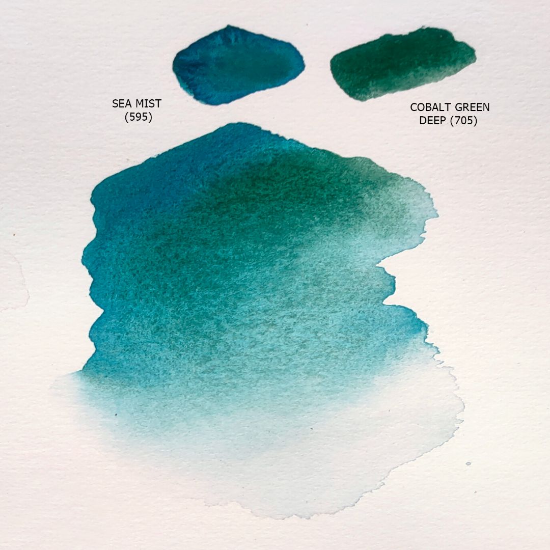
The main background colour is Sea Mist, thanks to its pronounced granulation effect, it perfectly shapes the space, and the Cobalt Green Deep additive adds variety to the shade and perfectly connects the background with the greenery of the leaves.