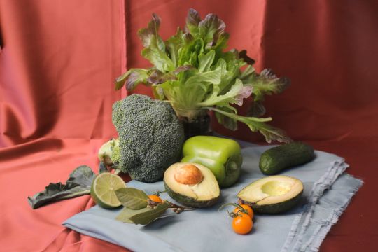
After completing a light drawing, before starting to work with paints, I moisten the sheet well from the back of the drawing, place it on the tablet, carefully expelling the water remaining between the pad and the sheet. The sheet should fit snugly to the pad over its entire surface. After placing the sheet on the pad, I carefully apply water to the front side, without going beyond the contours of the painted vegetables (except lettuce, broccoli and cucumber leaves). I'll start working with broccoli.
Broccoli
With a mixture of Green Shadows + Chomim-cobalt mist colours, I form the main colour with short rounded strokes. In the shadow part, I add Augite porphyrite to the mixture, as a reflex from the background. Augite porphyrite is a new monopigment colour in the palette, created on the basis of natural earth, has a colour index P.R.102 (Natural Red Iron Oxide), is transparent, completely washed off the sheet, leaving no traces, and also has a strong granulation effect. The paint has a delicate and clean muted cold brown-purple colour with a slight pink tinge.
In the darkest parts of broccoli, I increase the amount of Green Shadows paint in the Green Shadows + Chomiim-cobalt mist mixture. Green Shadows paint is developed on the basis of two pigments: Phthalocyanine Green BS (P.G.7), Mars Black (P.Bk.11), has a beautiful deep velvety dark green colour and a pronounced granulation effect due to Mars Black. On the wet surface of the sheet, the paint moves quickly and actively, first leaving visible Mars Black particles on the surface. Smaller particles of Phthalocyanine Green, continuing to move, colour the paper in a cold emerald green colour, glowing with a green undertone. The colour is very rich, deep and powerful, so you need very little paint. I mix it with Chomim-cobalt mist to give softness and achieve a colder shade. Chomim-cobalt mist is also a granulating paint, but much softer in colour, tone and granulation effect. The colour of the paint is colder, and the granulation effect is softer due to the Cobalt Blue (P.B.28) included in its composition.
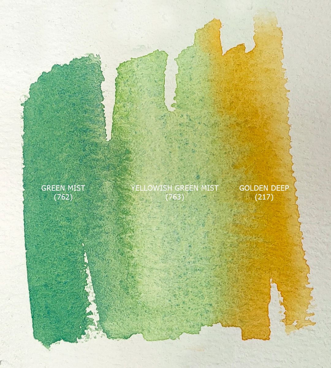
In the light parts of broccoli, I use Chomiim-cobalt mist strongly diluted with water. I emphasize the bright accents of the incident light Yellowish green mist, which has a rich but soft yellow-green colour and a soft granulation effect, due to the Cerulean Blue (P.B.35) that is part of it. The paint also actively moves in water, disintegrating with particles of Cerulean Blue pigment (P.B.35), which provides a granulation effect, and Hansa Yellow (P.Y.3), which gives a ringing lemon-coloured undertone.
Lettuce
For the letucce, I set the main colour in the first layer with a mixture of May green + Golden deep. The result is a complex, close to olive, shade of green with a lemon undertone. I take May green, and not the Yellowish green mist, which is similar in colour, which I have already worked with in this still life, because I'm going to paint a salad in several layers and for the first layer I use transparent non-granulating paints. May green has a very bright and sonorous green-green shade, works perfectly in layering and consists of a mixture of pigments of pigments: Hansa Yellow (P.Y.3), Phthalocyanine Green YS (P.G.36). I apply the strokes vertically, emphasizing the movement of the lettuce leaves "to the top". Depending on the play of light in the leaves, I change the proportion of colours in the mixture: then I take more May green and less Golden deep, then vice versa.
At the ends, the leaves turn a reddish hue, and I add Grey-violet granite to the mixture. This is a new monopigment colour of granulating paints, which contains natural earth with the name of the pigment Brown Iron Oxide (P.Br7). Transparent, delicate, muted, cold gray-purple colour with a red-brown tint, has a pronounced granulation effect. Due to the unique properties of the colour, it looks harmoniously in any colour palette, because its colour can be called neutral.
To convey the depth of the bundle, as well as the shadow fragments of the leaves, I use Green mist. This is a new colour of the granulating series, developed on the basis of Cobalt Blue (P.B.28) and Hansa Yellow (P.Y.3) pigments. It is darker in tone and colder in colour than Yellowish green mist. The granulation effect is provided by the presence of Cobalt Blue. The amount of Hansa Yellow in the paint is less than that of Yellowish green mist, so the cold yellow undertone is only slightly noticeable. I will transfer the darkest accents in the salad when the paper dries a little with a mixture of Green Shadows + Chomim-cobalt mist colours, and the lightest ones with a light May green solution.
Pepper
For the colour of pepper in the light, I take May green and apply it to the entire illuminated part of the pepper, leaving spots of glare, because pepper has a glossy surface, there are white highlights on it, I leave them as they were. Later, with a wet, clean brush, I will carefully close them, using paint on the edges of the highlights. For reflexes around the edges of the pepper, I use Augite porphyrite. For pepper semitones, I take Green mist. For the shadow part of the pepper at the tail, I'll take Chromium-cobalt mist. Accents in the shade will emphasize Green Shadows quite a bit. The cold colour of Green mist in halftones perfectly combines and emphasizes the May green glowing in the light, and the warm reflexes of Augite porphyrite together with the shadows made by Chomim-cobalt mist will give volume to pepper and combine it with the rest of the still life, creating a single picturesque space.
Avocado
For the sides of the avocado in the shade, I use a mixture of Green Shadows + Chromium-cobalt mist, applying strokes with light circular movements, imitating the rough texture of the avocado peel. In the darkest part, I use a little water, gradually adding it to a more illuminated fragment, lightening the tone of the colour and creating volume.
I work on the avocado slice only after the paint on the sides has dried. I take a light solution of the May green + Golden deep mixture, apply the paint denser along the edge of the cut, and refine the centre with a wet, clean brush, carefully distributing the existing paint. I also make the shadow from the bone on the first half of the avocado and the shadow in the hole for the bone on the second half of the avocado with a mixture of May green + Golden deep, but the proportion of Golden deep in this mixture is greater. The bone is Grey-violet granite and Golden deep, on the border of my own bone shadow I will add just a little Green Shadows.
Background
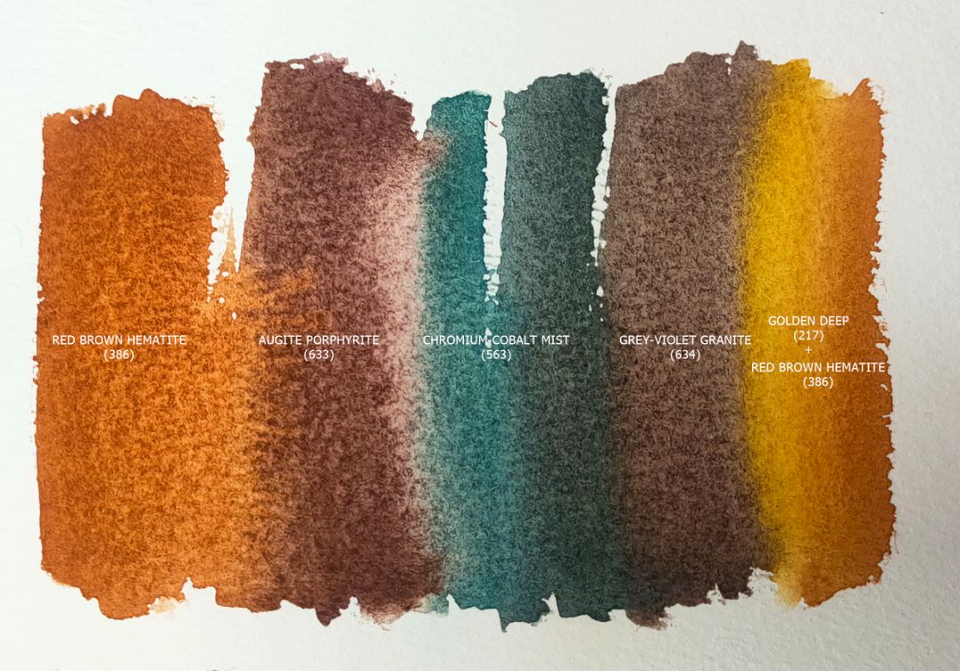
Colours: 386. Red brown hematite (P.Br.7 *** □ ▲), 633. Augite porphyrite (P.R.102*** □△G), 563. Сhromium-cobalt mist (P.B.28, P.G.17 *** ◨△G), 634. Grey-violet granite (P.Br.7 ***□△G), 217. Golden deep (P.O.62 *** □ ◮).
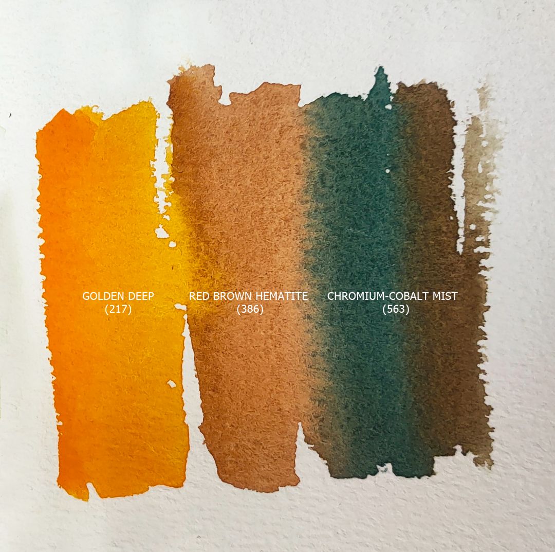
The main background colour is Red brown hematite (386) with the addition of Augite porphyrite and Chromium-cobalt mist in the shadows. I add Grey-violet granite (634) and Golden deep (217) to the light. While working on the background, I periodically mix paints right at work.
Cucumber
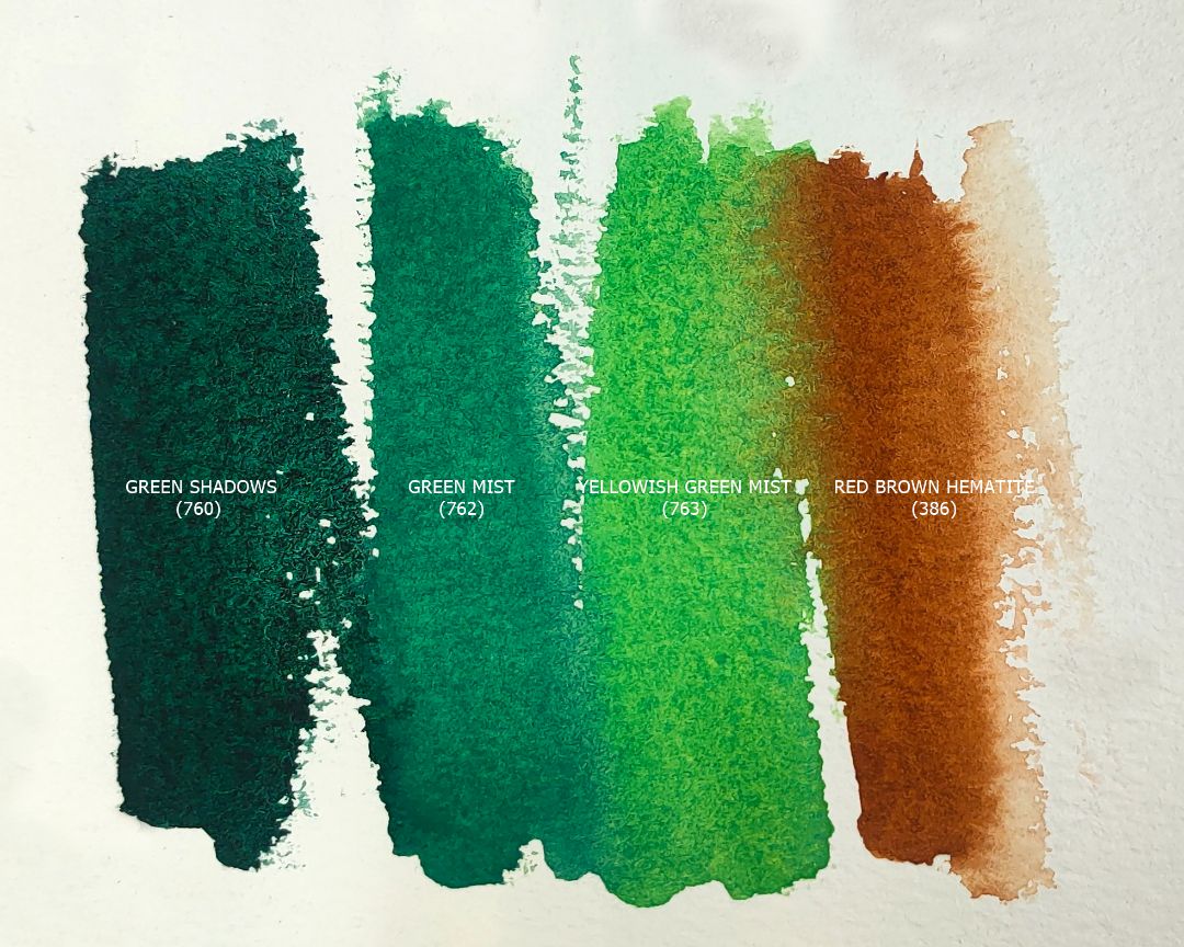
Colours: 760. Green Shadows (P.G.7, P.Bk.11 *** ◨▲G), 716. Sap green (P.Y.150, P.G.36, P.Bk.7 *** □ ▲), 763. Yellowish green mist (P.B.35, P.Y.3 *** ◨ ◮G), 386. Red brown hematite (P.Br.7 *** □ ▲).
The cucumber is located in the background, almost in shadow, so, basically, I use a mixture of Green Shadows + Sap green. For small illuminated fragments and a tail, I use Green mist. Our still life is located on a red-brown background of drapery and to create a common space of a still life on a sheet, it is necessary to remember about colour reflexes. I will make a reflex almost along the very edge of the cucumber, but leaving a small gap of green colour, using Red brown hematite.
Light green drapery
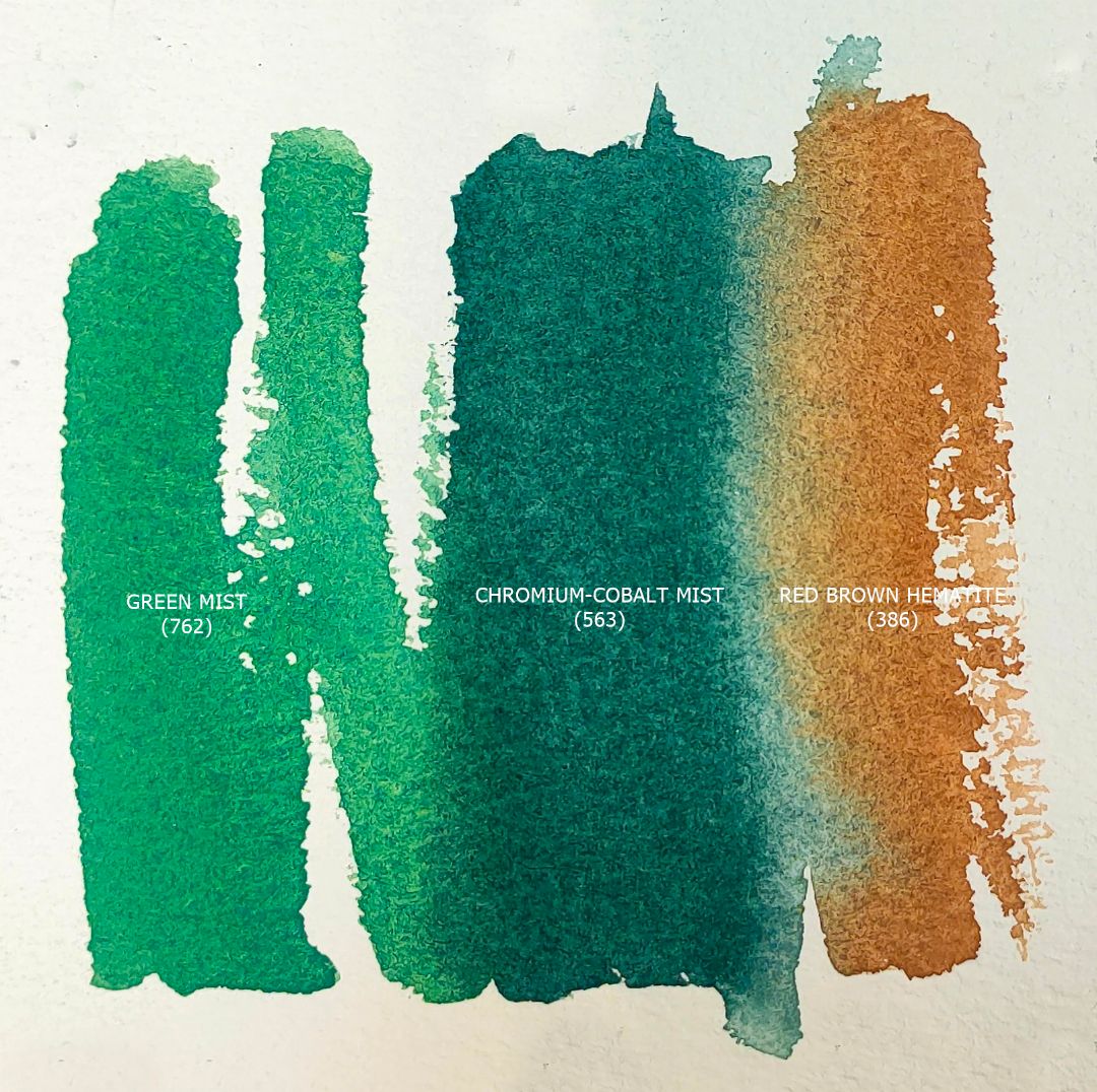
Colours: 762. Green mist (P.B.28, P.Y.3 *** ◨ △G), 563. Сhromium-cobalt mist (P.B.28, P.G.17 *** ◨△G), 386. Red brown hematite (P.Br.7 *** □ ▲).
The main colour of the drapery is Green mist, in the shadows I will add Chromium-cobalt mist, and the reflexes from the red-brown background are Red brown hematite.
Lime
762. Green mist (P.B.28, P.Y.3 *** ◨ △G), 763. Yellowish green mist (P.B.35, P.Y.3 *** ◨ ◮G), 217. Golden deep (P.O.62 *** □ ◮).
For half a lime in the lower part, I will take Green mist, and on the illuminated part I will add Yellowish green mist (763) right at work and gently mix at the junction.
When depicting a slice of lime, I will first draw a cut pattern with a very light Yellowish green mist colour, leaving the borders of the segments white. Then, with a denser same colour, I will walk along the perimeter of the segments, imitating the texture of the cut softness of lime with light strokes. And then I will add quite a few colour accents using Golden deep. When the paint dries, I'll go over the remaining white fragments with a wet brush, dim the white colour on the far side of the lime slice.
A sprig of bay leaf
Colours: 716. Sap green (P.Y.150, P.G.36, P.Bk.7 *** □ ▲), 217. Golden deep (P.O.62 *** □ ◮).
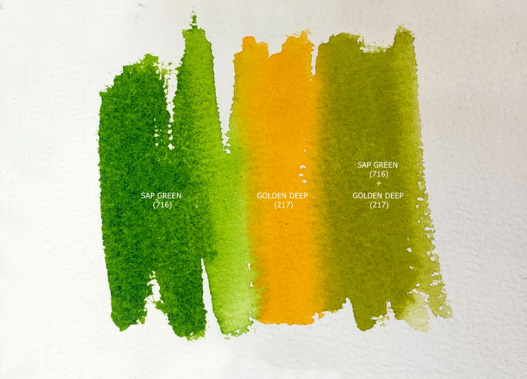
For a sprig of bay leaf, I take a mixture of Sap green + Golden deep paints. In the shadow part, I use a mixture with a small amount of water, and for illuminated areas I add more water and more Sap green to it. I wash out the veins on the leaves with a clean brush.
Cherry tomatoes
Colours: 217. Golden deep (P.O.62 *** □ ◮), 386. Red brown hematite (P.Br.7 *** □ ▲), 563. Сhromium-cobalt mist (P.B.28, P.G.17 *** ◨△G).
The main colour of tomatoes is Golden deep. Just like peppers, tomatoes have a glossy surface, so I leave white highlights, I will refine them later with a clean, wet brush. In the shadow part, I add Red brown hematite in the shadows and distribute it according to the shape of a tomato. I make the green tails of tomatoes with Chromium-cobalt mist paint, adjusting its density depending on the illumination.
