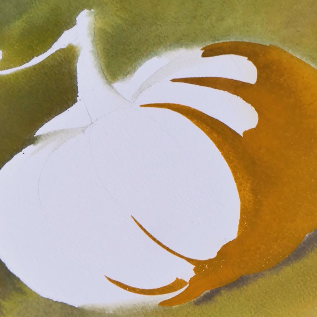
WATERCOLOUR PUMPKIN. THE ILLUSION OF VOLUME IN WATERCOLOUR PAINTING
What should an artist do for showing something on the paper? What tasks to set and solve? How to create an illusion of volume on a sheet and a feeling of a three-dimension world?Are there any rules on how to do it? Of course, there are. Always when starting the demonstration part of the master class I talk about the basic important rules of drawing and composition.
The first example I’m going to demonstrate was shown by Alexander Korolev to his students - a professor at the Academy of Arts - who created his own training system based on the old masters principles. Despite the simplicity and clarity of the example, Korolev demonstrated it on the third year of the Academy. He wanted to remind students of the failure of subject painting without constructive understanding and the subjects shape presentation. Anton Azhbe also taught his students using the examples that I will show. First of all, it is sphere’s shape and its’ derivative – cube’s shape.
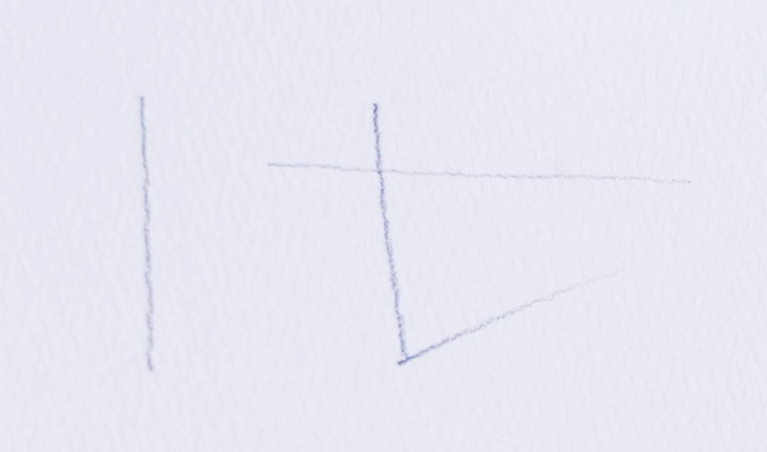


LINE
SPHERE
CUBE
When starting work the artist should make a clear decision in what light scheme he will work and not deviate from it until the end of the work. If the light part is top then the side part will be in shadow, etc. Closer to us shadows will be more contrasting, further away from us - will dissolve in space. It is important to check the ratios of light and shadow and keep them in the selected light scheme, not allowing, for example, the reflex to be lighter than the part of the object in the light and the far edge of the object to be more contrasting with the near one.
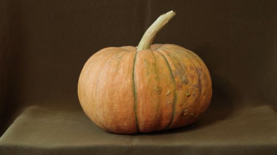
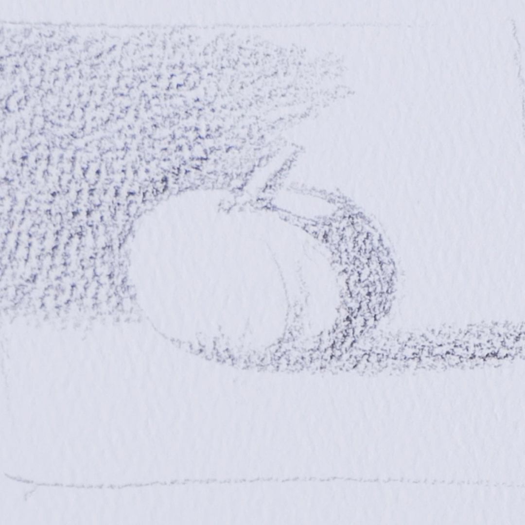

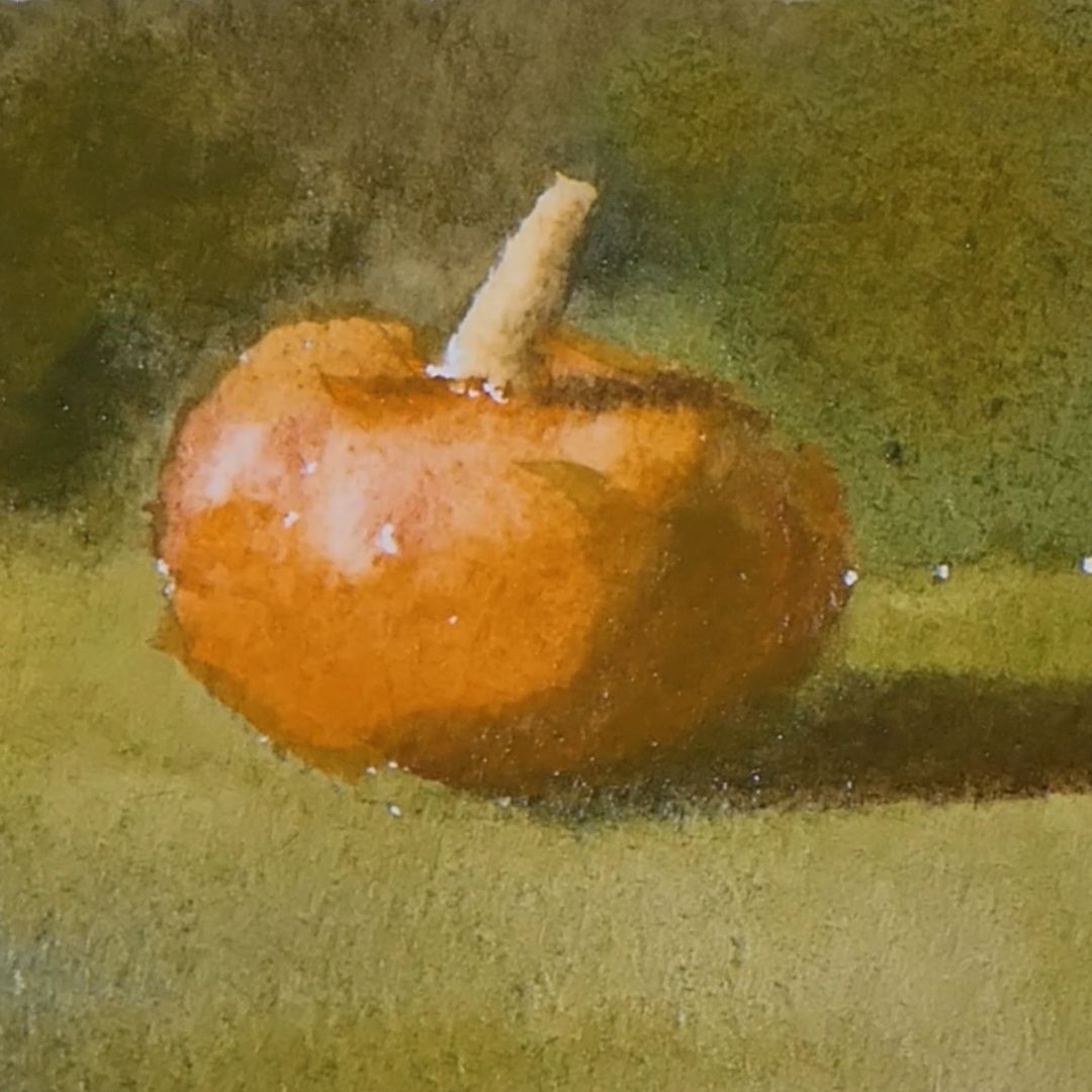
The golden ratio rule also works in tone solutions. We have three main tones: light, grey and dark. If you draw light work and grey tones tend to light, then dark tones will be the accent, and vice versa, light tones will be the accent in dark work. There is no need to recalculate all the possible tonality that you see in nature but you need to generalize to three main ones by using the proportional relation of these tonalities as per rules of the golden section. Then you get a memorable tense composition.
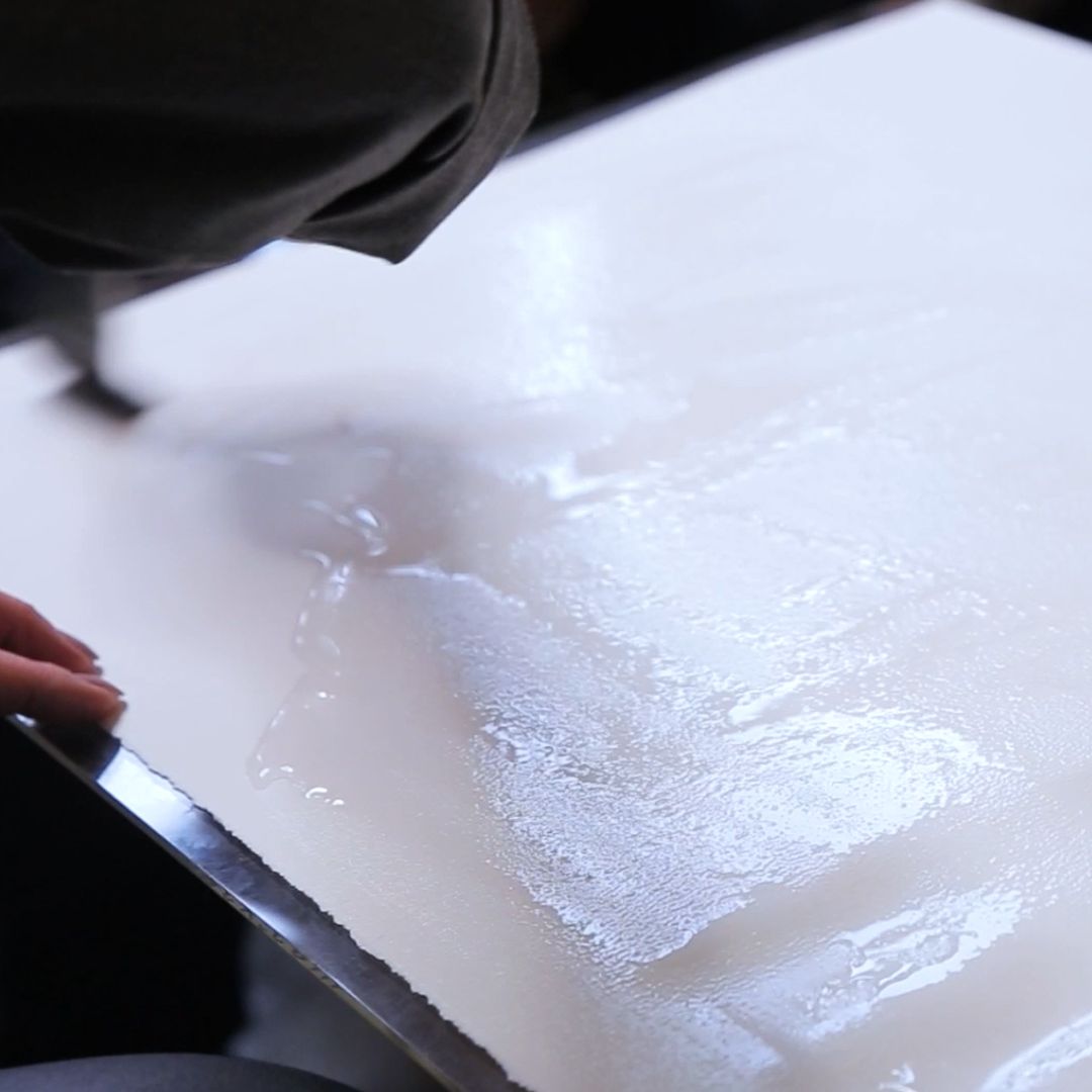
PREPARATION OF THE PAPER


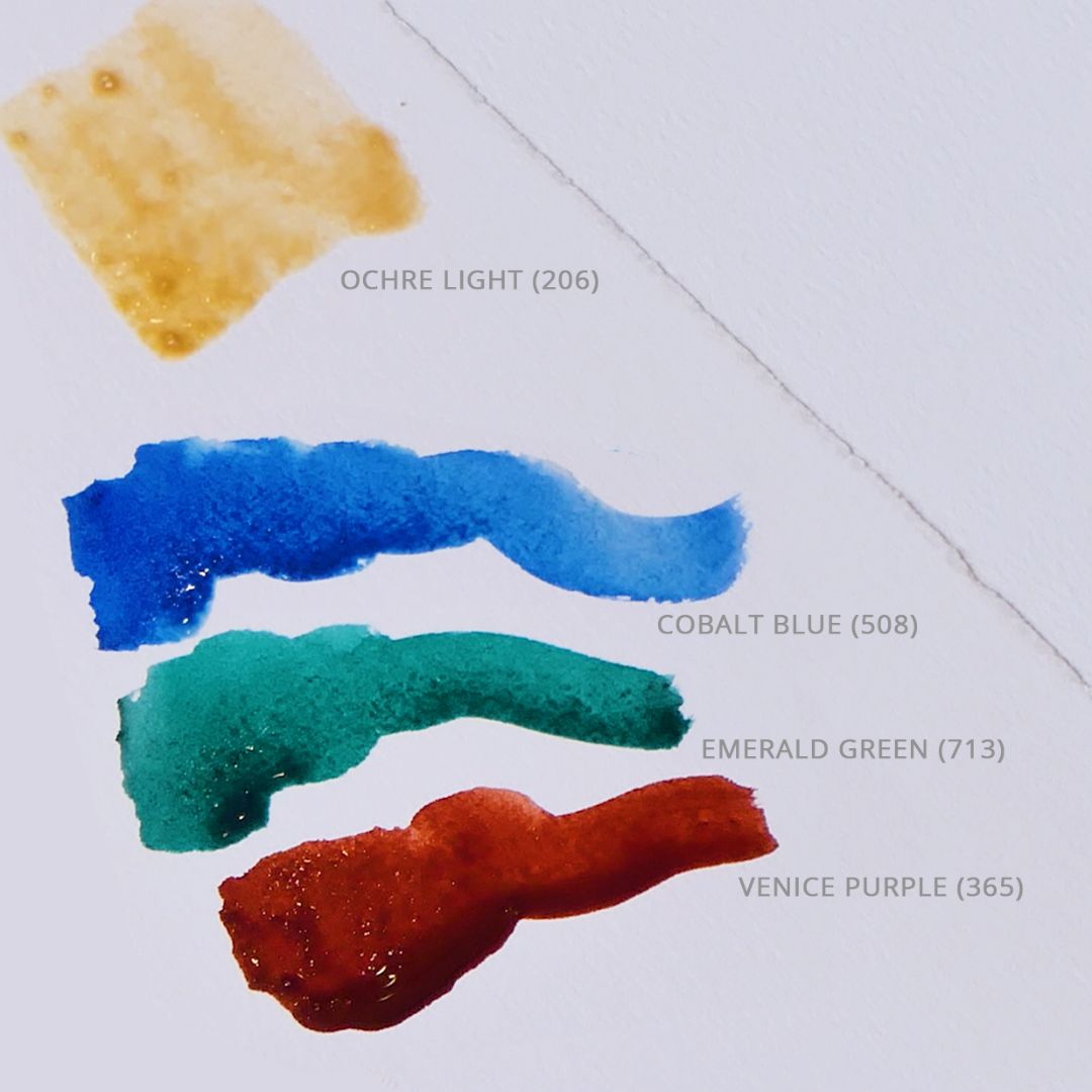
COLOUR PALETTE
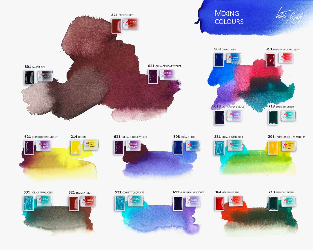
Pumpkin: Golden deep (217), Cadmium orange (304), for a pink shade in the light – Madder lake red light (313), Venice purple (365), and for the shadow part I add Bright blue (509) and Emerald green (713). The tail from the pumpkin in the light – use Ochre light (206) and in the shadow there is a reflex of colour from the background and pumpkin.


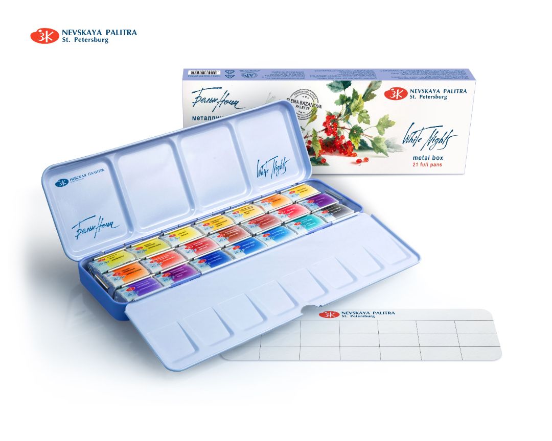
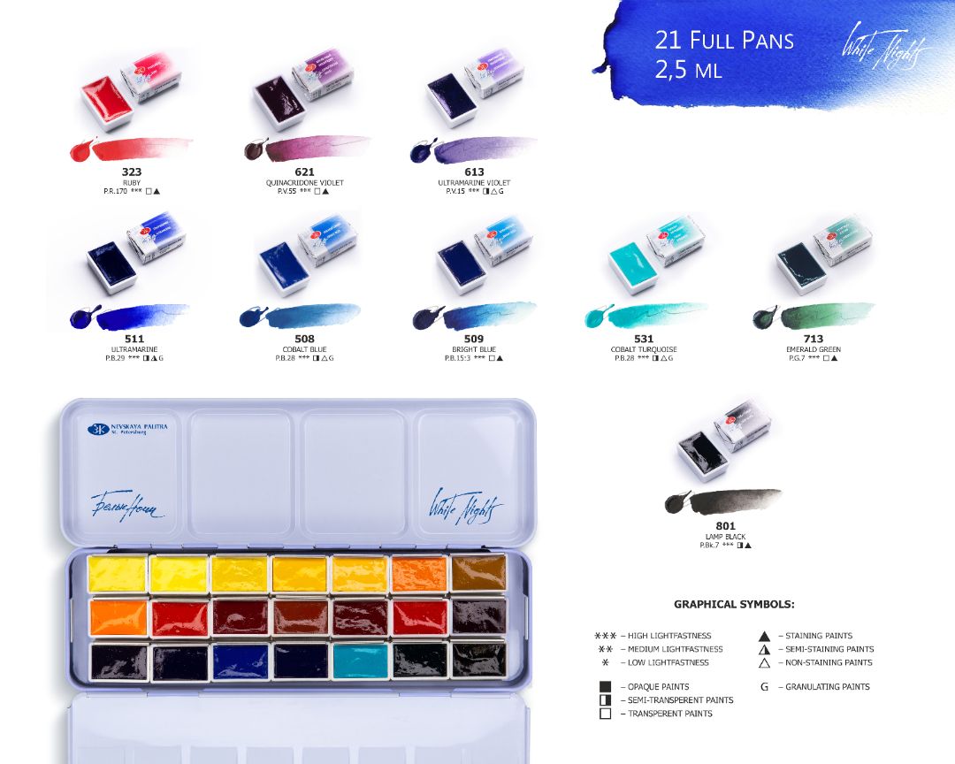
ELENA BAZANOVA'S BALANCED PALETTE IN A METAL CASE. 21 SATURATED, VIBRANT, MONO-PIGMENT COLOURS
Set contains 21 x 2,5ml pans:
Lemon (214), Cadmium lemon (203), Aureolin (253), Cadmium yellow medium (201), Naples yellow light (219), Golden deep (217) , Ochre light (206), Cadmium orange (304), Geranium red (364), Madder lake red light (313), English red (321), Venice purple (365), Ruby (323), Quinacridone violet (621), Ultramarine violet (613), Ultramarine (511), Cobalt blue (508), Bright blue (509), Cobalt turquoise (531), Emerald green (713), Lamp black (801).




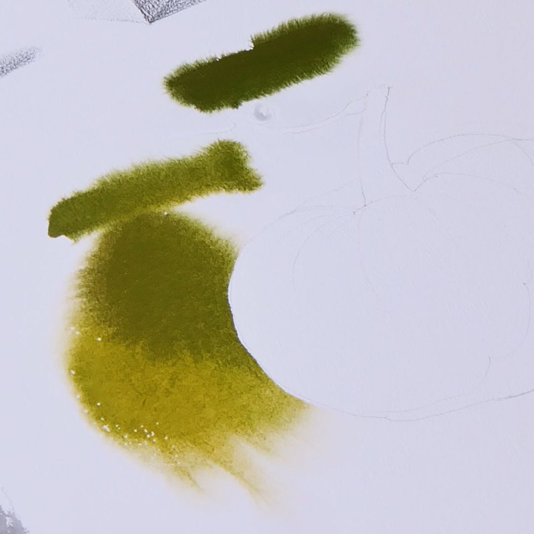
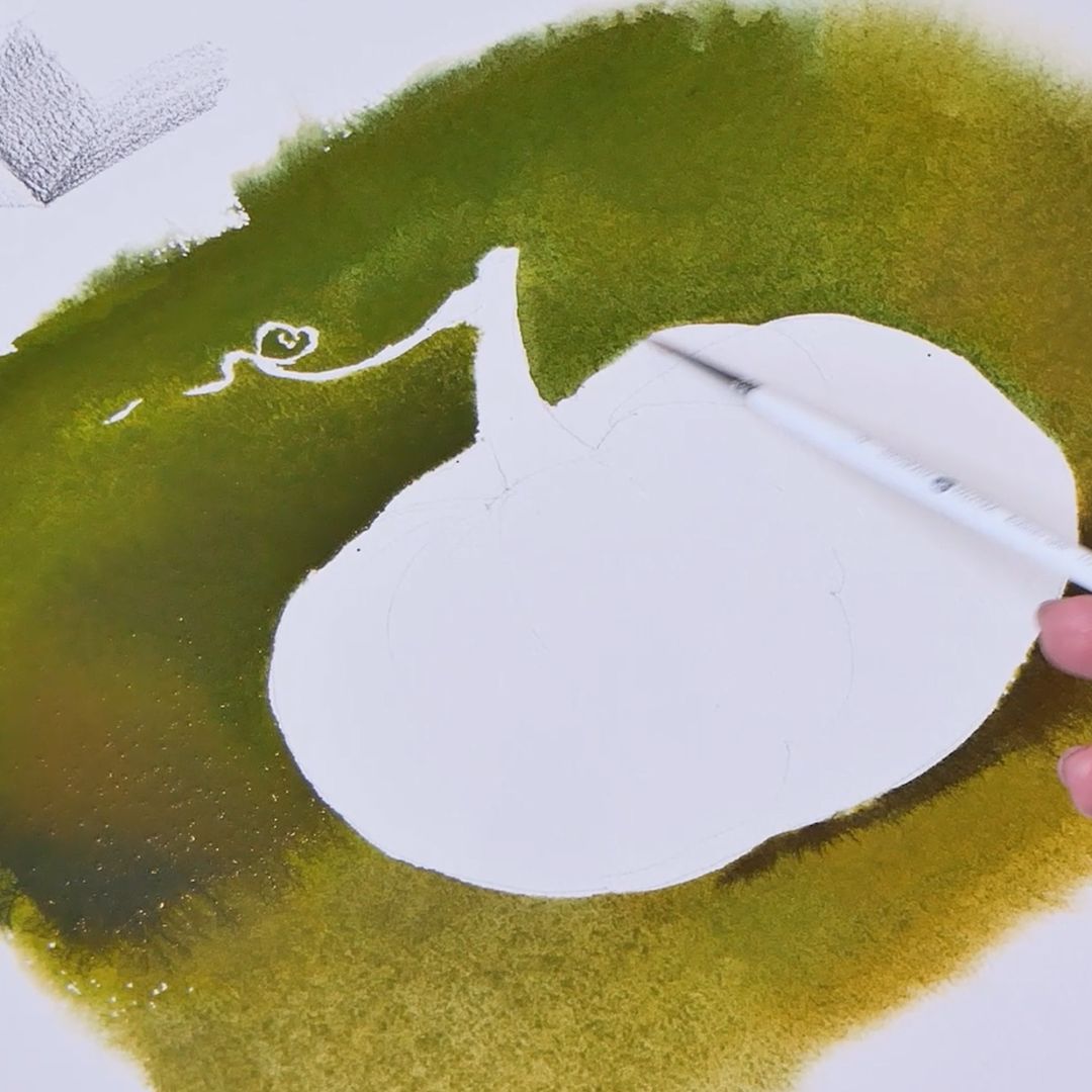
Before starting painting, I gently moisten the dark background around the light pumpkin again since the sheet has already dried up. To write a dark, rich background I densely type paint on the brush, as part of the paint goes deep into the wet sheet and with drying the colorful layer brightens, so it is important to immediately gain all the strength of tone. Having a lot of paint onto the brush, I press the brush tightly against the paper and handing it a large amount of paint where needed. I lift the brush and only touch the paper slightly, where the tone density is not required. After finishing work with the background you need to dry the sheet. But before that, you need to soften the borders. To do this you need a wet brush, gently and delicately blur the hard borders of the pumpkin and background and allow the background colour to integrate into the volume of the pumpkin. This way we get a connection between the object and the surrounding space. Also you can go a little further and work out the volume of the pumpkin with the background color by creating a stronger connection between the background and the pumpkin. Such techniques were used by masters of the 19th century.

Dry the surface of the sheet with a hairdryer. Next, I move on to pumpkin. I take a dense colour for the shady part of the pumpkin, using golden dark and cadmium orange, as well as a mixture left over from the background. The drawing of its own shadow forms the pumpkins’ volume and emphasizes its structure and shape. I lay tone after tone in accordance with the light scheme that I talked earlier, additionally filling it with colour. I fill the illuminated part of the pumpkin with a clean saturated color by mixture of golden dark and Madder Lake. Finally, I draw a pumpkin surface pattern which is richer in the shadows and almost dissolves in the general colour of the pumpkin in the light.
