SUMMER SKETCHES WITH ELENA BAZANOVA. BLOSSOMING QUINCE
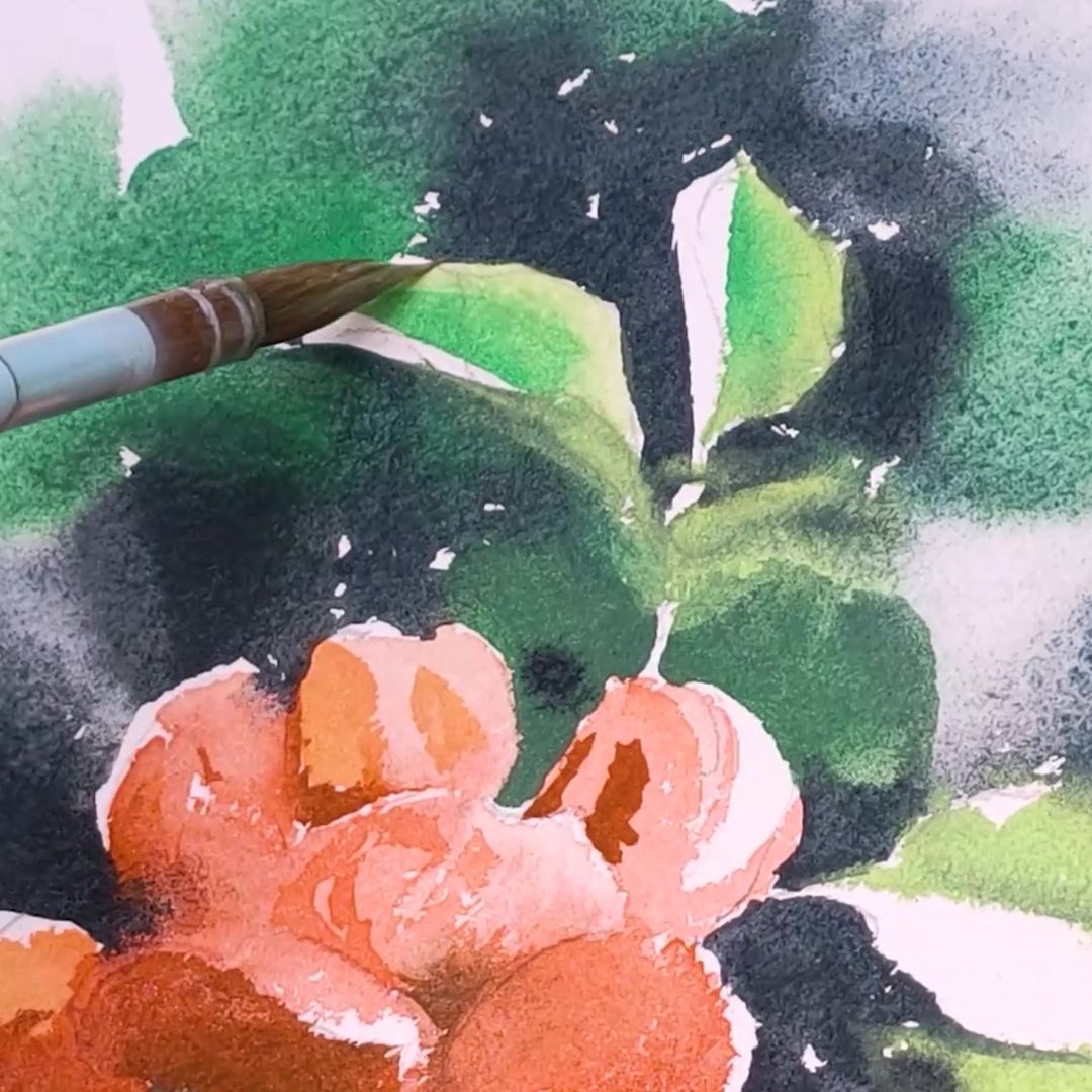
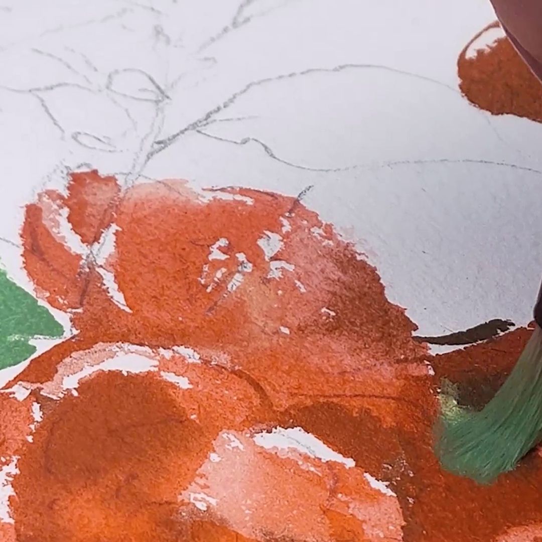
Continuing to test new colours, while walking in the park, I saw a wonderful bush of blossoming quince. The petals of the buds had a delicate but rich orange-pink colour, and I, having admired them, decided to paint a quick sketch. First, I make a light drawing with a pencil and after that, I carefully moisten the sheet on the back side, place it on the tablet and slightly moisten the surface of the paper in place of the background and greenery on the side of the drawing.
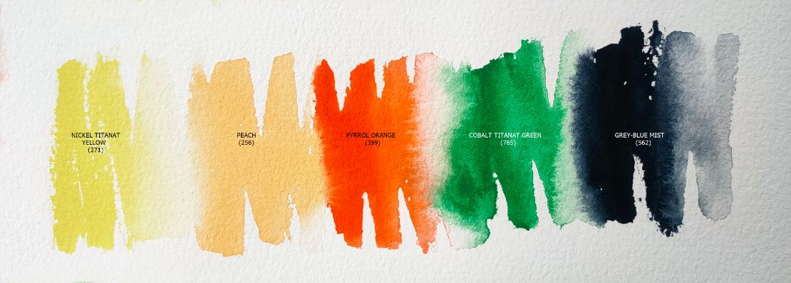
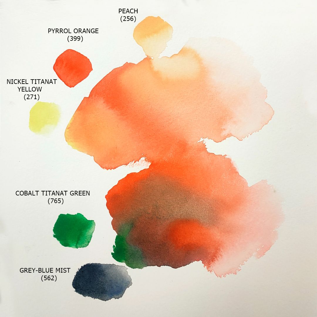
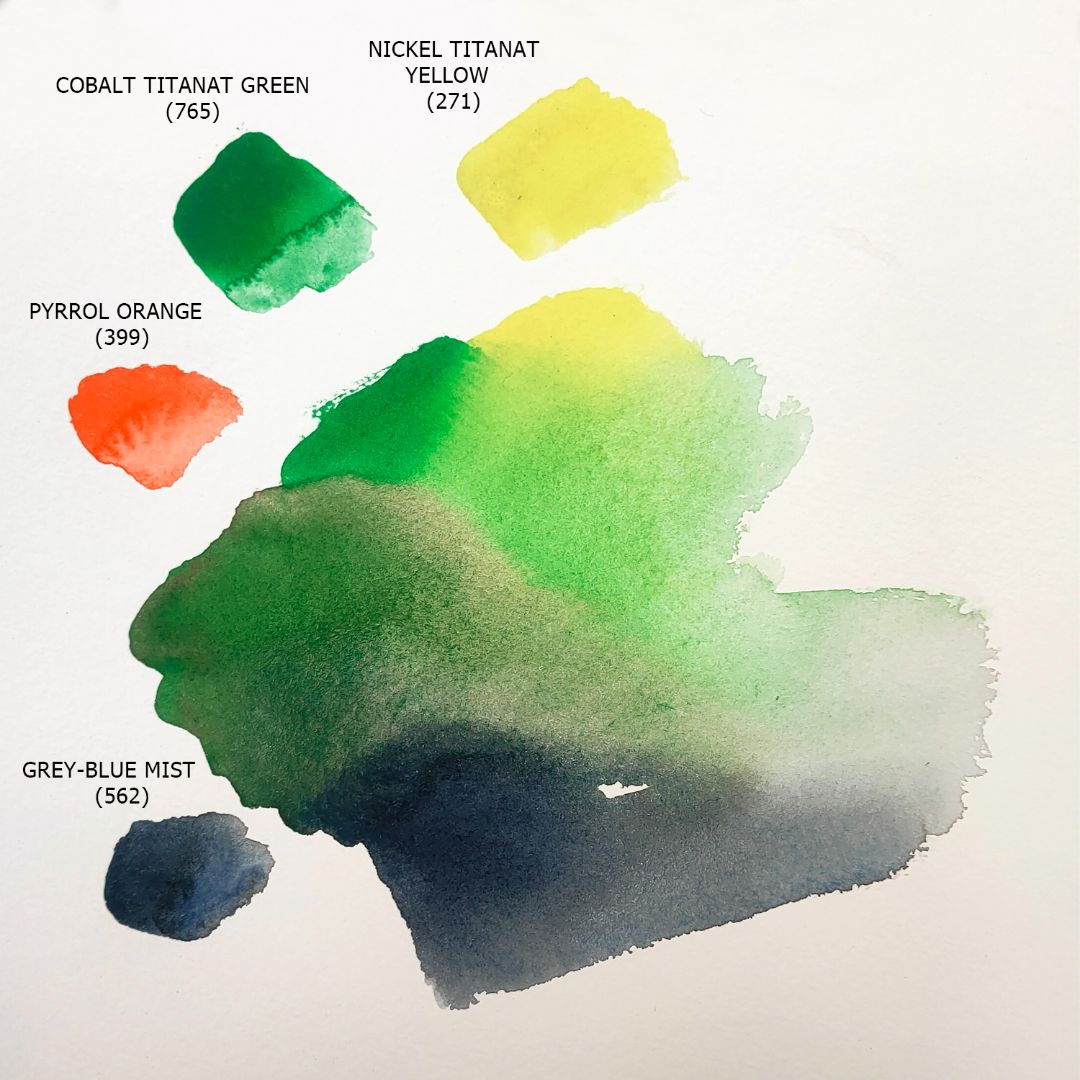
For the palette I chose 5 colours: 1. 271. Nickel Titanat Yellow (P.Y.53 *** ■△), 2. 256. Peach (P.Y.3, P.O.64., P.W.6 *** ■◮), 3. 399. Pyrrol Orange (P.O.73 *** ◨◮), 4. 765. Cobalt Titanat Green (P.G.50 *** ■△ G), 5. 562. Grey-Blue Mist (P.B.29, P.Bk.7 *** ◨◮ G) .
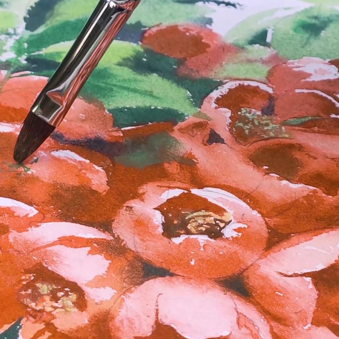
QUINCE FLOWERS
BACKGROUND AND GREENERY
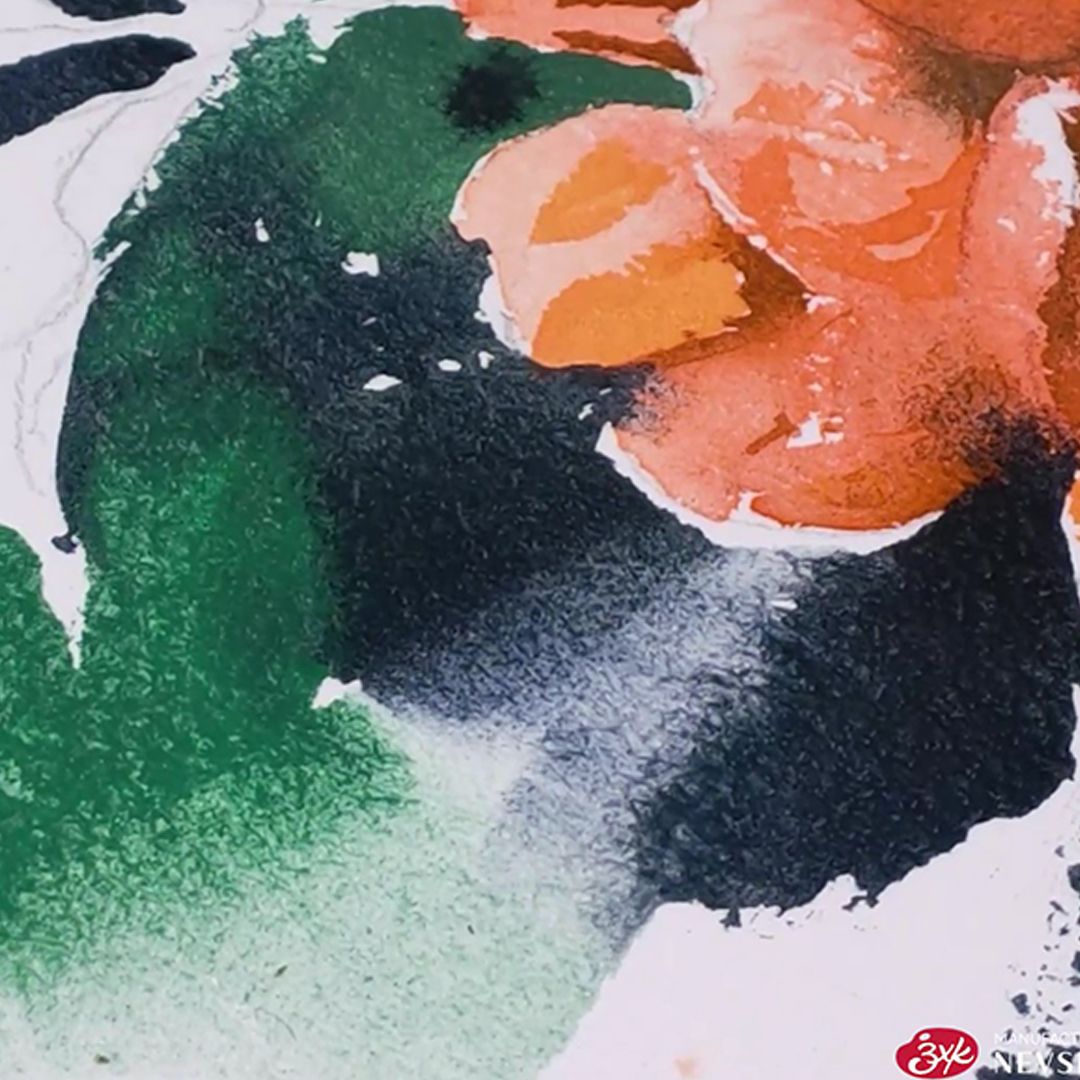
First, I make a light drawing with a pencil and after that, I carefully moisten the sheet on the back side, place it on the tablet and slightly moisten the surface of the paper in place of the background and greenery on the side of the drawing. When working with colour, I constantly monitor the condition of the paper; it should not dry out before I finish, otherwise the touch of the brush will become harsh: the boundaries of the colour of the brush strokes will be obvious, which will destroy the overall space of the composition. Of course, sometimes you need a hard stroke, but I prefer to place such accents at the end of the work, when the paper is dry. Also, where necessary, I further blur the boundaries and remove excess fragments of white paper using a damp, clean brush or a weak solution of base colour paint. This allows you to shape the foreground and background in the painting.

Greenery and background
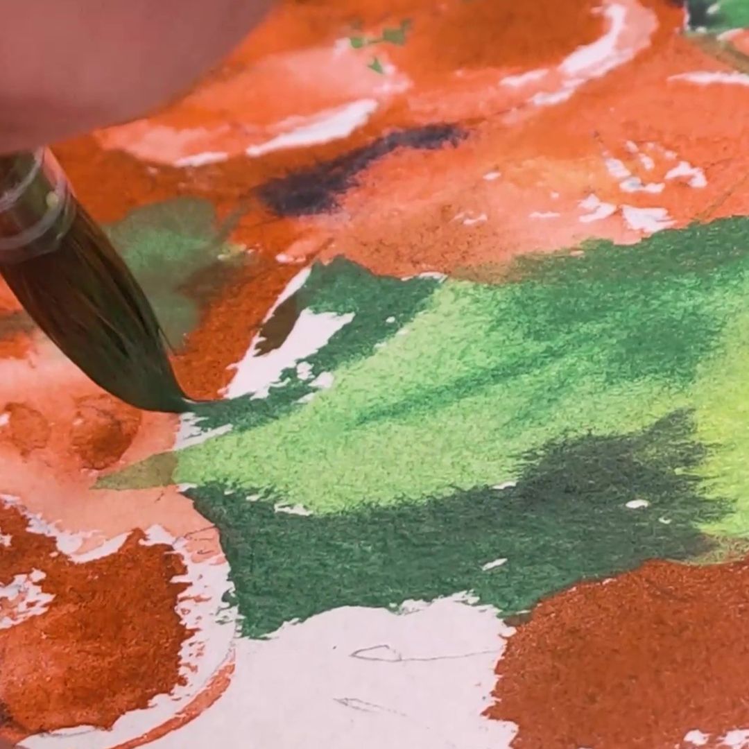
The main colour of the greenery is Cobalt Titanat Green, which has a rich, warm but soft colour with a very delicate granulation effect. I start with the shadows and add Cobalt Titanat Green + Grey-Blue Mist to create the depth of shadows I need with a cool, dark blue tint. For partial shade I use a mixture of Cobalt Titanat Green + Pyrrol Orange, resulting in a warm, muted brownish tint, and for leaflets in the light, I use Cobalt Titanat Green + Nickel Titanat Yellow, resulting in a rich, ringing yellow-green colour. To get the general background, I brushed a wide wet brush along the edge of the paint, allowing it to spread in some places, creating amazing colour shifts due to the granulation effect.